

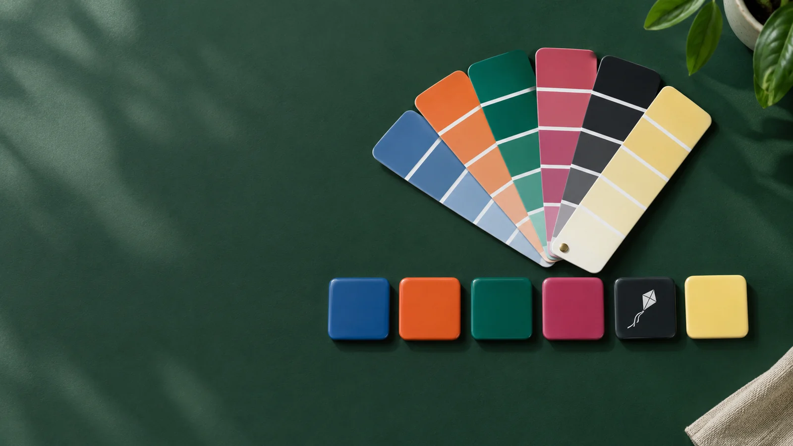
The best app icon colours are one strong main colour and one contrasting accent, with at least 3:1 contrast between the subject and the background. A mid-tone background stays visible on both light and dark wallpapers, and the colour should fit your brand while standing apart from your category. In AI Icon Creator's test of eight background colours on the same icon, only the mid-tone blue and berry kept at least 3.9:1 contrast against both a light and a dark wallpaper.
This guide covers how to pick app icon colours step by step, what our eight-colour test showed, how gradients work, and what happens to your colours when people switch their Home Screen to dark or tinted mode.
What is the best colour for an app icon?
There is no single best colour for an app icon: the best colour is the one that matches your brand, stands apart in your category and stays readable at small sizes. Blue, red and yellow were among the most common app icon colours in the top charts, and white and black backgrounds had become more popular, according to Appbot's 2022 analysis of the top 200 iOS and Google Play apps. Pink was rare.
Colours also carry associations that people bring with them. These are common patterns in the app stores, not rules:
| Colour | Often read as | Common in |
|---|---|---|
| Blue | Trust, calm, reliability | Finance, productivity, social, health |
| Green | Growth, money, health | Finance, fitness, food, nature |
| Red and orange | Energy, urgency, appetite | Food, entertainment, sports, deals |
| Yellow | Optimism, attention | Notes, kids, utilities |
| Purple | Creativity, premium | Creative tools, music, meditation |
| Pink | Playful, caring | Beauty, dating, family |
| Black and white | Premium, minimal, bold | Pro tools, fashion, social |
Being common isn't the same as being right for you. If most apps in your category are blue, a blue icon blends in.
How to choose app icon colours in five steps
Choosing app icon colours comes down to five checks, from your brand to the Home Screen modes people actually use:

1. Start from your brand colour
If your brand already has a main colour, your app icon should use it, so the icon, website and product feel like one thing. If you don't have a brand colour yet, the icon colour you choose will become it, so give it the time a logo decision deserves.
2. Look at your category
Search your category on the App Store and Google Play and note the colours that appear most. Finance leans blue and green, food leans red and orange, meditation leans purple and deep blue. Pick a colour that still fits the category but isn't the one everyone uses, so your icon is easy to find among the others.
3. Pair the background and the subject
The subject and the background need a clear light–dark difference, not just different hues. Aim for at least 3:1 contrast, the minimum that the WCAG accessibility guidelines ask of meaningful graphics. A quick check is to convert the icon to greyscale: if the subject and the background turn into similar greys, they'll merge when the icon is small. Keep to one main colour plus one accent; more colours make an icon harder to read at small sizes and harder to remember.
4. Test on light and dark wallpapers
Wallpapers vary widely, and dark mode may be on. Very dark backgrounds disappear on dark wallpapers, and very light or pastel backgrounds disappear on light ones. Mid-tone backgrounds with moderate saturation hold up on almost anything.
5. Check dark, tinted and themed modes
On iOS and Android, people can switch app icons to dark, tinted or themed versions that drop most of your colour. In those modes only the light–dark difference inside the icon survives, which is why step 3 matters so much. The section on dark and tinted modes below shows what that looks like.
Our test: the same app icon in eight colours
In AI Icon Creator's test, one kite icon was generated in the Clean flat style with eight different backgrounds: six solid colours and two gradients, with the subject colour left on Auto. Each icon was then measured for contrast between the subject and the background, and between the icon and a light and a dark wallpaper, using the WCAG contrast formula.

| Background | Subject vs background | Icon vs light wallpaper | Icon vs dark wallpaper |
|---|---|---|---|
Electric blue #2F6BFF | 4.9:1 | 4.3:1 | 3.9:1 |
Berry #E3336C | 4.4:1 | 3.9:1 | 4.3:1 |
Emerald #0FA37F | 3.4:1 | 3.0:1 | 5.5:1 |
Orange #FF6A2B | 3.0:1 | 2.7:1 | 6.1:1 |
| Sunset gradient (orange to pink) | 3.3:1 | 2.9:1 | 5.6:1 |
Ink #151A23 | 18.3:1 | 16.0:1 | 1.0:1 |
Custard #FFE38A | 6.2:1 | 1.1:1 | 14.5:1 |
| Cotton candy gradient (pale blue to lilac) | 6.5:1 | 1.3:1 | 12.7:1 |

What the test showed:
- Mid-tones are the safest background. Electric blue and berry were the only colours at 3.9:1 or more against both wallpapers.
- Extremes fail on one wallpaper. The ink icon was invisible on a dark wallpaper (1.0:1), and the custard and cotton candy icons almost disappeared on a light one (1.1:1 and 1.3:1).
- Bright warm colours give white subjects less contrast. A white kite on orange measured just 3.0:1, the weakest pairing, so its shape will be the first to fade in tinted mode.
- Auto subject colours adapt to the background. On the pale custard and cotton candy backgrounds, Clean flat's Auto subject colour chose a dark brown and a deep navy kite instead of white, which kept the subject contrast above 6:1.
Want to see your own icon in a few colours? Generate it in Clean flat and set a background, or leave the colours on Auto:
What dark, tinted and clear modes do to your colours
Dark, tinted and clear modes let people restyle every app icon on their Home Screen, and they change your colours more than any design decision you make. On iOS and iPadOS, people can choose default, dark, clear or tinted icons, and clear and tinted each come in light and dark versions. The system generates the variants you don't design yourself, as Apple's Human Interface Guidelines for app icons explain.

- Tinted mode turns your icon into shades of a single colour the user picks. Your hues are gone; only the lightness of each part remains.
- Dark mode puts icons on a dark background and dims bright colours. Very dark icons lose their edges.
- Clear mode makes icons translucent, so the wallpaper shows through.
- Android themed icons recolour the icon's monochrome layer to match the wallpaper, on Android 13 and later.
Design for these modes by giving the subject and background a strong light–dark difference. You can also design your own dark and tinted variants when the automatic ones lose your brand's character. Our app icon sizes guide lists what each platform expects.
How to use gradients in app icons
A gradient in an app icon works best as two or three neighbouring colours, such as orange to pink or blue to teal, flowing in one direction, usually from the top left. Close hues look rich; opposite hues, such as green to red, look muddy in the middle.
Gradients follow the same contrast rules as solid colours. In our test, the orange-to-pink sunset gradient kept 3.3:1 against its white kite and stayed visible on both wallpapers. The pale blue-to-lilac cotton candy gradient looked soft and pretty but almost vanished on a light wallpaper at 1.3:1. Pastel gradients need a darker subject and are best checked on a light Home Screen before you commit.
Our guide to icon styles shows how gradients, flat colour and 3D compare on the same subject.
Common app icon colour mistakes
- Too many colours. Three or more strong colours compete at small sizes. Keep one main colour and one accent.
- Matching hues, not contrast. Red on green or blue on purple can look distinct in colour but turn into the same grey.
- Pure black or pure white backgrounds without testing on both wallpapers. Each disappears on one.
- Copying the category leader's colour. People find your app by colour first, so a copy makes you harder to find.
- Designing only for the default mode. Check how the icon looks in tinted and dark modes, where most of the colour is gone.
For other small-size problems, see how to keep an icon legible at small sizes.
Frequently asked questions
What colours make an app icon stand out on the Home Screen?
The app icon colours that stand out most are mid-tone, fairly saturated colours that differ from the other apps in your category, paired with a subject in a clearly lighter or darker shade. A blue icon among blue competitors blends in; a berry or orange one next to them is found first.
Should my app icon use my brand colours?
Your app icon should use your brand's main colour when you have one, so people connect the icon with your website and product. If the brand colour is very dark or very pale, use a slightly adjusted shade for the icon background so it stays visible on both light and dark wallpapers.
Are gradients a good idea for app icons?
Gradients can work well in app icons when they use two or three neighbouring colours in one direction and keep strong contrast with the subject. Pastel gradients are the risky case: in our test, a pale blue-to-lilac gradient measured only 1.3:1 against a light wallpaper.
How do I choose colours for my app icon with AI?
To choose app icon colours with AI, generate your icon with colours on Auto to see what suits the subject, then fix the background to your brand colour or a recommended preset. In AI Icon Creator, Clean flat lets you set a solid or gradient background, and the colour settings guide explains every option.
Why do app icons look different in dark or tinted mode?
App icons look different in dark and tinted mode because the system replaces or dims your colours: tinted mode keeps only the lightness of each part, and dark mode darkens the background. Icons with a strong light–dark difference between subject and background survive these modes best.
Try your subject with a few colour approaches: