

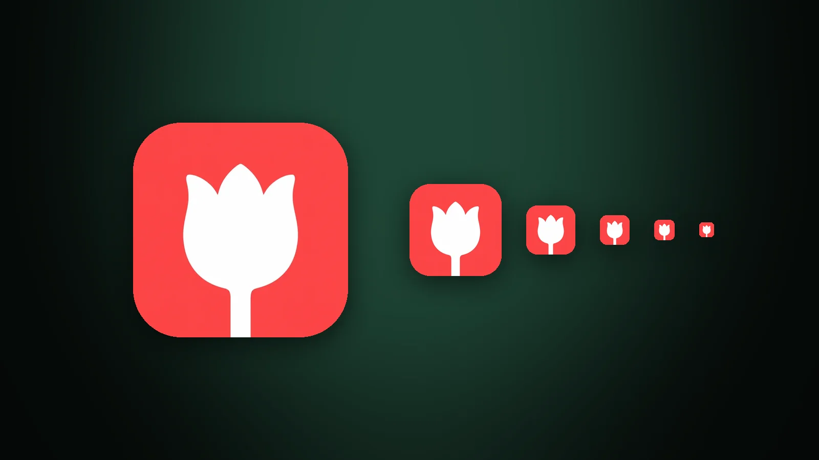
An app icon stays legible at small sizes when it uses one bold shape, lines at least 2 px wide at the smallest size, gaps of at least 2 px, a subject that fills most of the canvas, and at least 3:1 contrast between subject and background. You can check all of this in a few minutes: shrink the icon to 20–60 px, squint at it, and fill it with black.
This guide shows where app icons get small, how much detail survives, three quick tests, and the five most common problems with a fix for each.
Where do app icons appear at small sizes?
An app icon appears small in system lists such as Settings, Spotlight search and notifications, and as a favicon in browser tabs. Your artwork is drawn at 1024 × 1024 px, but people often see it at a fraction of that:
| Where it appears | Size in points or dp | Real pixels |
|---|---|---|
| iOS notification | 20 pt | 40–60 px |
| iOS Settings | 29 pt | 58–87 px |
| iOS Spotlight | 40 pt | 80–120 px |
| iOS Home Screen (iPhone) | 60 pt | 120–180 px |
| Android legacy launcher | 48 dp | 48–192 px depending on screen |
| Browser tab (favicon) | 16 px | 16–32 px |
The full list, with every platform, is in our app icon sizes guide. Apple's Human Interface Guidelines for app icons ask for a simple design built around one core idea, which is the same advice small sizes give you.
How much detail can a small app icon hold?
A small app icon can hold very little detail, because it has very few pixels. The 1024 px master has 1,048,576 pixels. A 20 pt notification icon drawn on a standard screen has 400, and 3,600 on a 3× phone: about 0.3% of the master. Everything you draw has to fit in that.

In AI Icon Creator's example, a piggy bank in flat style and a camping scene in Clay 3D style were shrunk to 60, 40, 29 and 20 px. The piggy bank is still a piggy bank at 20 px because it has one clear outline. The scene, which is the more charming icon at full size, loses its tent, trees and boat, and becomes a dark blob. Detail costs pixels, and small icons don't have any to spare.
Three quick checks for a legible app icon
The three quickest legibility checks for an app icon are shrinking it, squinting at it and filling it with black. Each one takes under a minute, and together they catch most problems before you export anything.

- Shrink it. View the icon at 60, 40, 29 and 20 px. Use the real size on screen, not a zoomed-out preview of a big canvas.
- Squint at it. Blur the icon or look at it from across the room. If you can still name the subject, the shape and contrast are working.
- Fill it with black. Turn every pixel of the subject solid black. If the outline still says what it is, the silhouette works. Our guide to app icon design best practices has more silhouette examples.
Run all three, because each one finds different problems. Shrinking exposes thin lines, squinting exposes weak contrast, and the silhouette exposes shapes that only work because of their colours.
Five problems that make an icon unreadable, and how to fix them
Five problems account for most unreadable small icons: thin lines, narrow gaps, too much detail, low contrast and a subject that is too small. Each has a simple fix:

Lines that are too thin
Thin lines are the first thing to disappear when an icon shrinks. A stroke that is 16 px wide on a 1024 px canvas is 1.6% of the width: at 32 px it is half a pixel, and the screen can only show it as a faint tint.

In a test we ran, one house outline was drawn with strokes of 16, 40 and 80 px on a 1024 px canvas and shrunk to 32 px. The thin stroke became a half-pixel tint, the medium stroke came out 1.25 px wide and looked weak, and the bold stroke, at 2.5 px, stayed clear. To check your own stroke, multiply its width by the target size and divide by 1024:
| Stroke on a 1024 px canvas | At 60 px | At 32 px | At 20 px |
|---|---|---|---|
| 16 px | 0.9 px | 0.5 px | 0.3 px |
| 40 px | 2.3 px | 1.3 px | 0.8 px |
| 64 px | 3.8 px | 2.0 px | 1.3 px |
| 100 px | 5.9 px | 3.1 px | 2.0 px |
Our rule of thumb is that a line you need people to see should be at least 2 px wide at the smallest size the icon will appear at. That is a stroke of about 64 px at 32 px, and about 100 px at 20 px. Draw fewer lines and make each one bold.
Gaps that are too narrow
Narrow gaps close up when an icon is scaled down, and the shapes on either side merge into one blob. A 12 px gap between two bars on a 1024 px canvas is 0.4 px at 32 px, so the bars run together; a 50 px gap is 1.6 px, and the bars stay separate. Open gaps up to at least 2 px at the smallest size, or merge the shapes on purpose. This is why a stack of coins works when the coins have visible gaps and fails when they touch.
Too much detail
Textures, small ornaments and subtle shading turn into noise at small sizes. Keep the one or two features that make the subject recognisable, such as a tent's door or a leaf's vein, and remove the rest. A scene with several objects should become one object: in our example, the single tent stays a tent at 32 px and the full camping scene does not. The reasoning behind one focal point is in our guide to how to make an app icon.
Not enough contrast
When the subject and background are close in lightness, they merge at small sizes and in Home Screen tinted mode. A white seedling on a pale mint background measured 1.2:1 in our test, and was hard to see at 32 px. The same seedling on deep green measured 3.7:1 and stayed clear. Aim for at least 3:1, the WCAG minimum for meaningful graphics, and check by converting the icon to greyscale. Our guide to app icon colours has measured contrast for eight backgrounds.
A subject that is too small
A subject that fills only a small patch in the middle of the canvas gets even smaller at 32 px. In our example, the same seedling filling 30% of the canvas was a speck at 32 px; at 62% it was clear. As a rule of thumb, let the subject take up roughly 60–70% of the canvas, with a moderate margin around it, and keep it inside the platform's safe zone.
Want to see how your own subject holds up? Generate it in a few styles and shrink each result to 32 px:
Which app icon styles stay legible at small sizes?
Flat and graphic styles stay legible at small sizes better than any other family, because they have bold shapes, flat colour and no fine texture. In AI Icon Creator's test of the same bell in eight styles at 24 px, the flat bell was the clearest, while a chrome bell on a black background was among the hardest to read. Soft 3D and glass icons can work when the subject is simple and the contrast is strong.
That doesn't mean every icon should be flat. It means the richer the style, the simpler the subject should be. The full comparison is in our guide to icon styles.
How to fix an app icon that is already made
To fix an app icon that is unreadable at small sizes, remove or merge detail, bold up the main shape and increase the contrast, then run the three checks again. In AI Icon Creator you can do this without starting over: open the icon in Adjust an icon and use the Fewer details or Bolder shape actions, or select one area and choose Simplify here. If the style itself is the problem, generate the same subject again in a flatter style and compare.
Whatever you change, look at the result at 60, 40, 29 and 20 px on a real screen. Then check both a light and a dark wallpaper.
What about favicons?
A favicon is the smallest app icon you'll make: it appears at 16 px in a browser tab, and 32 px on high-density screens. Everything in this guide applies, with less room. A favicon should usually be a simplified version of your app icon: one shape, one or two colours. You can turn a PNG or SVG into a favicon with our free PNG to ICO converter or favicon converter, then check it in a real browser tab.
Frequently asked questions
What size is too small for an app icon?
An app icon is too small when people can no longer name its subject. Icons appear as small as 20 pt in iOS notifications and 16 px in browser tabs, so a legible icon has to survive both. If your icon still reads at 20 px, it will read everywhere it appears.
How thick should the lines in an app icon be?
Lines in an app icon should be at least 2 px wide at the smallest size the icon will appear at. On a 1024 px canvas that is about 64 px for a 32 px display size, and about 100 px for 20 px. Thinner lines fade into a faint tint at small sizes.
Why does my app icon look blurry when it's small?
An app icon looks blurry when small because fine details, thin lines and narrow gaps are smaller than a pixel, so the screen averages them into grey. The fix is to make the design bolder and simpler, not to sharpen it. Bolder strokes, wider gaps and fewer features survive being scaled down.
How do I test how my app icon looks at small sizes?
To test an app icon at small sizes, export it at 60, 40, 29 and 20 px and view it at real size on a phone, then blur it and fill it with black. Also check it on light and dark wallpapers. Our app icon sizes guide lists every size to test.
Do I need a separate, simpler icon for small sizes?
You don't need separate artwork for most small sizes, because iOS and Android scale your master icon down themselves. Design the master so it holds up at 20 px. The exception is the favicon, where a simplified version of the icon often reads better at 16 px.
Try it on your own idea: