

The app icon sizes that matter most in 2026: 1024 × 1024 px for iOS, iPadOS and macOS; 512 × 512 px for the Google Play store listing; 108 × 108 dp layers for Android adaptive icons; and 192 × 192 px and 512 × 512 px for web apps, plus a 32 × 32 px favicon. Design one square master at 1024 px, keep the subject inside each platform's safe zone, and let the platforms round the corners. Everything else is generated from that master.
This guide lists every size with where it's used, shows what an icon really looks like at each one, and ends with a checklist to run before you submit. If you haven't designed the icon yet, start with our step-by-step guide on how to make an app icon.
App icon sizes at a glance
This table lists the app icon size each platform expects in 2026 and the shape the platform turns it into.
| Platform | What you provide | Size | Notes |
|---|---|---|---|
| iOS, iPadOS, macOS | App icon master | 1024 × 1024 px | Square, opaque, no rounded corners |
| watchOS | App icon master | 1088 × 1088 px | Masked to a circle |
| visionOS | Layered icon | 1024 × 1024 px | Masked to a circle |
| tvOS | Layered icon | 800 × 480 px | Landscape |
| Google Play | Store listing icon | 512 × 512 px | 32-bit PNG, up to 1024 KB |
| Android | Adaptive icon layers | 108 × 108 dp | Visible area about 72 dp, safe zone 66 dp |
| Android | Legacy launcher icon | 48 × 48 dp | 48–192 px across screen densities |
| Web | Favicon | 16, 32 and 48 px | Often one .ico file, or an SVG |
| Web | Apple touch icon | 180 × 180 px | Used when a site is added to an iPhone Home Screen |
| Web app (PWA) | Manifest icons | 192 × 192 and 512 × 512 px | Add a maskable 512 px version |
Platform rules change, usually after Apple's and Google's developer conferences. The official pages are linked in each section below; check them before a release.
iOS app icon sizes
Provide one 1024 × 1024 px icon. Xcode generates every smaller size from it, including the ones for the Home Screen, Spotlight, Settings and notifications. The App Store icon size is the same 1024 × 1024 px, and it uses the same image.
Apple's rules for that image:
- A full square, with no rounded corners. The system applies its own mask, and pre-rounded art ends up with a double edge.
- No transparency. Make the background fully opaque.
- sRGB or Display P3 colour. Grey Gamma 2.2 is also accepted for greyscale icons.
- Keep the main subject near the centre, so nothing important is lost when the corners are masked.
Since iOS 26, icons can be layered: a background plus one or more foreground layers that the system renders with Liquid Glass highlights and depth. You build these in Icon Composer, which comes with Xcode. A flat 1024 px image still works; the layers just give you more control over the effect. See Apple's Human Interface Guidelines for app icons.
Dark, clear and tinted appearances
People can switch their Home Screen icons to default, dark, clear or tinted, and clear and tinted each come in light and dark versions. You can design each variant yourself, or let the system generate the ones you don't provide. If you make your own, keep the same shapes in every version so people can still find your app, and use your default icon as the starting point for the dark one.
iPhone and iPad icon dimensions, if you supply every size yourself
Most projects no longer need this, but if you turn off the single-size option in Xcode, these are the common iPhone and iPad icon dimensions:
| Where it appears | Size in points | Pixels (@2x / @3x) |
|---|---|---|
| iPhone Home Screen | 60 pt | 120 / 180 px |
| iPad Home Screen | 76 pt | 152 px |
| iPad Pro Home Screen | 83.5 pt | 167 px |
| Spotlight | 40 pt | 80 / 120 px |
| Settings | 29 pt | 58 / 87 px |
| Notifications | 20 pt | 40 / 60 px |
| App Store | — | 1024 px |
A macOS app built with an asset catalog still needs its own set: 16, 32, 64, 128, 256, 512 and 1024 px.
Android app icon sizes
An Android app needs two icons: a 512 × 512 px icon for its Google Play listing, and an adaptive launcher icon made of two 108 × 108 dp layers that ships inside the app.
Google Play store icon: 512 × 512 px
From the Google Play icon design specifications:
- 512 × 512 px, 32-bit PNG, sRGB, up to 1024 KB.
- A full square. Google Play rounds the corners itself, with a radius of 30% of the icon's size.
- No drop shadow. Play adds its own. Shadows and lighting inside the artwork are fine.
- No transparency. Transparent areas show the store's background colour instead of yours.
- No text or badges that suggest rankings, offers or awards; these break Google Play's policies.
Adaptive icons: 108 × 108 dp
Since Android 8, launcher icons are adaptive: a background layer and a foreground layer that each device masks into its own shape, such as a circle or a squircle. The Android adaptive icon guidelines set the numbers:
- Both layers are 108 × 108 dp.
- The outer 18 dp on each side is reserved for masking and motion effects, so about the central 72 dp is visible.
- Keep the logo inside the 66 dp safe zone and make it at least 48 dp across.

In pixels, a 108 dp layer is 108 px at mdpi, 162 at hdpi, 216 at xhdpi, 324 at xxhdpi and 432 at xxxhdpi.
Legacy launcher icons
Older launchers use a plain 48 dp square icon:
| Density | mdpi | hdpi | xhdpi | xxhdpi | xxxhdpi |
|---|---|---|---|---|---|
| Launcher icon | 48 px | 72 px | 96 px | 144 px | 192 px |
Themed icons
From Android 13, people can turn on themed icons, which recolour app icons to match the wallpaper. Your app joins in if its adaptive icon includes a monochrome layer. From Android 16 QPR 2, Android themes icons automatically for apps that don't provide one.
Web and web app icon sizes
A website needs favicons at 16, 32 and 48 px plus a 180 px Apple touch icon; an installable web app (PWA) also needs 192 px and 512 px icons in its manifest.
- Favicon: 16 × 16, 32 × 32 and 48 × 48 px, usually bundled into one
favicon.ico. You can add an SVG favicon for sharp tabs on high-resolution screens. If your logo is a PNG, our free PNG to ICO converter builds a multi-sizefavicon.icoin your browser; for a vector logo, the SVG to ICO converter draws each size from the SVG, so the small ones stay sharp. - Apple touch icon: 180 × 180 px, opaque. iOS uses it when someone adds your site to their Home Screen.
- Web app manifest: at least 192 × 192 and 512 × 512 px. Chrome looks for both before it offers to install your app.
- Maskable icon: a 512 px icon marked
"purpose": "maskable", with a solid background and the subject inside a centred circle 80% as wide as the icon. Android crops it to the launcher's shape.
Don't use your maskable icon for every purpose. The extra padding makes it look small in places that don't apply a mask.
To make the whole web set from one image, including favicon.ico, the Apple touch icon, Android and PWA icons, a web manifest and the HTML for your page's <head>, use our free favicon converter.
Other platforms
Apple's other platforms and Windows each use their own app icon sizes:
- watchOS: 1088 × 1088 px, masked to a circle. Avoid a black background; it disappears against the watch face.
- visionOS: 1024 × 1024 px, built from a background and up to two layers on top.
- tvOS: 800 × 480 px, landscape, with two to five layers for the parallax effect.
- Windows: at minimum 16, 24, 32, 48 and 256 px, usually combined in one
.icofile.
What each app icon size actually looks like
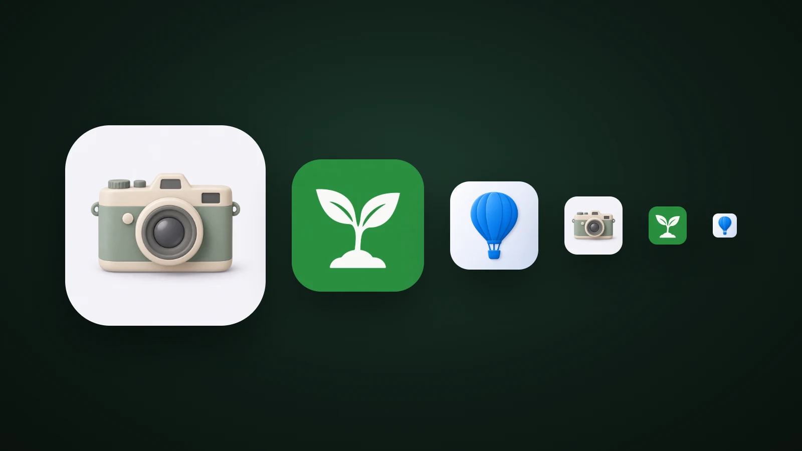
A table of numbers hides the real problem: most app icon sizes are tiny. In AI Icon Creator's test, two icons made with our AI app icon generator, a detailed Clay 3D camera and a simple Clean flat seedling, were downscaled to the exact pixel size of each slot, from 180 px down to 16 px. The camera's details merged below 48 px; the seedling was still recognisable at 16 px.

The detailed camera looks great at 180 px, but by 48 px its lens, dials and strap lugs have merged into a blur. The flat seedling is one bold shape on one colour, and it's still recognisable in a browser tab. That doesn't mean every icon has to be flat; it means you should look at your icon at 48 px and below before you commit to it. Our guide to keeping an icon legible at small sizes covers the fixes.
Want to see how your own idea holds up? Generate a few versions and compare them at small sizes:
Why you shouldn't round the corners yourself
You shouldn't round an app icon's corners because every platform takes a square image and applies its own mask. Apple uses a rounded rectangle whose curve matches the device. Google Play uses a 30% radius and adds a shadow. Android launchers pick a circle, a squircle or a rounded square. watchOS and visionOS use a circle.

So provide a plain, full-bleed square, and keep the important part of the design away from the corners.
Common app icon size mistakes
Most app icon size mistakes only show up after a platform has processed the icon:

- Pre-rounded corners. The mask is applied on top, leaving a light rim or uneven corners.
- A transparent background. Transparent areas can render black on a Home Screen, and App Store Connect rejects an App Store icon with an alpha channel.
- Words in the icon. An app name that's readable at 1024 px is a smudge at 60 px, and your app's name already appears under the icon. Apple recommends text only when it's essential to your brand.
- A subject that fills the whole square. On a circular launcher mask, the edges are cut off. Keep it inside the safe zone.
- Upscaling a small image. A 512 px logo stretched to 1024 px looks soft on the App Store page. Start from 1024 px or a vector.
Export every app icon size at once
Once you have a 1024 px master, you don't need to resize anything by hand. In AI Icon Creator, open any icon you've made and choose App icon pack under Download & export. You get a ZIP with:
- iOS: an
AppIcon.appiconsetwith the 1024 px icon, ready to drag into Xcode. - Android: launcher icons for mdpi to xxxhdpi, round icons, an adaptive icon for Android 8 and later, and a 512 px Play Store icon.
- Web:
favicon.ico, the 16, 32, 180, 192 and 512 px PNGs, a maskable icon, asite.webmanifestand a snippet for your page's<head>.
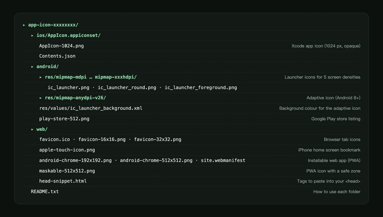
The pack doesn't include dark or tinted variants, and only flat styles get an Android monochrome layer for themed icons. iOS generates the appearances you don't provide, and Android 16 QPR 2 and later themes icons that have no monochrome layer. For step-by-step instructions, see how to download and export your icon.
App icon checklist before you submit
Before you submit an app icon to a store, check that:
- The master is 1024 × 1024 px, square and opaque.
- No rounded corners, drop shadows or borders drawn in.
- The subject sits inside the safe zone: 66 of 108 dp on Android, 80% on maskable web icons.
- It's still recognisable at 48 px and at 16 px.
- No text, except a single letter or wordmark that's part of your brand.
- The Google Play icon is a 32-bit PNG under 1024 KB.
- The web manifest lists a 192 px and a 512 px icon.
- You've checked the current App Store and Google Play icon requirements.
Frequently asked questions
What size should an app icon be?
Design it at 1024 × 1024 px. That single square covers the App Store and iOS, and you can scale it down for Google Play (512 px), Android launchers and the web. Starting smaller means scaling up later, which blurs the icon.
What are the iPhone app icon dimensions?
On an iPhone Home Screen, an app icon is 60 × 60 points, which is 180 × 180 px on most current iPhones (@3x) and 120 × 120 px on @2x screens. You don't export these yourself: provide the 1024 px master and Xcode creates them.
Is 1024 × 1024 px enough for an iOS app?
A 1024 × 1024 px icon is enough for an iOS app: current versions of Xcode generate every smaller iPhone and iPad size from that one image. You only need separate files if you want different artwork at small sizes, or if you're building a macOS app with an asset catalog.
How do I make one app icon that works on both iOS and Android?
Design one square 1024 × 1024 px icon with the subject centred and clear of the edges, so circular and rounded masks never cut it off. Then export it for each platform. That single master covers the App Store, the 512 px Google Play icon, Android's adaptive launcher icon and web favicons. The App icon pack in AI Icon Creator exports all of these from one icon.
What's the difference between px and dp?
Pixels (px) are physical dots on the screen. Density-independent pixels (dp) are Android's unit that stays the same physical size on every screen: 1 dp is 1 px at mdpi, 2 px at xhdpi and 4 px at xxxhdpi. iOS points (pt) work the same way.
Does an app icon need a particular DPI or file format?
An app icon doesn't need a particular DPI, because screens only use its pixel dimensions. Use PNG for app and store icons. Web favicons can also be .ico or SVG.
Do I need a different icon for dark mode?
You don't need a separate dark mode app icon: iOS generates dark, clear and tinted versions from your default icon, and newer Android versions theme icons automatically. Design your own variants if the automatic ones lose your brand colours or look muddy.
Need an icon to start from? Describe your app's subject, pick a style and generate a 1024 px master: