

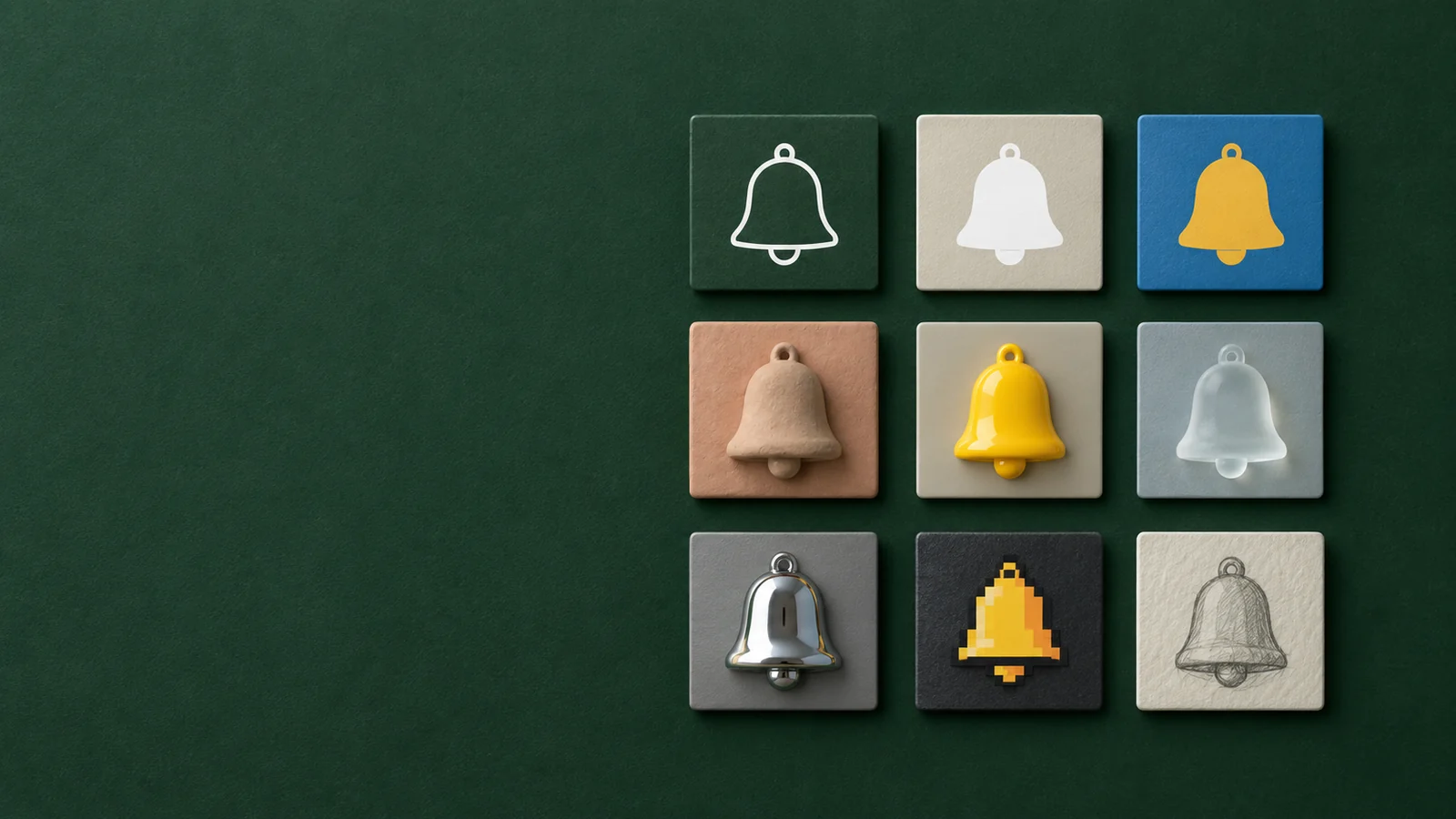
Icon styles fall into two families. Interface icons, the small symbols inside apps and websites, are usually line (outline), filled (glyph), duotone, flat colour, gradient, hand-drawn or pixel art. App icons, the square on the Home Screen, are usually flat and graphic, 3D, made of a material such as glass or metal, or built around a character. Choose a style by where the icon appears, how small it gets and the personality of your brand, then use it consistently.
This guide shows every style on the same subject, a bell, so you can compare them directly, and ends with the icon style trends shaping 2026.
What is an icon style?
An icon style is the set of visual rules every icon in a set follows: line weight, whether shapes are filled, corner radius, colours, perspective and lighting. Two bells can show the same idea and still look nothing alike. The style is what makes them feel like part of one product.
That's why style matters more than any single icon. A mix of outlined and filled icons, or flat and 3D ones, looks unfinished even when each icon is well drawn.
Interface icon styles
Interface icon styles set the look of the small symbols in toolbars, menus, tabs and buttons, which usually appear at 16 to 32 px. The main ones are line, filled, duotone, flat colour, gradient, hand-drawn, pixel art and isometric, and all of them need to be quick to read and consistent across dozens of symbols.

Line (outline) icons
Line (outline) icons are drawn with strokes of one even weight and no fill. They feel light and modern and suit clean, content-heavy interfaces. Their weakness is small sizes: a thin stroke can fade into the background, so keep the stroke at least 1.5 px at the size you use.
Filled (glyph) icons
Filled (glyph) icons are solid shapes in a single colour. They read faster at small sizes and carry more visual weight. Many interfaces pair the two: an outline icon for the normal state and the filled version for the selected one, as in a tab bar.
Duotone icons
Duotone icons use two tones of the same colour, typically a light fill with a stronger outline or accent. Duotone adds depth without leaving a single-colour palette, which makes it popular in dashboards and marketing sites.
Flat colour icons
Flat colour icons use solid shapes in several colours with no shading or gradients. They are friendly and easy to recognise, and they're the most common style in icon libraries.
Gradient icons
Gradient icons let colour flow across the shape. They feel energetic and modern but can muddy at small sizes, so keep them to two or three close colours.
Hand-drawn icons
Hand-drawn icons use loose, imperfect lines that look sketched. They give a product a personal, crafted feel, which works well for creative tools, education and food, but they're harder to keep consistent across a large set.
Pixel art icons
Pixel art icons are built on a coarse grid of square pixels, a nod to early computer graphics. They suit games and retro-themed products, and they stay crisp at exactly the size they were drawn for.
Isometric icons
Isometric icons show objects in a fixed three-quarter view with parallel lines instead of perspective. They are good at showing structure, such as servers, buildings or devices, and are common in technical illustrations. They need more space than a flat symbol, so they're rarely used for toolbar icons.
App icon styles
App icon styles fall into four groups: flat and graphic, 3D, materials such as glass and metal, and characters. An app icon is a single square that has to stand out among dozens of others on a Home Screen. It has more room than an interface icon, so it can use depth, materials and light. Here's the same bell as an app icon in eight styles:

Flat and graphic app icons
Flat and graphic app icons put a bold symbol on a solid or gradient background, with no lighting. They are the safest choice for legibility and work for almost any category. Variations push the idea further: edge negative, for example, lets the shape run off the edge of the square for a more graphic, poster-like look.
3D app icons
3D app icons model the subject as an object with light and shadow. Clay 3D looks soft and matte, like modelling clay, and feels friendly. Glossy 3D has smooth, shiny surfaces and feels polished. Other dimensional styles, like a folded ribbon or a matte tinted silhouette, use depth in a more abstract way. 3D icons stand out on a Home Screen, but they need a simple subject; fine details get lost in the shading.
Glass and metal app icons
In glass and metal app icons, the material is the style. Frosted glass icons are translucent and glowing, and they sit naturally next to Apple's Liquid Glass look in iOS 26. Metal icons, such as polished chrome or brushed steel, feel premium and technical. Both depend on contrast: a chrome bell on black looks striking at full size but, as you'll see below, gets hard to spot on a dark wallpaper.
Character and mascot app icons
Character and mascot app icons make a character, often an animal, the face of the app. Mascot icons are memorable and warm, which is why they're common in games, education, kids' apps and consumer apps with a social side.

Keep the character to its head or upper body, give it one clear expression, and make sure the silhouette works without the details.
Skeuomorphic app icons
Skeuomorphic icons imitate real objects in detail: a notepad with lined paper, a leather-bound book, a camera with a realistic lens. They dominated app icons until iOS 7 moved to a flatter look in 2013. Today's 3D and material styles borrow their depth and texture but keep the simpler shapes of flat design.
Want to try these on your own subject? Pick a few styles and compare them side by side:
How each icon style holds up at small sizes
Some icon styles survive being shrunk much better than others. In AI Icon Creator's test, the same bell was generated in eight app icon styles and downscaled to 60 px, the Home Screen size, and to 24 px. Flat and graphic styles stayed recognisable at 24 px; the folded ribbon and the chrome bell on black were the hardest to read:

What we saw:
- Flat and graphic styles read best. A white bell on blue is unmistakable even at 24 px.
- Soft 3D holds up when the subject is simple, but a pale background can blend into light wallpapers.
- Abstract and detailed styles suffer. The folded ribbon turns into an unclear shape, and the chrome bell's details and black background almost disappear.
If your icon will often appear small, lean towards bold shapes and strong contrast. Our guide to keeping an icon legible at small sizes covers the fixes.
How to choose an icon style
Choose an icon style by answering three questions:
- Where will the icon appear? Interface icons need a simple line or filled style. An app icon can use depth and materials.
- What should people feel? Clean flat feels confident, clay feels friendly, glass feels light, metal feels premium, a mascot feels personal.
- What does your category look like? A style that's rare among your competitors helps you stand out.
For a deeper walkthrough, see how to choose a style for your app icon. To see all 14 of our app icon styles with sample icons, browse the style library. Once you've chosen, our guide on how to make an app icon takes you from idea to finished icon.
Icon style trends for 2026
The biggest icon style trends for 2026 come from the platforms themselves:
- Glass and translucency. Apple's Liquid Glass design in iOS 26 renders layered app icons with highlights, refraction and translucency, and adds a clear appearance alongside dark and tinted. Expect more glass-like app icons, and more icons designed as simple layers that can take on those effects. The Apple Human Interface Guidelines explain how layered icons work.
- Strong silhouettes. Tinted icons on iOS and themed icons on Android turn your icon into a single colour. Icons that depend on colour to be recognised lose out; icons with a clear shape win.
- Soft, tactile 3D. Clay-like and toy-like 3D keeps growing in consumer apps, helped by AI tools that make it quick to produce.
- Characters. Mascots continue to spread beyond games into finance, health and productivity apps that want to feel less corporate.
- Quiet interfaces. Inside apps, thin line and simple filled icons remain the default, so the app icon is where brands show their personality.
Keep your icon style consistent
An icon style only works when every icon follows it:
- Use the same stroke weight, corner radius and perspective across every interface icon.
- Don't mix outline and filled icons in the same row, except to show a selected state.
- Your app icon and interface icons can differ. A 3D app icon with line icons inside the app is normal. Share colours and shapes so they still feel related.
- When you add icons later, check them against the originals at the size they'll be used.
Frequently asked questions
What are the different icon styles?
For interface icons: line (outline), filled (glyph), duotone, flat colour, gradient, hand-drawn, pixel art and isometric. For app icons: flat and graphic, 3D (such as clay and glossy), materials (such as glass and metal), characters and mascots, and the older skeuomorphic style.
What's the difference between outline and filled icons?
Outline icons are drawn with strokes and no fill; filled icons are solid shapes. Filled icons read faster at small sizes and look heavier. Many apps use outline icons by default and the filled version to show which item is selected.
What icon style should I use for my app icon?
Flat and graphic styles are the safest choice for an app icon, because they stay legible at every size. 3D, glass and character styles stand out more on a Home Screen; choose them when they match your brand and your subject is simple.
Can I use a line icon as my app icon?
You can use a line icon as your app icon, but thin lines are hard to see at Home Screen size and disappear in tinted and themed modes. If you like the line look, thicken the strokes and put them on a strong background colour.
Are 3D icons still in style in 2026?
3D icons are still in style in 2026: soft, simple 3D is one of the most common app icon styles, and Apple's Liquid Glass brings highlights and depth to app icons on iOS 26. What has gone out of style is heavy, detailed realism; today's 3D icons keep simple shapes.
Try your own subject in a few styles: