

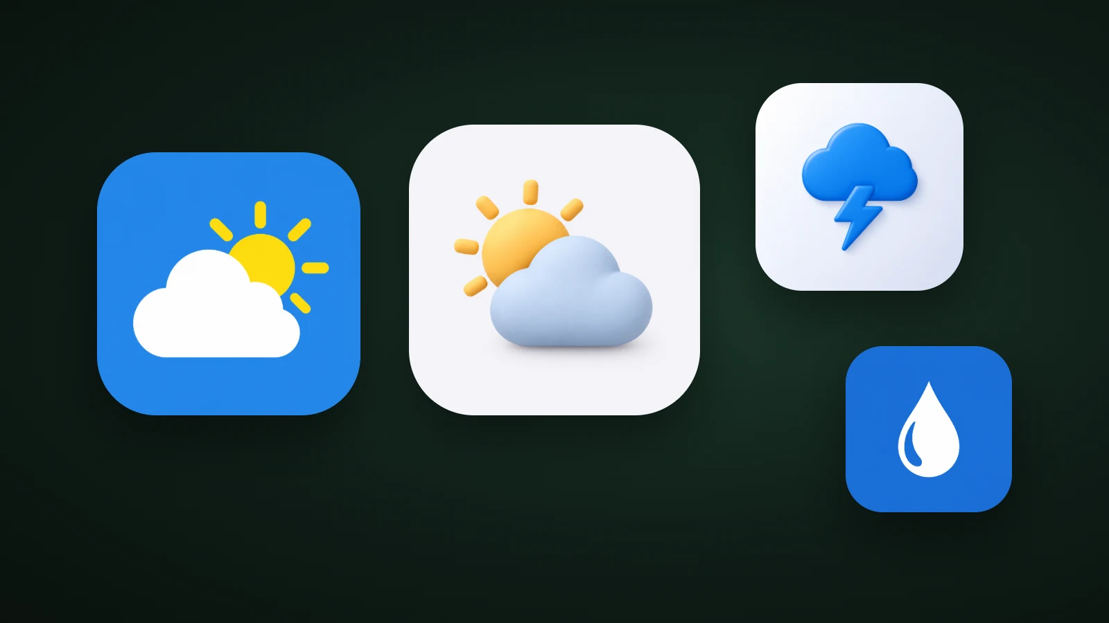
A weather app icon works best when it shows one clear weather symbol, such as a sun, a cloud, a raindrop, a bolt or a moon, in a colour that stands out from the default sky blue. In AI Icon Creator's review of the 100 top free Weather apps in the US App Store on 30 September 2026, 32 icons showed a weather symbol, 19 a name, 19 an abstract mark and 11 a radar map. Blue was the edge colour of 34 icons, and 32 icons used four or more main colours, more than twice as many as in Food & Drink.
This guide shows what the category looks like, why a sun and a cloud can merge in tinted mode, and four icon ideas for different kinds of weather apps.
What do weather app icons look like?
Weather app icons are mostly weather symbols, names and abstract marks. AI Icon Creator's review looked at the 100 apps in the US App Store's Top Free chart for Weather on 30 September 2026, and we classified what each icon shows by eye. The icons aren't reproduced here.

- Weather symbols (32). Suns, clouds, drops, moons, bolts and a tornado, alone or combined.
- Names and wordmarks (19). Mostly local TV stations and news brands that people already know.
- Abstract marks (19). Swirls, waves, rings and geometric shapes.
- Instruments and alerts (13). Thermometers, gauges, pulse lines, a buoy and a sailboat, for niche and safety apps.
- Radar or heat-map imagery (11). A miniature of the map inside the app, often in rainbow colours.
- A single letter (3) and characters (3). Rare in this category.
The radar icons show the risk of putting your app's screen in your icon. A rainbow storm map is striking at full size, but at 32 px it becomes a blur of colour with no recognisable shape. A symbol or a simple mark is easier to spot in a list. Our guide to icon metaphors helps you choose one.
Which colours do weather app icons use?
Weather app icons lean on blue, white and very dark colours. In the same chart, we measured the median colour of each icon's outer edge: 34 were blue, 22 white or near white, 14 black or very dark, 7 green, 7 red, 4 teal, 3 purple, 3 grey, 3 orange, 2 yellow and 1 pink.

Blue is the sky, and dark is the night, so both are natural choices, and together with white they cover 70 of the 100. That leaves the sunrise, dusk and storm colours almost free: orange, yellow, pink and purple together covered only 9 icons. A forecast app in a blue sky colour joins the crowd, while an app in dusk purple or sunrise orange is easier to find. Our guide to app icon colours explains how to check contrast on light and dark wallpapers.
Weather icons also use more colours than most. AI Icon Creator counted the main colours in each icon (colours that cover at least 8% of the image) and found that 32 of the 100 weather icons used four or more. In Food & Drink it was 13 of 100, and in Finance 6.

Radar maps and sun-and-cloud scenes account for much of the difference. Our guide to minimalist app icons shows how few colours the strongest icons use.
Why sun and cloud vanish in tinted mode
A sun behind a cloud is the most common weather icon, but the two shapes are usually separated by hue, not by lightness, so they merge when colour is removed. On iOS, people can switch to tinted and dark icons that drop most of your colour, and Android can theme icons from a single-colour layer. In those modes, only the light–dark difference survives.

In AI Icon Creator's test, the same "sun peeking out from behind a cloud" was generated in a flat style and in a clay style. We measured the contrast between the median sun, cloud and background colours with the WCAG formula. In the flat icon, a yellow sun against a white cloud measured 1.35:1, and the sun against the blue background 2.73:1. In the clay icon, the orange sun and the pale blue cloud measured 1.02:1, which is effectively the same lightness, and both sat on a light background at about 1.45:1. In greyscale, the sun turns into a pale grey disc behind the cloud.
The WCAG guideline for graphics asks for at least 3:1 between meaningful parts. To reach it, make the sun much lighter or darker than the cloud, or draw the sun as a bold shape with a clear edge. Check every icon in a greyscale copy before you decide. Our guide to keeping an icon legible at small sizes has more checks.
Try your own weather symbol in a few styles:
Four weather app icon ideas
Each kind of weather app has a symbol people expect. Here are four, with a note on when each works:

- Forecast apps: a sun behind a cloud. It's instantly familiar, but it's also the most crowded look, so change the colour and separate the shapes by lightness.
- Storm and alert apps: a cloud with a bolt. One strong shape says "warning" without a map. Avoid red alert marks that suggest an official warning system.
- Rain and precipitation apps: a single drop. It's the simplest weather symbol: one shape that stays clear at small sizes.
- Night sky and astronomy apps: a moon. It's calm, and different from the daytime sun that most forecast apps use. Our guide to glassmorphism icons shows a frosted moon.
App icon or weather condition icons?
Your app icon is one symbol, while weather condition icons are the set of small symbols inside your app for clear, cloudy, rain and snow. Search results for weather icons are mostly icon sets for forecast screens, such as the icon lists in weather data services. Those are a separate design job.
Keep the two related but not identical. The app icon should be your strongest single symbol, on a full square, with no text. The in-app set should share its colours and line weight, and it can afford more detail because it's shown larger. Our guide to icon styles covers interface icon styles.
What to avoid in a weather app icon
- A whole scene. Sun, cloud, rain, lightning and a rainbow at once turn to noise at 32 px. Use two shapes at most.
- A radar map. It's the app's content, not its symbol, and it turns into a blur of colour at small sizes.
- Numbers. A fixed temperature such as "72°" is wrong most of the time, and text is hard to read at icon sizes.
- Official-looking marks. Government seals, agency names or alert colours can suggest an official status you don't have.
- Sun and cloud in the same lightness. Check a greyscale copy, as in the test above.
How to design a weather app icon
To design a weather app icon, pick the one thing your app is about, choose one weather symbol, use a colour that isn't the default sky blue, separate the shapes by lightness and test small and in greyscale.

- Pick the one thing your app is about: forecasts, storms, rain, air quality or the night sky.
- Choose one weather symbol, and use two shapes at most.
- Pick a colour that isn't the default sky blue. Dusk purple, sunrise orange or storm dark can stand apart.
- Separate the shapes by lightness, so tinted modes keep both.
- Test at 32 px, on light and dark wallpapers and in greyscale.
Frequently asked questions
What should a weather app icon look like?
A weather app icon should show one simple weather symbol, such as a sun, a cloud, a drop, a bolt or a moon, on a colour that stands out from other weather apps. In the top 100 US weather apps, 32 icons used a weather symbol. Keep it to one or two shapes so it stays clear at 32 px.
What colour should a weather app icon be?
A weather app icon can be blue, because 34 of the top 100 US weather icons had a blue edge, but a different colour stands out more. Sunrise orange, dusk purple, night navy or storm grey are less used. Whatever you choose, keep at least 3:1 contrast between the symbol and the background.
Should a weather app icon show the current weather?
A weather app icon should show a fixed symbol rather than the current weather, because an app icon is a fixed image and the App Store and Google Play listings show the same one to everyone. Use the changing conditions inside the app and in widgets, and keep the icon as your stable brand mark.
Should I put a radar map in my weather app icon?
You shouldn't put a radar map in your weather app icon, even though 11 of the top 100 US weather apps did. A map is detailed and multicoloured, so at 32 px it becomes a blur without a recognisable shape. A single symbol or a simple mark is easier to find.
How do I make a weather app icon with AI?
To make a weather app icon with AI, describe one weather symbol and your app's focus, generate it in a few styles, and check each result at 32 px and in greyscale. In AI Icon Creator you can compare the same sun, cloud or drop in several styles side by side.
Ready to try your own weather symbol?