
Advanced settings let you control the parts of an app icon that a style allows you to change, usually colours, sometimes a background, an edge or an expression. Many options start on Auto, which means the model chooses a colour that suits your subject. Choose a recommended colour or type a HEX value when you need your icon to match a brand.
Open Advanced settings under the selected style in the icon studio. Reset choices at the bottom puts everything back to the defaults.
Auto or your own app icon colours
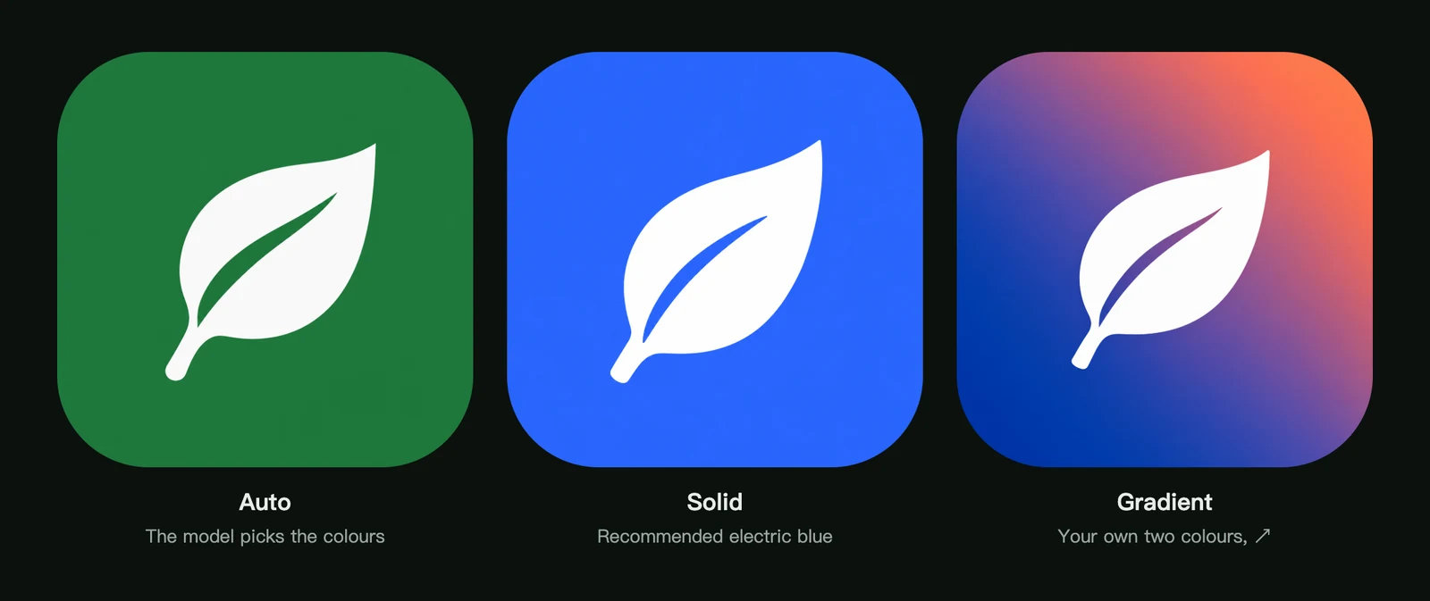
- Auto is the quickest way to good results, and a good choice while you are still exploring ideas. Colours can differ from one generation to the next.
- A recommended colour is a preset that is known to work well with the style.
- A custom colour takes any HEX value, such as
#2F6BFF. Use it to match your brand.
Example: backgrounds in Clean flat
Clean flat has the most flexible background: Auto, a solid colour, or a two-colour gradient with a direction.
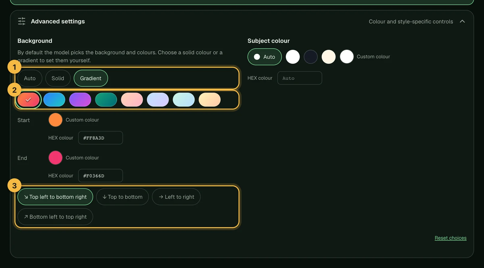
Once you choose a background, Subject colour appears next to it. Leave it on Auto and the subject is coloured to stand out on that background, for example white on a deep blue or a dark tone of the same hue on a pale pink.
What each style lets you set
| Style | Advanced settings |
|---|---|
| Clean flat | Background (Auto, solid or gradient with direction) and subject colour |
| Clay 3D | None. Colours are always chosen by the model |
| Refined metal | None. Pick one of three renderings instead |
| Minimal friendly character | Glow colour, from presets or your own |
| Edge negative | Background colour and the edge the shape touches |
| Fused glass | Glass colour, from presets or your own |
| Playful characters | Subject and background colours (Minimal rendering only) |
| Glossy 3D | Symbol colour and background tone |
| Folded ribbon | Background colour |
| Monoline character | None. The accent colour is chosen by the model |
| Geometric expression | Shape colour and expression (8 presets or your own words) |
| Coloured frosted glass | Glass palette: Auto or one of 8 palettes |
| Matte tinted silhouette | Background colour |
| Glass-crash toy | Background colour. The toy's colour is always chosen to suit the animal |
Not sure which style to use? See the 14 icon styles explained.
Why a colour gets flagged
Some styles need enough contrast to stay readable. If a colour would not work, the studio tells you, either as you type it or when you click Generate icon, and the icon is not generated, so no credits are used.
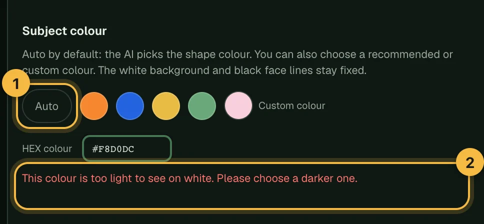
Common messages:
- "This colour is too light to see on white" or "too dark for the face lines to show": pick a mid-tone colour.
- "This background is too dark for the style": choose a lighter background.
- "The two gradient colours are too close": pick two colours that differ more.
- "These colours are too close": increase the contrast between the subject and the background.
Tips for app icon brand colours
- Put your main brand colour where it matters most for that style: usually the background in Clean flat and Edge negative, or the subject in Geometric expression.
- If a brand colour is flagged, try a slightly lighter or darker shade of it.
- Check the result at real sizes before you ship, and if one colour is slightly off, edit the icon with Fine-tune colours instead of generating it again. The colour guide on our blog covers contrast and home-screen visibility in more depth.
Frequently asked questions
Can I keep exactly the same colours across several icons?
Yes. Choose a recommended colour or type the same HEX value for each icon instead of using Auto. Auto may pick different colours each time.
Can I write the colour in my prompt instead?
It's better to use advanced settings when a style has them; see how to write a prompt. Colour words in the prompt can conflict with the settings. For styles without colour settings, the model chooses colours that suit the subject.
Do flagged colours cost credits?
No. The check happens before generation starts, and no credits are used.
Did not find an answer?
Open a ticket and tell us what happened. We will reply as soon as we can.