
Notes on icon design and making
App icon design principles, platform guidelines, style inspiration and techniques.
All articles
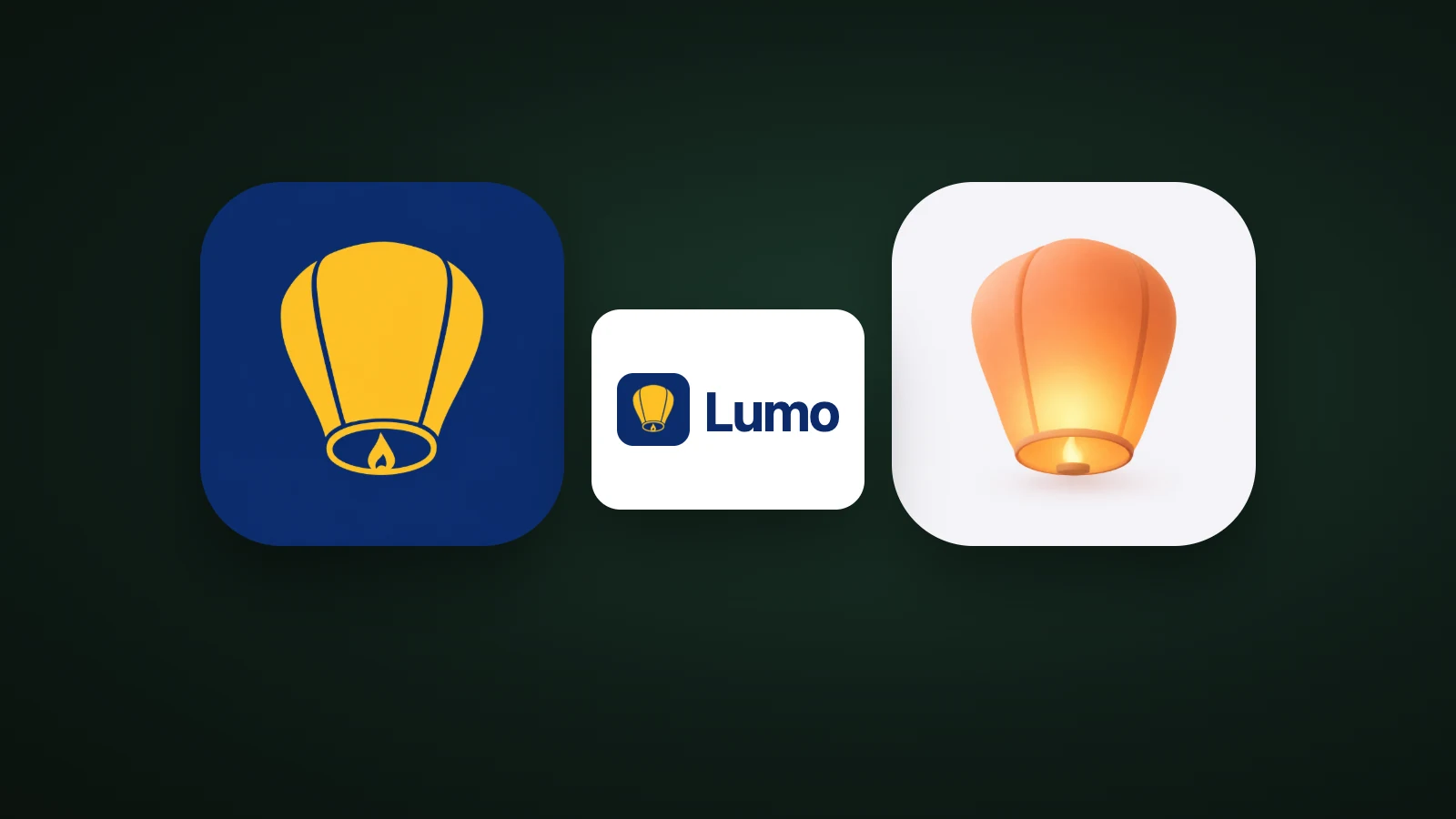
App Logo Design: How to Design a Logo and App Icon Together
App logo design explained: how an app logo differs from an app icon, what the top US apps put in their icons, and how to design both from one symbol.
 AI Icon Creator Team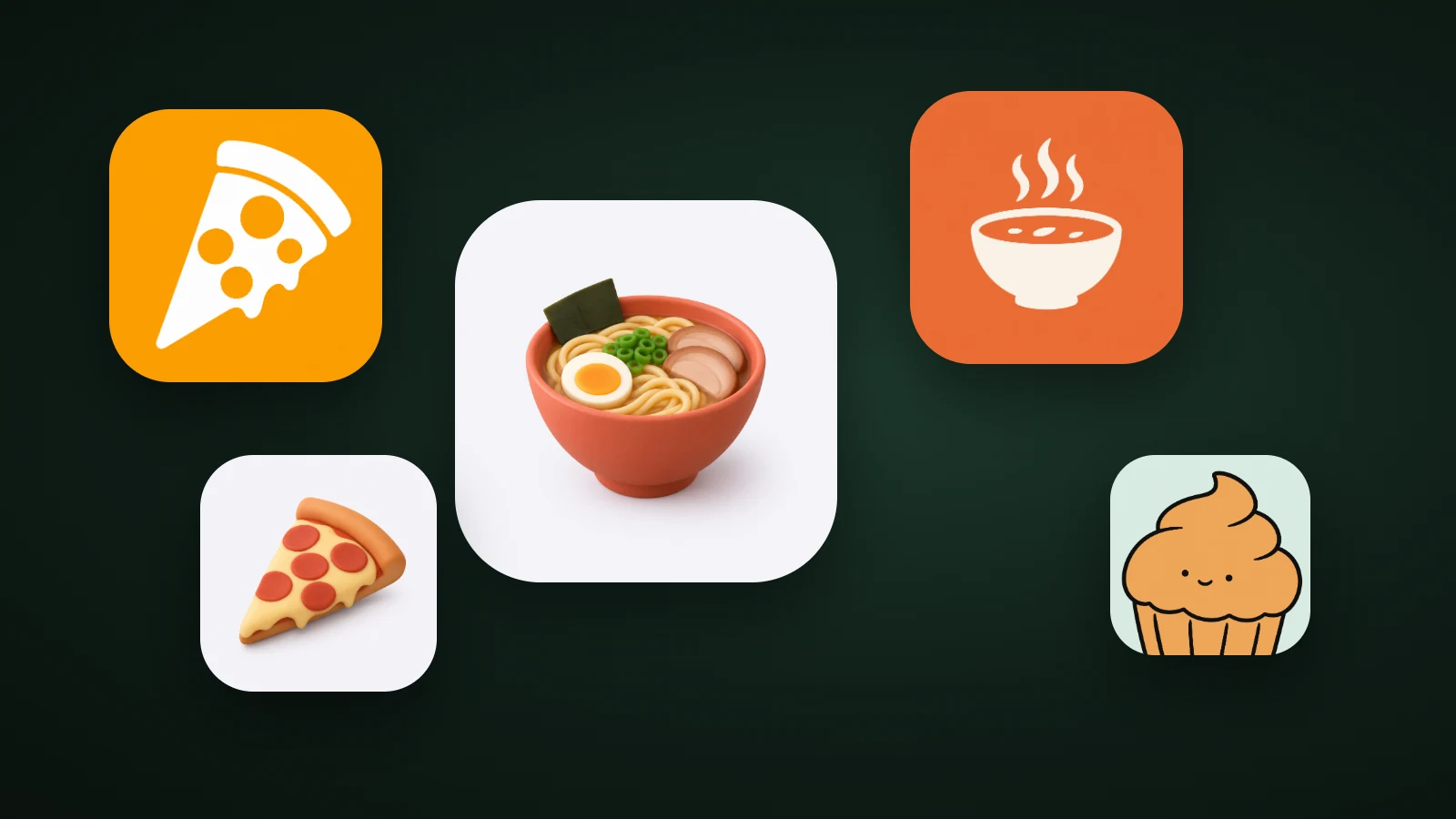
Food App Icons: Colours, Subjects and Styles That Work
Food app icons: what the top 100 US food and drink apps show, which colours they use, how to keep food appetising at small sizes, and four icon ideas to try.
AI Icon Creator Team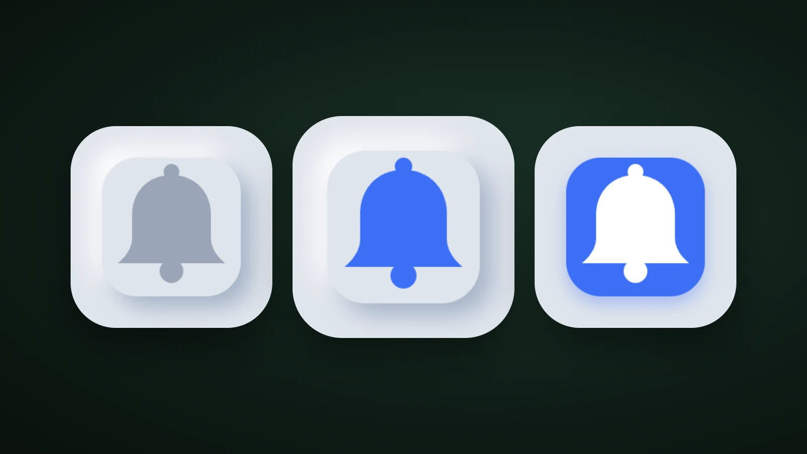
Neumorphism Icons: What They Are and How to Adapt Them
Neumorphism explained: how soft UI shadows work, a contrast test of neumorphic icons at real sizes, and how to adapt the style for an app icon that reads.
AI Icon Creator Team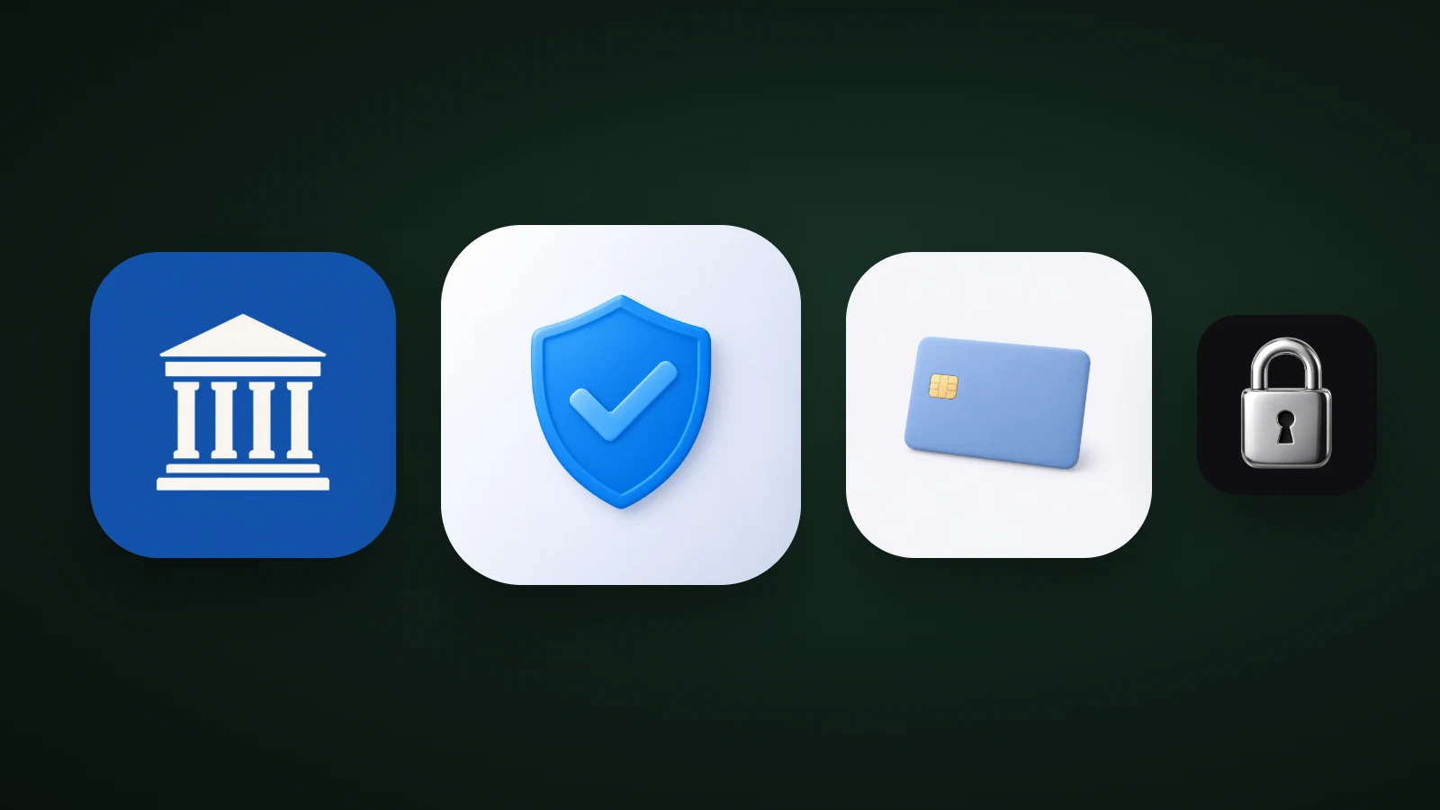
Banking and Finance App Icons: Ideas, Colours and Trust
Banking and finance app icons: what the top 100 US finance apps use, which colours signal trust, six icon ideas, and what to avoid so your icon looks safe.
AI Icon Creator Team
App Icon Design Best Practices: 8 Principles That Work
Eight app icon design best practices, from one focal point and the silhouette test to colour, text and platform rules, plus how to test an icon before launch.
AI Icon Creator Team
App Icon Sizes 2026: iOS, Android and Web Size Chart
Every app icon size you need in 2026 for iOS, Android, Google Play and the web, plus safe zones, masks, common mistakes and a checklist before you submit.
AI Icon Creator Team
How to Keep an App Icon Legible at Small Sizes
How to keep an app icon legible at small sizes: where icons shrink to 20–40 px, three quick tests, and fixes for thin lines, narrow gaps, detail and contrast.
AI Icon Creator Team
How to Choose an App Icon Style: Flat, 3D, Glass or Mascot?
How to choose an app icon style: which of flat, soft 3D, glass, metal or character icons fits your app, audience and category, with side-by-side examples.
AI Icon Creator Team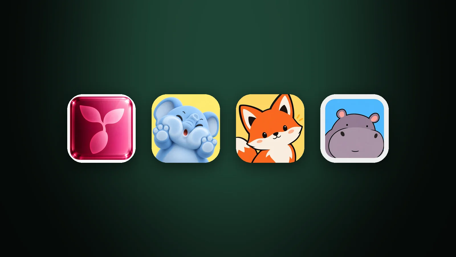
App Icon Metaphors: How to Choose What Your Icon Shows
How to choose an app icon metaphor: four types from literal to character, a silhouette and 32 px test, and how to avoid dated or confusing symbols.
AI Icon Creator Team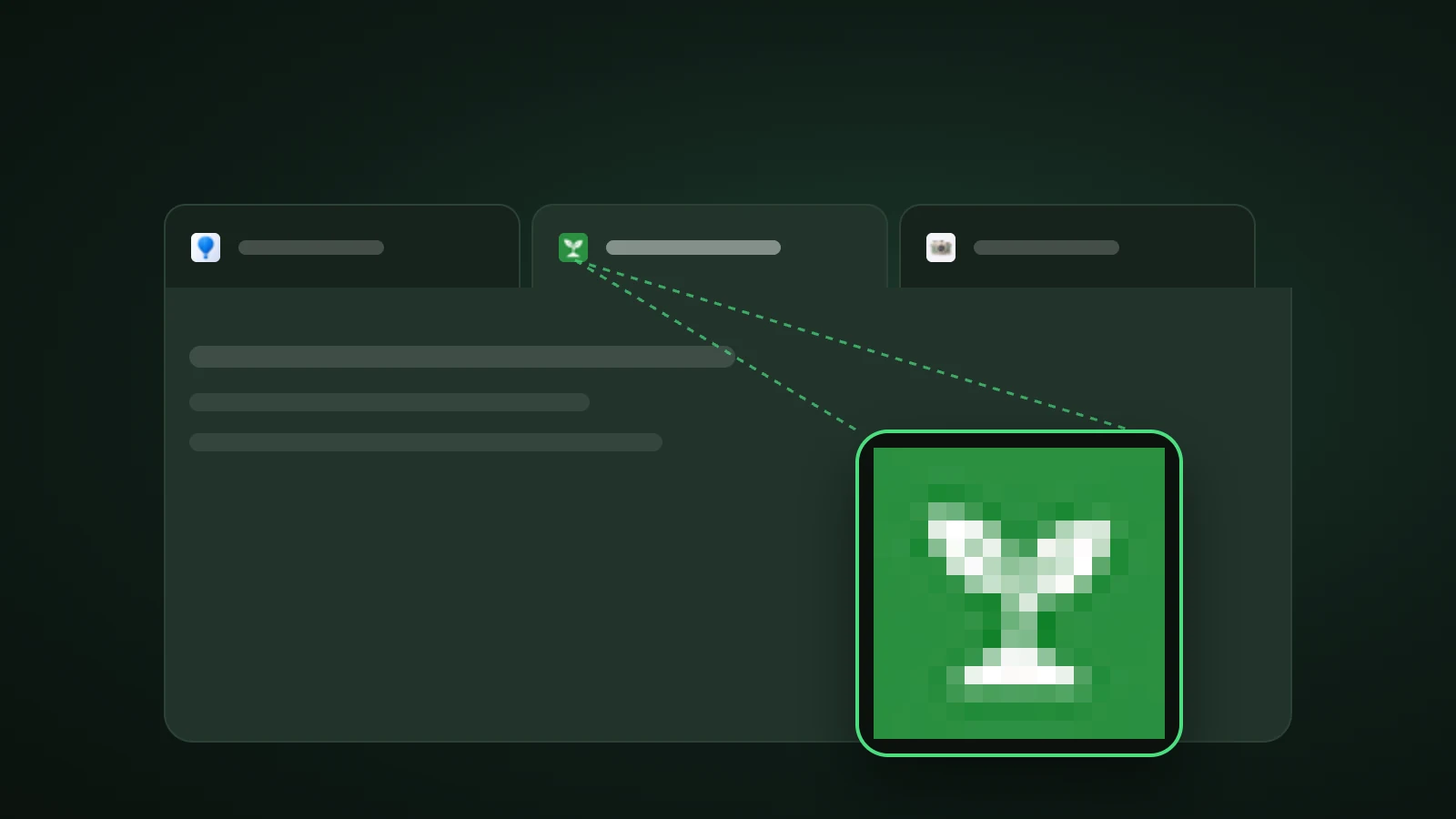
Favicon Sizes: What Size Should a Favicon Be in 2026?
What size should a favicon be? 32 × 32 px for tabs, over 48 px for Google Search, 180 px for Apple, 192 and 512 px for Android, plus the files and tags.
AI Icon Creator Team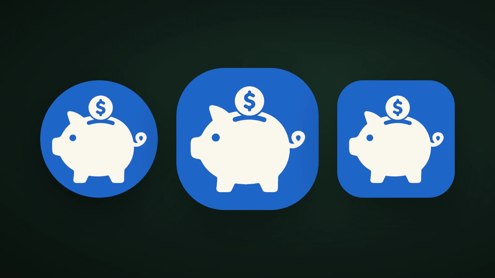
Android Adaptive Icons: Design Guide, Sizes and Safe Zone
How to design an Android adaptive icon: the 108 dp layers, the 66 dp safe zone, launcher shapes, themed monochrome icons, and how to build it in Android Studio.
AI Icon Creator Team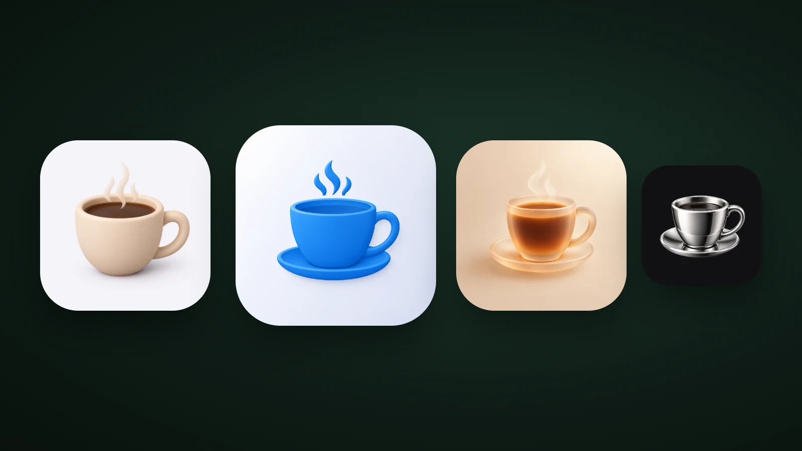
3D App Icons: How to Make Them and What to Avoid
How to make a 3D app icon: four materials compared at real sizes, the lighting that makes them look right, three ways to build one, and a contrast trap.
AI Icon Creator Team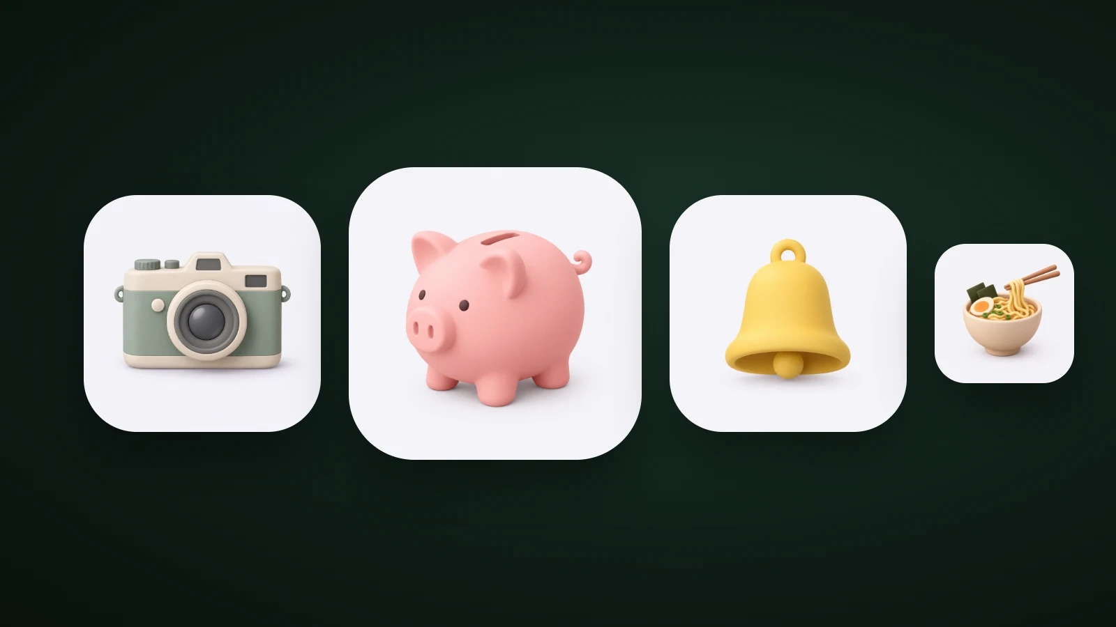
Claymorphism: What It Is and How to Use It in Icons
What is claymorphism? The soft, puffy clay style explained: how it works, how it differs from neumorphism, and how to use it in app icons, with tested examples.
AI Icon Creator Team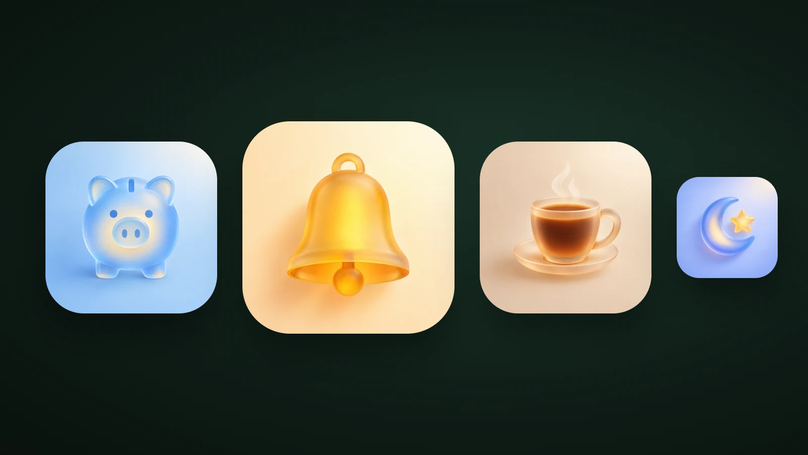
Glassmorphism: What It Is and How to Design Glass Icons
What is glassmorphism? Frosted glass design explained: how it works, a blur and contrast test, how it differs from Liquid Glass, and how to design glass icons.
AI Icon Creator Team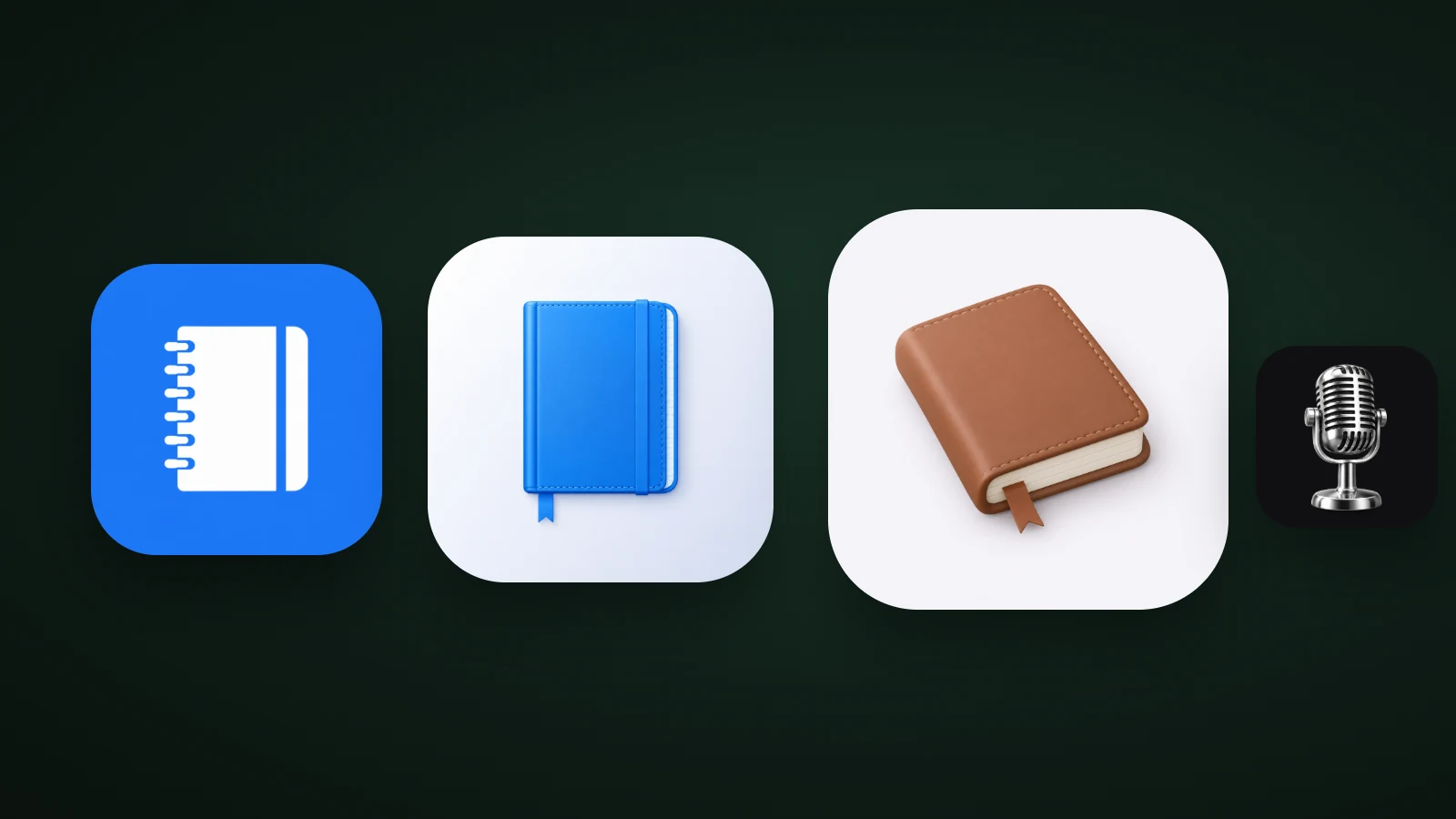
Skeuomorphism: What It Is and How to Use It in App Icons
What is skeuomorphism? From leather notepads to iOS 7 and back to soft 3D: how skeuomorphic icons work now, what realism costs when small, and how to make one.
AI Icon Creator Team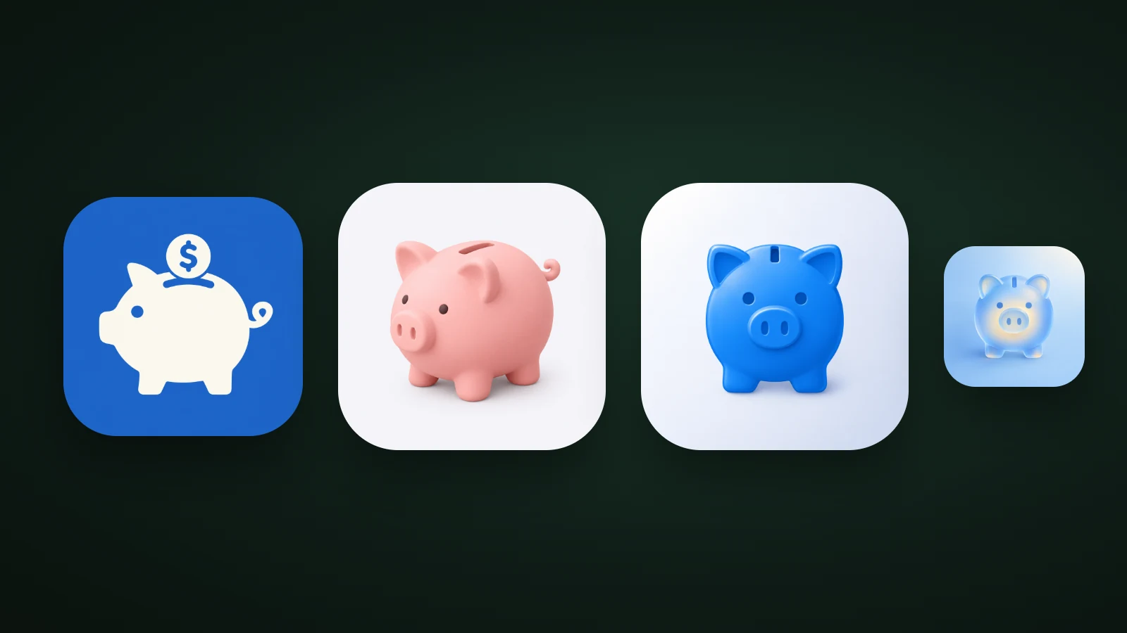
App Icon Designer: Hire a Designer, Use AI or DIY?
Should you hire an app icon designer, use an AI generator or make it yourself? How each option compares, when to choose which, and how to brief a designer.
AI Icon Creator Team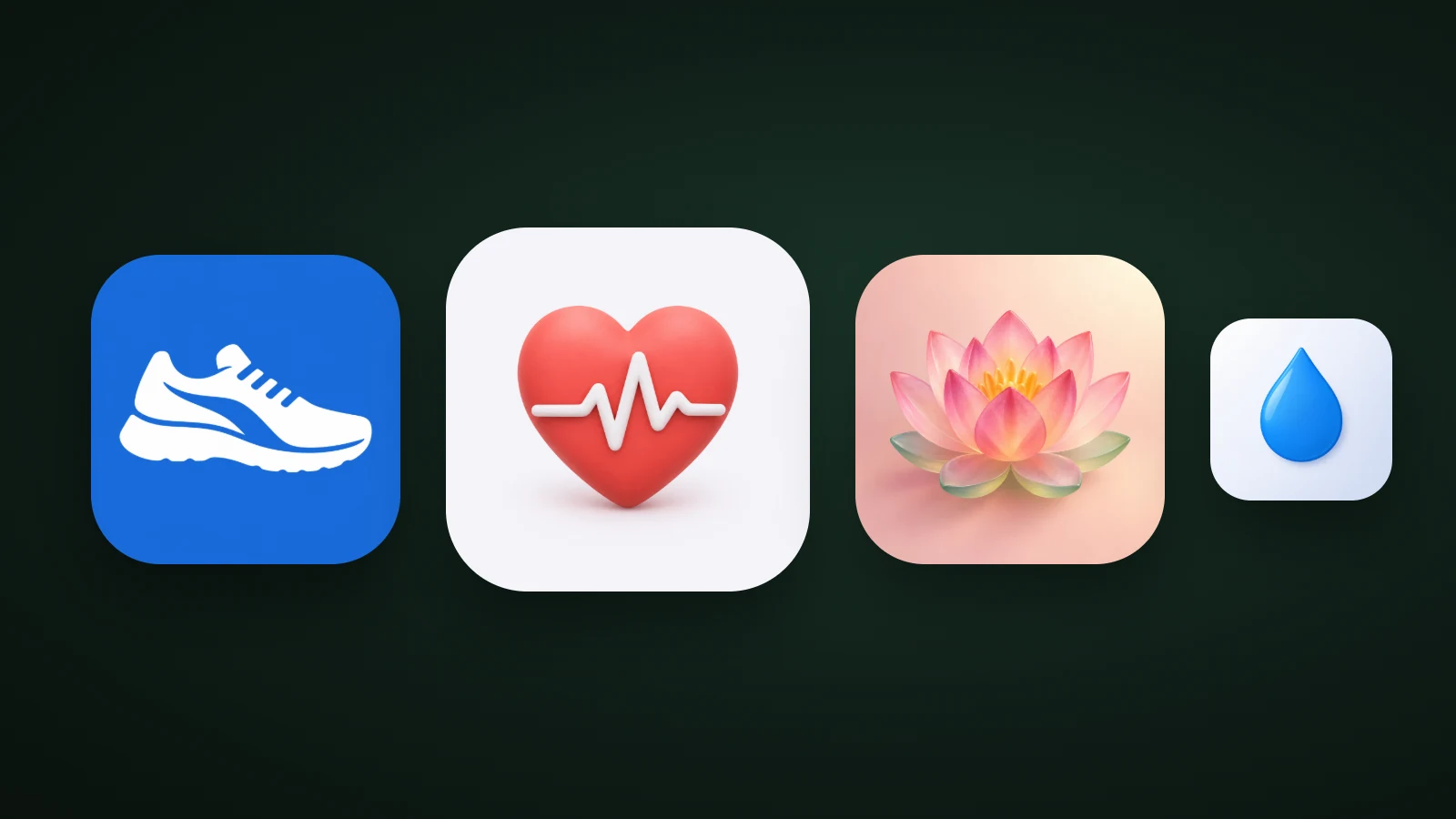
Health and Fitness App Icons: Ideas, Colours and What Works
Health and fitness app icons: what the top 100 US apps use, which colours dominate, and six icon ideas for workout, running, sleep, yoga and nutrition apps.
AI Icon Creator Team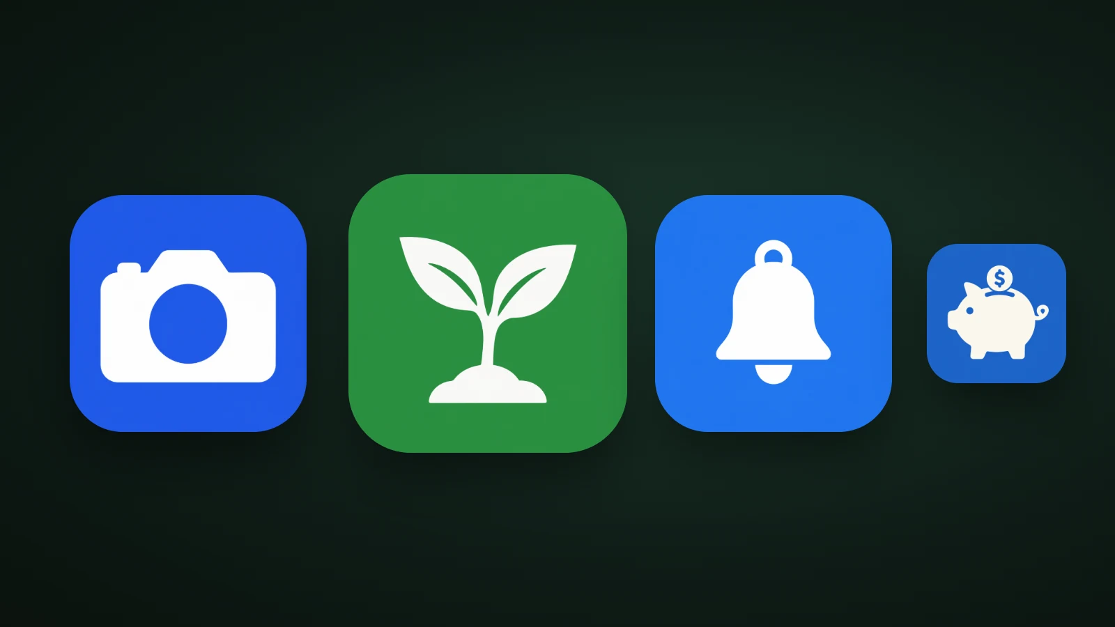
Minimalist App Icons: How to Design One That Stands Out
How to design a minimalist app icon: how top US apps use colour, a camera cut from nine parts to three, negative space, and the risks of going too plain.
AI Icon Creator Team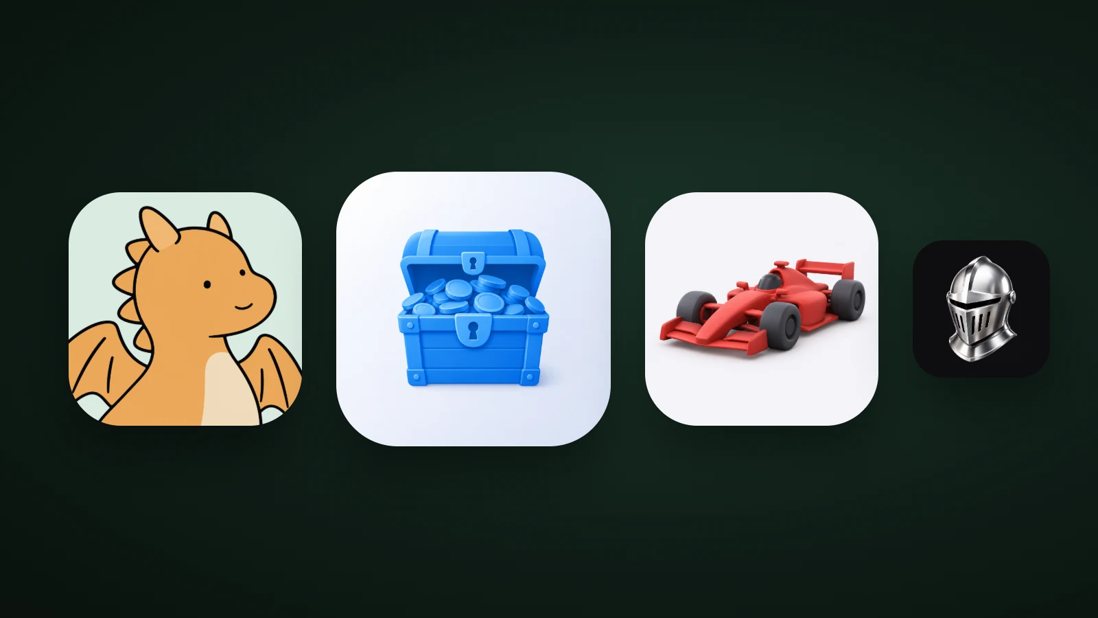
Game App Icon Design: What Works, With Data From the Top 100
Game app icon design: what the top 100 US free games show, how game icons differ from app icons, four icon ideas by genre, and how to test your own.
AI Icon Creator Team
App Icon Colours: How to Choose Colours That Stand Out
How to choose app icon colours: brand, category, contrast and wallpaper tests, gradients, and what dark and tinted modes do, with data from an 8-colour test.
AI Icon Creator Team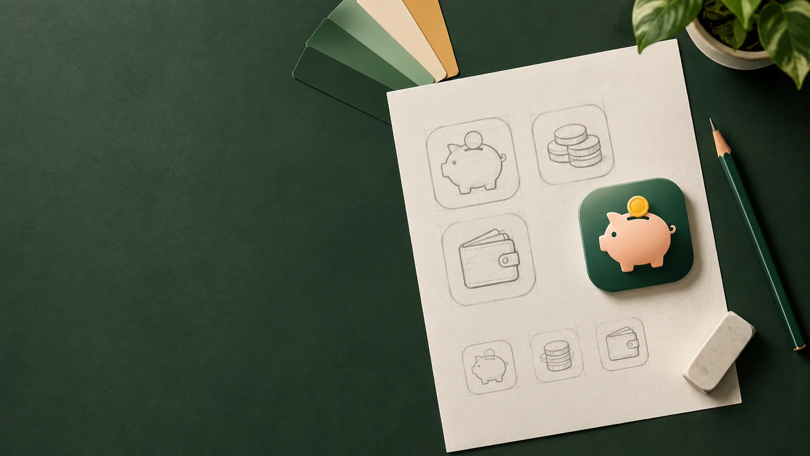
How to Make an App Icon: A Step-by-Step Guide (2026)
How to make an app icon in six steps: pick one idea, sketch options, choose a style, build a 1024 px master, test it small and export every size.
AI Icon Creator Team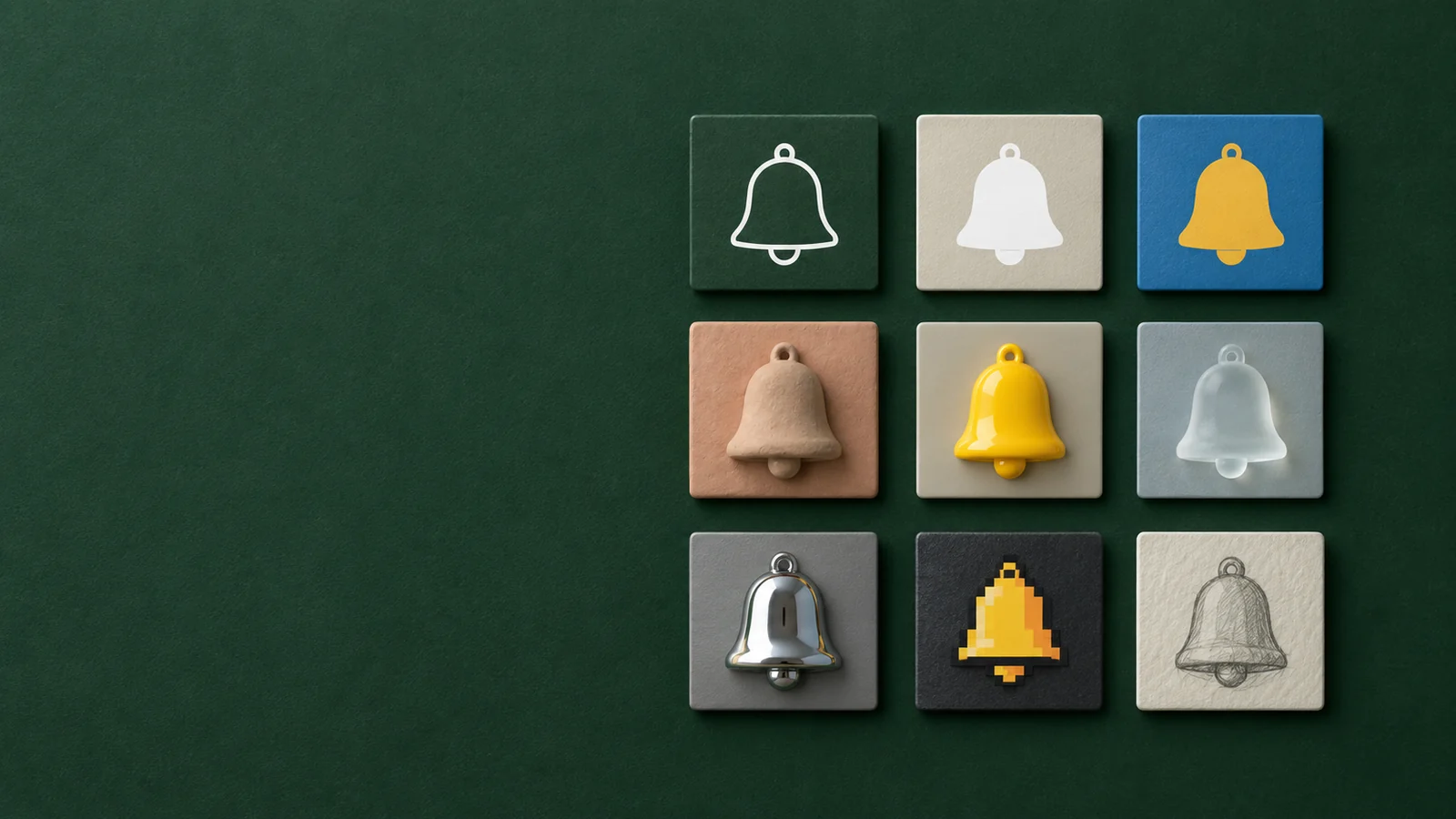
Icon Styles Explained: Types of Icons, with Examples
A visual guide to icon styles: line, filled, duotone, flat, gradient, 3D, glass, metal and mascot icons, when to use each, and the icon style trends for 2026.
AI Icon Creator Team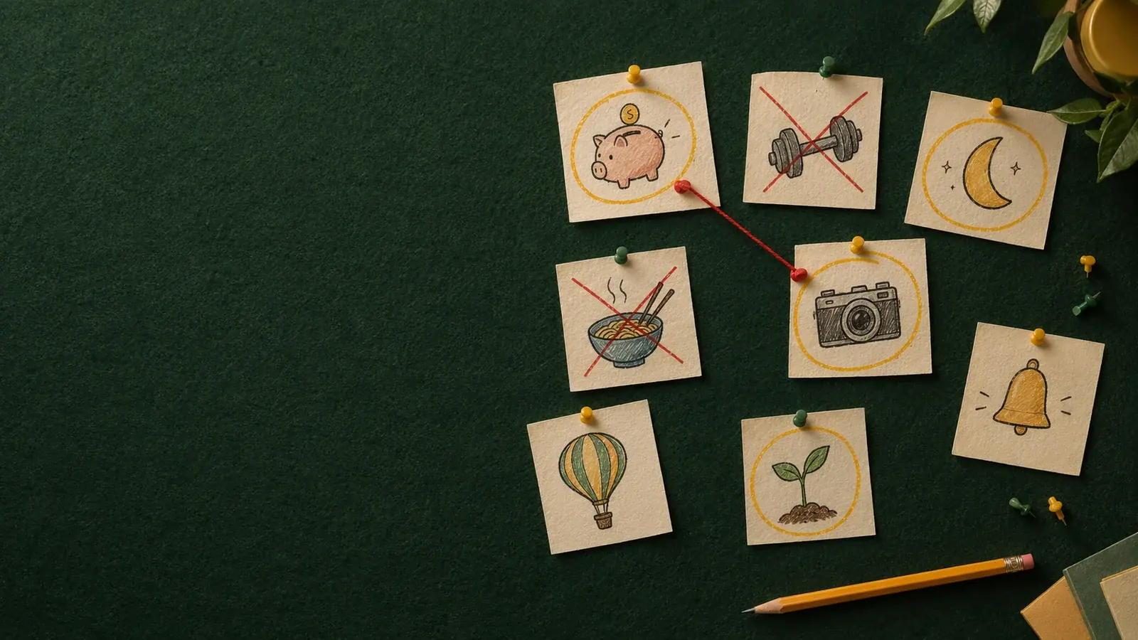
60 App Icon Ideas by Category (and How to Find Your Own)
App icon ideas for 12 kinds of apps, from finance to pets, with real examples, plus a simple method to brainstorm and shortlist an icon idea for your own app.
AI Icon Creator Team