

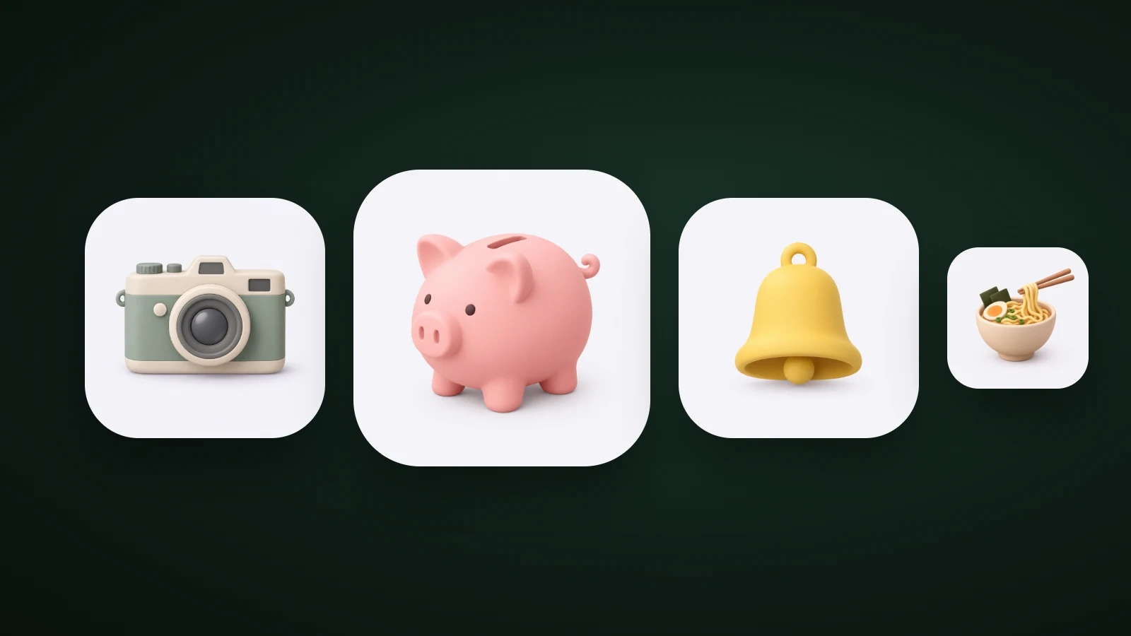
Claymorphism is a design style that makes interface elements and icons look like soft, puffy pieces of modelling clay. It combines large rounded shapes, two inner shadows (a lighter one at the top left, a darker one at the bottom right), one big soft outer shadow and saturated pastel colours. In app icons it's the soft, matte 3D look. Its weak spot is contrast: in AI Icon Creator's test of six clay app icons, five measured below 3:1 between the object and its background.
This guide explains where claymorphism comes from, how it's built, how it differs from neumorphism and glassmorphism, and how to use it well in app icons.
What is claymorphism?
Claymorphism is a soft, three-dimensional design style in which shapes look inflated, like blobs of clay or a balloon. It was named by the designer Michał Malewicz of Hype4 Academy, who described it as the result of inflating the flat, slightly dented shapes of neumorphism into round, dome-like 3D forms. He also called the look "fluffy 3D".
It grew out of two things. Designers were tired of flat interfaces and wanted the illusion of depth back, and easier 3D tools made friendly, toy-like 3D artwork popular. A 2026 guide from Setproduct describes claymorphism as no longer the hot new thing but settled into a comfortable niche: onboarding flows, kids' apps, friendly-looking fintech and 3D landing pages. Searches are still rising: Google Ads data for the US shows monthly searches for "claymorphism" growing from about 260 in October 2025 to about 720 in August 2026.
How does claymorphism work?
Claymorphism works by faking a soft, inflated surface with a few shadows. According to Hype4 Academy's original article, the effect comes from combining inner and outer shadows:
- Two inner shadows give the clay look. The one at the top left is slightly lighter, and the one at the bottom right is slightly darker.
- One larger outer shadow lifts the shape off the background. It is often shifted sideways as well as down, which breaks the usual rules for interface shadows.
- Very round corners, usually beyond 50% roundness for the size of the shape, so it starts as a square and ends up puffy.
- Colour that shows the shading. Claymorphism works in dark mode, but only if the shape isn't completely black, because the inner shadows must be visible.
Setproduct's guide adds the palette: pale, tinted backgrounds, saturated pastel surfaces such as lavender, mint, peach and sky blue, and shadows that borrow the colour of the surface instead of neutral grey. Here is the recipe as CSS, as a starting point for a button or card:
.clay {
  width: 100px;
  height: 100px;
  border-radius: 36px;
  background: #7c6cf0;
  box-shadow:
    14px 20px 32px rgba(124, 108, 240, 0.35),
    /* large, soft, colour-matched outer shadow */ inset -8px -10px 16px
      rgba(60, 40, 160, 0.35),
    /* darker inner shadow, bottom right */ inset 8px 10px 16px
      rgba(255, 255, 255, 0.55); /* lighter inner shadow, top left */
}
Claymorphism vs neumorphism vs glassmorphism
Claymorphism, neumorphism and glassmorphism are three "morphism" styles that all fake depth, but they do it differently. Neumorphism pushes shapes out of a surface of the same colour, glassmorphism layers translucent blurred panes, and claymorphism floats a solid, coloured, inflated shape above the page.

In AI Icon Creator's comparison, the same button was built three ways in CSS. The neumorphic button uses the page's own colour, so its fill has a 1:1 contrast with the background, and only its two shadows define its edge. The clay button uses a saturated lavender that measured 3.5:1 against its pale page, so it stays visible even if the shadows are removed. The glass button's contrast depends on whatever is behind it.
That difference is why Setproduct calls claymorphism a softer, higher-contrast cousin of neumorphism. Malewicz himself blamed neumorphism's fading less on accessibility than on looking visually boring and being hard to build, and said that inflating its shapes gives a friendlier result. The full comparison of app icon styles is in our guide to icon styles.
Claymorphism in app icons
In app icons, claymorphism is the soft, matte 3D look: a rounded object with gentle shading and a small soft shadow, made to look as if it were sculpted from clay. It's one of the most popular looks for consumer, lifestyle and kids' apps, because it feels warm and tactile among flat icons.

In AI Icon Creator's test, six clay app icons were measured by comparing the median colour of the object with the background, using the WCAG contrast formula. Only the green tent reached 3:1 (3.8:1). The camera came close at 2.9:1, and the piggy bank (1.9:1), ramen (2.0:1), coffee cup (2.0:1) and yellow bell (1.5:1) fell well short.
The shapes still read, because the shading and soft shadow give each object an edge. But two things weaken pale clay icons: tinted and dark Home Screen modes, which keep only lightness, and very small sizes. The fix is the one from the CSS example: use a saturated object colour or a mid-tone background. Our guide to 3D app icons compares four 3D materials the same way, and the app icon colours guide has contrast data for eight backgrounds.
When to use claymorphism, and when not to
Claymorphism suits products that want to feel friendly and playful, and it's a poor fit for dense, serious interfaces. Use it for:
- Kids, family and education apps, where a toy-like look is the point.
- Lifestyle, wellness, food and habit apps, which benefit from warmth.
- Onboarding screens, empty states and marketing art, in small doses.
Avoid it for data-heavy dashboards, professional tools and anything that needs to feel precise: stacking many puffy surfaces turns a screen into visual soup. In icons, avoid it for subjects with thin or spiky parts, which don't survive the rounding. Our guide on how to choose an app icon style compares clay with flat, glass and character styles.
How to make a claymorphism icon
To make a claymorphism icon, pick one fat, simple object, use a soft matte 3D style, lift the contrast, and test it small.

- Pick one fat, simple object, such as a bell, a mug or a camera.
- Choose the clay look. In AI Icon Creator, choose the Clay 3D style, one of the 14 app icon styles, and describe only the object.
- Lift the contrast. Aim for at least 3:1 between the object and the background.
- Test small and in greyscale. Our guide to keeping an icon legible at small sizes shows how.
Try a simple object in the clay style and a few others:
Frequently asked questions
What is claymorphism?
Claymorphism is a design style that makes elements look like soft, puffy modelling clay, using very round shapes, two inner shadows, one large soft outer shadow and saturated pastel colours. It was named by designer Michał Malewicz of Hype4 Academy. In app icons it appears as a soft, matte 3D look.
Is claymorphism still popular?
Claymorphism is still used, mostly in playful, friendly products. A 2026 design guide describes it as no longer the hot new thing but settled into a niche, and Google Ads data shows searches for it rising from about 260 a month in October 2025 to about 720 in August 2026.
What's the difference between claymorphism and neumorphism?
Neumorphism shapes an element from a surface of the same colour using a light and a dark shadow, which leaves it with very little contrast. Claymorphism floats a coloured, inflated shape above the page with inner highlights and a soft outer shadow, so it stays visible and looks friendlier.
Is claymorphism accessible?
Claymorphism can be accessible if you check contrast, because the shapes are solid and coloured rather than defined only by shadows. Pastel-on-pastel combinations still fail, so use a saturated fill or a mid-tone background and aim for at least 3:1 against the page.
Can I use claymorphism for an app icon?
You can use claymorphism for an app icon, and clay is one of the most common styles for consumer and kids' apps. Choose one simple, rounded subject, lift the contrast with a saturated colour, and check it at 32 px and in greyscale before you ship.
Ready to try it? Make your subject in a clay style and compare: