

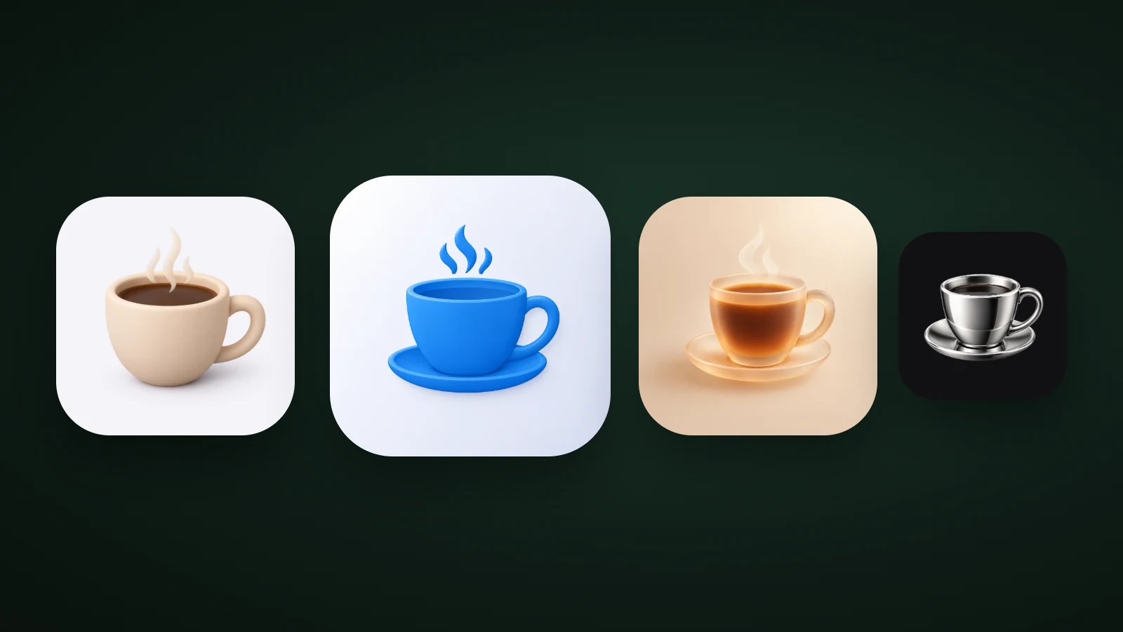
A 3D app icon shows its subject as a lit, rounded object with depth, instead of a flat shape. A good one has one simple object, one light source from the top left, soft shading, a single clear material, and at least 3:1 contrast between the object and its background. In AI Icon Creator's test of one coffee cup in four 3D materials, only two of the four reached that contrast, and the two that missed were the softest, lightest ones.
This guide compares four 3D materials at real sizes, shows what makes a 3D icon look right, and gives three ways to make one.
What is a 3D app icon?
A 3D app icon is an app icon drawn as a three-dimensional object, with light, shading and a soft shadow, rather than as flat colour. The subject looks like something you could pick up: a clay mug, a glossy plastic bell, a glass cup.
Interest is growing. Google Ads data for the US shows searches for "3d app icons" rising from about 170 a month in autumn 2025 to about 480 by August 2026. Those searches come from two kinds of people: those who want 3D icons to restyle their own Home Screen, and people who make apps. This guide is for the second group. For icon styles in general, see our guide to icon styles.
3D app icons are not the same as 3D icon mockups, which are presentation tools that make a flat icon float in a scene. A mockup changes how you show an icon, not how it looks on a phone.
3D app icon styles: four materials compared
The four most common 3D app icon materials are clay, glossy plastic, frosted glass and chrome. Each one gives a different feeling, and each one holds up differently at small sizes.

In AI Icon Creator's test, one coffee cup was generated in four 3D styles, shrunk to 60 and 32 px and converted to greyscale. We also measured the contrast between the median colour of the cup and the background, using the WCAG formula.
| Material | Feels | Contrast | What we saw at 32 px |
|---|---|---|---|
| Clay | Friendly, soft | 2.0 : 1 | Cream cup on a near-white background: faint |
| Glossy | Polished, playful | 3.5 : 1 | A saturated blue cup: the clearest of the four |
| Frosted glass | Calm, warm | 1.9 : 1 | The outline fades; only the dark tea still reads |
| Chrome | Premium, technical | 6.8 : 1 | Strong contrast, but reflections turn noisy at 20 px |
The finding is easy to miss: soft 3D styles tend to fail on contrast, not on shape. Clay and frosted glass both fell below 2:1 because they use light, low-saturation colours on light backgrounds. The shape of the cup was perfectly good; there was just nothing separating it from the background. If a soft style is right for your brand, give it a darker or more saturated object colour, or a mid-tone background. Our guide to app icon colours has measured contrast for eight backgrounds.
What makes a 3D icon look right?
A 3D icon looks right when all its light and shadow agree: one light source, soft shading, a small contact shadow and rounded forms. When they disagree, the icon looks pasted together, even if every part is well drawn.

- One light source. Light comes from the top left, and highlights sit on the upper left of every form. If two objects are lit from different sides, the eye notices at once.
- Soft shading. Colour deepens gently towards the lower right. Hard-edged shadows make the icon look cut out.
- A small contact shadow. A soft shadow under the object grounds it. Keep it inside the icon: the platforms apply their own corner mask and Google Play adds its own shadow, so don't draw an extra outer one. Our app icon sizes guide lists what each platform adds.
- Rounded, simple forms. A fat handle and a thick rim survive shrinking. A thin spout or a delicate ornament disappears at 32 px.
How to make a 3D app icon
To make a 3D app icon, choose a simple object, pick a material, light it with one source, check the contrast and test it small. You can do the drawing yourself in 3D software, start from a library, or generate it.

- 3D software such as Blender or Spline gives you full control of shape, light and material, but you model, light and render every icon, and it needs 3D skills.
- Icon libraries offer 3D icon packs and templates that are quick and often free. Other apps use the same icons, and licences vary, so check that commercial use is allowed. They suit graphics inside an app better than the app icon itself.
- An AI icon generator makes a unique icon from a short description in minutes. In AI Icon Creator, you write the subject, choose one of the 14 app icon styles, and compare results side by side. You still check size, contrast and lookalikes. Our guide to commercial use of generated icons explains the licence.
Whichever route you take, the process is the same:

- Pick one simple object. A cup, a bell, a leaf. A scene with several objects turns to mush in the shading. Our guide to icon metaphors helps you choose what to draw.
- Choose a material for the feeling. Clay for friendly, glossy for polished, glass for calm, chrome for premium.
- Set one light and one soft shadow.
- Give it contrast. Aim for at least 3:1 between the object and the background. Light-on-light fails first.
- Test small and in greyscale. View it at 60, 32 and 20 px, and in greyscale. If the shape still reads, it works. Our guide to keeping an icon legible at small sizes shows the fixes.
Try a simple object in a few 3D styles and compare:
3D app icons on iOS, Android and visionOS
3D app icons work on every platform, with one difference: on Apple's newer platforms the system adds its own lighting. Apple's Human Interface Guidelines for app icons explain that the system masks and lights your icon, so keep your own lighting simple and don't draw the corners or the outer shadow. On visionOS, icons are built from layers that separate slightly and shift as you look at them, which gives a real sense of depth. Our app icon sizes guide lists the sizes for visionOS, iOS, Android and the web.
Common mistakes with 3D app icons
- Too much realism. A photo-real object with fine texture loses everything at 32 px. Simplify the form and soften the material.
- Light-on-light colours. As the test above shows, cream on white or pale glass on peach fails contrast. Use a saturated object colour or a mid-tone background.
- Several objects. One object is a 3D icon; a scene is an illustration.
- Inconsistent lighting. Highlights on different sides make the icon look assembled.
- An outer drop shadow. The platform applies its own mask, and Google Play adds its own shadow.
Frequently asked questions
What is a 3D app icon?
A 3D app icon is an app icon that shows its subject as a rounded, lit object with depth, shading and a soft shadow, rather than as flat shapes. Clay, glossy plastic, frosted glass and chrome are the most common looks. A good one still has a simple shape, so it stays recognisable at small sizes.
How do I make a 3D app icon?
To make a 3D app icon, pick one simple object, choose a material, light it from the top left with soft shading, check that it has at least 3:1 contrast with the background, and test it at 60, 32 and 20 px. You can model it in 3D software, use a 3D icon library, or generate it with an AI icon generator such as AI Icon Creator.
Are 3D app icons better than flat ones?
3D app icons aren't better than flat ones in every case: 3D icons stand out and feel friendly, while flat icons are the most legible at small sizes. Choose 3D when your subject is simple enough to survive the shading and your category is full of flat icons. Our guide on how to choose an app icon style helps you decide.
What is the best 3D style for an app icon?
The best 3D style depends on your app's personality: clay for friendly consumer apps, glossy for polished and playful ones, frosted glass for calm and wellbeing apps, and chrome for premium or technical products. Whichever you choose, make sure the object has at least 3:1 contrast against its background.
Can I use free 3D icon packs for my app icon?
You can use free 3D icon packs if their licence allows commercial use, but other apps may use the same icons, so yours won't be unique. Packs work well for graphics inside an app. For the app icon itself, a design made for your subject is easier to recognise.
Ready to try? Make the same subject in a few 3D styles: