

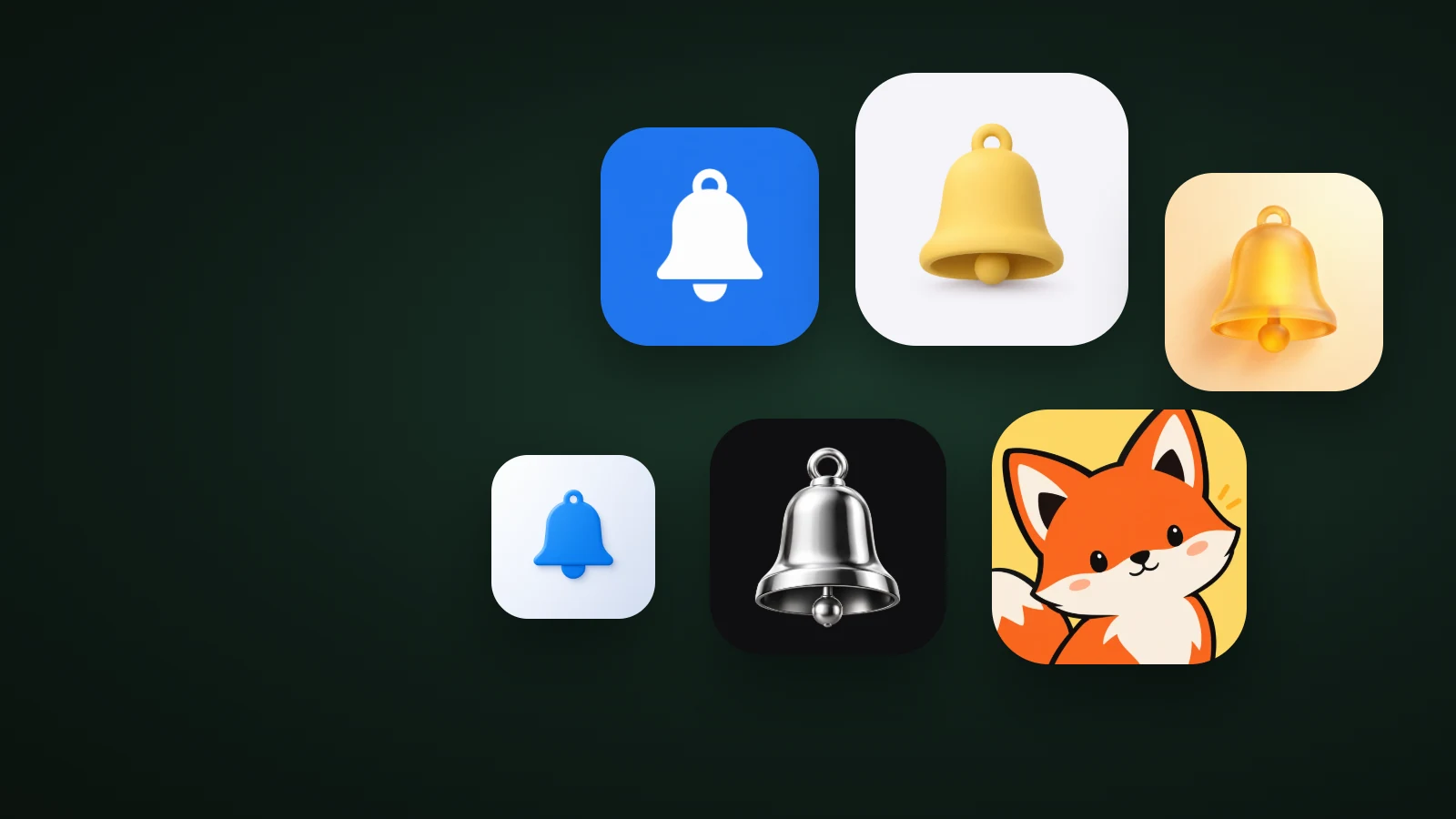
To choose an app icon style, start from who uses your app, how it should feel and what your competitors look like, then compare two or three styles on the same subject. As a rule of thumb: flat and graphic styles suit tools, finance and productivity apps; soft 3D suits lifestyle, health and consumer apps; glass and metal suit premium, creative and hardware apps; characters suit games, kids and social apps. Whatever you pick has to stay recognisable at 32 px.
This guide gives you a quick way to narrow the choice, a comparison of the main style families and a simple way to decide between the last two.
Which app icon style fits your app?
The right app icon style depends mostly on your category and audience. This table is a starting point, not a rule; the best choice is sometimes the style your competitors don't use.

| Type of app | Style family to start with | Why |
|---|---|---|
| Productivity, finance, developer tools | Flat and graphic | Clear at every size, feels precise and trustworthy |
| Lifestyle, health, food, shopping | Soft 3D (clay or glossy) | Friendly and tactile, stands out among flat icons |
| Premium brands, creative tools, hardware companions | Glass or metal | Polished, crafted, light or technical |
| Kids, games, social, learning | Characters and mascots | Memorable and warm, gives the app a face |
| Wellbeing, journals, mood tracking | Frosted glass or an expression | Calm and soft, or a mood people recognise |
| Brands known by an initial | A bold 3D letter | Keeps the brand, adds depth and colour |
The main app icon style families compared
App icon styles fall into four families: flat and graphic, soft 3D, glass and metal, and characters. They differ most in how they survive small sizes, how much they stand out and how much personality they carry.

- Flat and graphic is the most legible family. In AI Icon Creator's test of the same bell in eight styles at 24 px, the flat versions stayed the clearest. The trade-off is that flat icons are everywhere, so they need a distinctive shape or colour to be noticed.
- Soft 3D, such as clay or glossy plastic, stands out on a Home Screen full of flat icons and feels friendly. It needs a simple subject, because fine details get lost in the shading.
- Glass and metal feel premium and sit naturally next to Apple's Liquid Glass look. They depend on contrast: in the same test, a chrome bell on a black background was among the hardest to read at 24 px, while frosted glass held up better.
- Characters give an app a face people remember, which is why they're common in games and kids' apps. Keep the character to its head or upper body and one clear expression.
Our guide to icon styles shows each style in detail, including interface icon styles.
One subject, several styles
The fastest way to see which style fits your app is to make the same subject in each family and put them side by side. The difference in mood is bigger than most people expect:

A reminders app with the flat bell reads as a straightforward utility. The clay bell feels friendlier and more personal. The frosted glass bell feels calm and warm, and the chrome bell feels like a premium or professional tool. None of them is wrong; each one promises a different app.
Try it with your own subject. Pick a few styles and compare the results:
How to decide between two app icon styles
To decide between two app icon styles, test both on the things that matter after launch: small sizes, your category and your brand. The style that wins two of three is usually the right one.

- Write down your audience and three words for the feeling, such as "calm, trustworthy, simple" or "playful, bold, social".
- Shortlist two or three families from the table above, and drop any family that most of your competitors already use.
- Make the same subject in each. Keep the subject identical so you're only comparing style.
- Test small and in context. Look at each at 32 px, on light and dark wallpapers, and next to the top apps in your category. Our guide to app icon colours covers the wallpaper test.
If two styles are still tied, pick the one that fits the rest of your brand: your website, screenshots and marketing will have to live with it.
Common mistakes when choosing a style
- Choosing by personal taste alone. The icon is for your users and your category, not for you.
- Picking a detailed style for a detailed subject. A 3D rendering of a complex object turns to noise when small. Pair rich styles with simple subjects; Microsoft's app icon design guidelines make the same point, asking for one concept expressed in simple forms.
- Following a trend your category has already adopted. If every competitor switched to glass, glass no longer stands out.
- Changing style after launch without testing. People find your app by its look. Test a new style with an app store experiment before switching.
Frequently asked questions
What style should my app icon be?
Your app icon style should match your audience and stand out in your category: flat and graphic for tools and finance, soft 3D for lifestyle and consumer apps, glass or metal for premium products, and characters for games, kids and social apps. Compare two or three on the same subject before choosing.
Is a flat or 3D app icon better?
Neither a flat nor a 3D app icon is better in general. Flat icons are the most legible at small sizes and suit practical apps; 3D icons stand out more among flat icons and feel friendlier. Choose 3D when your subject is simple enough to survive the shading.
Should my app icon match my brand style?
Your app icon should share your brand's colours and core symbol, but its style can be richer than your logo, because an app icon has to stand out on a Home Screen. A flat logo can become a soft 3D or glossy app icon and still feel like the same brand.
How many styles should I try before choosing?
Trying three styles is usually enough to choose an app icon style: one safe option, one that fits your brand and one that's unusual for your category. In AI Icon Creator you can make the same subject in any of the 14 app icon styles and compare them side by side.
Ready to compare styles on your own subject?