

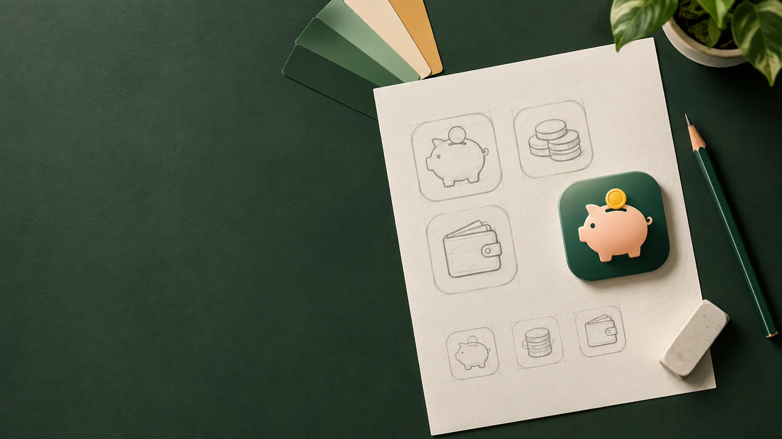
To make an app icon, decide on one idea that stands for your app, sketch a few ways to show it, choose a style and colours, and build a 1024 × 1024 px square master, either in a design tool or with an AI generator. Then test it at small sizes and on real Home Screens, fix what doesn't read, and export every size iOS, Android and the web need.
That's the whole process. The rest of this guide goes through each step with a worked example: an icon for a budgeting app, taken from first idea to finished icon.

Step 1: Decide what your app icon should say
The first step in making an app icon is to decide on one idea, because an app icon only has room for one. Before you open any tool, write down:
- What the app does, in five words or fewer. "Tracks what I spend" is better than "All-in-one personal finance platform".
- Who it's for and the feeling you want: calm, playful, serious, premium.
- What's already out there. Search your category on the App Store and Google Play and note the colours and shapes everyone uses, so you can avoid blending in.
Then turn the answer into something you can draw. There are three kinds of symbol to choose from:
- A literal object: a camera for a photo app, a cup for a coffee shop.
- A metaphor: an object that stands for the benefit, like a piggy bank for saving.
- A letter or abstract mark, when your brand already has one.
Our guide to icon metaphors has more examples of turning a feature into a single shape.
Step 2: Sketch several options and judge them as silhouettes
Sketch at least three ways to show your idea and judge them as silhouettes, not as finished drawings. Work quickly and small. Pencil thumbnails the size of a stamp are enough, because that's roughly how big the icon will be on a phone.
In AI Icon Creator's worked example for a budgeting app, three metaphors, a piggy bank, a stack of coins and a wallet, were generated in the same Clean flat style and compared at full size and at 32 px. Only the piggy bank stayed recognisable when small:

The piggy bank wins. Its outline is unique (ears, snout, tail, coin slot), and it means saving, which is what a budgeting app promises. The coins turn into yellow stripes when small, and the wallet reads but could belong to any payment app.
Judge each option by its silhouette: fill it in solid black and ask whether you'd still recognise it. If a shape needs its details to make sense, it won't survive the Home Screen.
Step 3: Choose a style and colours
An app icon's style sets the first impression before anyone works out what the icon shows. The same idea can look plain and bold, soft and friendly, polished or airy:

A few rules of thumb:
- Match the promise. Finance and productivity apps often suit clean, confident styles; games and kids' apps can go softer and more playful.
- Stand apart from your category. If every competitor uses flat blue, a warm 3D icon gets noticed.
- Keep colours few. One main colour plus an accent is usually enough, with a clear light–dark difference between the subject and the background.
Our guide to icon styles compares the main styles side by side on the same subject, so you can see which one fits before you decide.
Step 4: Make the 1024 × 1024 px master
An app icon master is a 1024 × 1024 px square image, and whatever tool you use, it follows the same rules:
- 1024 × 1024 px, square and opaque. No transparency.
- No rounded corners, borders or drop shadows. iOS, Android and Google Play apply their own masks and shadows.
- The subject in the centre, with breathing room, so a circular mask never cuts it off.
- No words. Your app's name already appears under the icon; a single letter is the only text worth using.
Every other size is generated from this master; the full list is in our app icon sizes guide.
Option A: design it yourself
If you draw, a vector tool gives you the most control. Build the icon from simple shapes, keep lines thick, and preview it at small sizes as you go. Apple's Human Interface Guidelines for app icons and its production templates are worth reading first.
For iOS 26 and later, Apple's free Icon Composer turns your artwork into a layered icon with Liquid Glass effects, and lets you preview its dark, clear and tinted appearances. A flat 1024 px image still works if you skip it.
Option B: make an app icon with AI
If you don't draw, or want to explore ideas faster, an AI app icon generator can do the drawing:
- Describe one subject in a few words, such as "a piggy bank". Add a key detail or the purpose if it helps: "a piggy bank for a budgeting app".
- Pick a style.
- Generate a few versions and pick the one with the clearest silhouette.
Every icon in this guide was made this way in AI Icon Creator. Most icons are ready in one to three minutes; our help centre shows how to make your first icon in three steps.
Try it with the subject from this guide, or type your own:
Step 5: Test your app icon where people will see it
Test an app icon on real Home Screens, at small sizes and in greyscale before you ship, because an icon that looks great in a design tool can disappear on a phone:

- Next to other icons, on both a light and a dark wallpaper. Does it stand out, or blend in?
- At small sizes: 60 px for the Home Screen, 32 px and below for settings, notifications and browser tabs.
- In greyscale. If the subject and background turn into similar greys, they'll merge when small. In AI Icon Creator's test, the pink Clay 3D piggy bank on a pale background faded into a light wallpaper and failed the greyscale check, while the white-on-blue Clean flat version passed easily.
- With someone who hasn't seen it. Show it for two seconds and ask what the app does.
Our guide to keeping an icon legible at small sizes has fixes for the most common problems.
Step 6: Refine it, then export every size
Most first versions of an app icon need one round of fixes before export:
- Too busy when small? Remove details or make the subject bigger.
- Low contrast? Darken the background or lighten the subject.
- Blends into your category? Try a different colour or style before a different idea.
In AI Icon Creator you can adjust the whole icon or just one area, such as the colour of the background, and each version is saved so you can compare them.
When the master is final, export it. You need a 1024 px icon for iOS, a 512 px icon for the Google Play listing, Android launcher icons at five densities and a set of favicons for the web. Instead of resizing by hand, the App icon pack in AI Icon Creator exports all of them in one ZIP, with a folder for each platform. If you only need the web set from an image you already have, the free favicon converter makes it in your browser.
Common app icon design mistakes
The most common app icon design mistakes are:
- Designing at a large size only. Always check 32 px before you fall in love with the details.
- Putting the app name in the icon. It's unreadable when small and repeats the label under the icon.
- Using a photo or screenshot. Photos are full of detail that turns to noise when shrunk.
- Rounding the corners yourself. The platform mask is applied on top and leaves uneven edges.
- Copying a competitor's colours and shape. People find your app by its icon; make it look like yours.
What's the best app for icon design?
The best app for icon design depends on whether you want to draw the icon yourself:
| Tool | Best for |
|---|---|
| Figma | Designing in the browser, with free app icon templates from the community |
| Sketch | Mac designers who prefer a native app |
| Adobe Illustrator and other vector editors | Detailed vector work you can reuse across your brand |
| Icon Composer (Apple) | Turning finished artwork into layered iOS 26 icons |
| AI Icon Creator | Generating the icon from a description, in a chosen style, without drawing |
Many teams combine them: generate a few directions with AI, pick one, and then refine or rebuild it in a vector tool.
Frequently asked questions
How long does it take to make an app icon?
By hand, expect days rather than hours once you count sketches, revisions and exports. With an AI generator you can have several candidate icons within minutes, and a final one after a round of adjustments the same day.
How can I make an app icon without a designer?
You can make an app icon without a designer or design skills, because the hard part is the idea and the judgement, not the drawing: choose one clear symbol, check it at small sizes and ask others what they see. An AI generator handles the rendering, and the checklist in Step 5 tells you whether the result works.
Can I turn my logo or a photo into an app icon?
You can turn a logo or photo into an app icon, but don't just shrink it. Logos are often wide and include text, so use only the symbol, centred on a square background. You can also upload a picture to turn it into an app icon in the style you pick.
What size should I make an app icon?
Make the master at 1024 × 1024 px. It covers the App Store and iOS, and every smaller size for Android and the web is scaled down from it.
Should my app icon match my logo?
It should feel like the same brand, sharing colours and the main symbol, but it doesn't need to be identical. An app icon is a square that has to work at 60 px next to dozens of other icons, which a logo was rarely designed for.
Ready to make yours? Describe your app's subject and try a few styles: