

A banking or finance app icon has one job: to look trustworthy. The way most top finance apps do it is with a simple mark, few colours and a calm palette of blue, white or green. In AI Icon Creator's review of the 100 top free Finance apps in the US App Store on 30 September 2026, 45 icons were built from a name or a letter, 36 from an abstract mark or emblem, and only 5 showed a money symbol. 73 used two main colours or fewer, and blue, white and green covered 63 of the 100.
This guide shows what the category looks like, how colour signals trust, six icon ideas for different kinds of finance apps, and what to avoid.
What do banking and finance app icons look like?
Banking and finance app icons are mostly names, letters and abstract marks, not pictures of money. AI Icon Creator's review looked at the 100 apps in the US App Store's Top Free chart for Finance on 30 September 2026. We classified what each icon shows by eye. The icons aren't reproduced here.

- Abstract marks and emblems (36). Geometric shapes, rings and brand emblems.
- Names and wordmarks (25). The company or app name, often on a solid colour.
- A single letter or lettermark (20). A bold initial, usually on one flat colour.
- Symbols and objects (10). A feather, a shield, a sunrise, a toggle, an acorn.
- Money symbols (5). A dollar sign, coins or cash.
- Animals and characters (4). Rare in finance, and used by newer apps that want to feel friendly.
The takeaway is that text and abstract marks make up more than four fifths of the chart, because many of these apps belong to established banks and brands that people already recognise by name. A new finance app doesn't have that recognition yet, so a clear symbol with a simple meaning can do more work. Our guide to icon metaphors helps you choose one.
Which colours do finance app icons use?
Blue, white and green are the colours of finance. In the same chart, we measured the median colour of each icon's outer edge: 22 were blue, 22 white or near white, 19 green, 8 black or very dark, 7 teal, 7 yellow, 6 red, 4 purple and 5 pink or orange.

Blue, white and green together account for 63 of the 100, and adding teal makes 70. Blue and white suggest calm, stability and security. Green suggests money and growth, and it's far more common here than in health and fitness apps, where only 7 of 100 icons led with green. Colour is also restrained: 66 icons used exactly two main colours, and 73 used two or fewer. Our guide to minimalist app icons explains how that count was measured.
If you pick a different colour from the crowd, keep the rest of the design conservative. A distinctive colour with a simple, symmetrical shape can stand out and still look safe. Our guide to app icon colours has measured contrast for eight backgrounds.
How to make a banking icon look trustworthy
An icon looks trustworthy when it is simple, balanced, clear and consistent. Four qualities do most of the work:
- Simple. One idea and a few shapes, as in Apple's Human Interface Guidelines, which ask for a simple design built around one core idea. Detail, texture and effects feel less serious, and top finance icons are among the plainest in the store.
- Balanced. Symmetrical or centred shapes, with room around them, look stable.
- Clear. A strong contrast between the mark and the background reads instantly, in Settings, notifications and the wallet screen. Aim for at least 3:1.
- Consistent. The icon should match your app, your website and your cards. Trust comes from a whole brand looking the same.
Six banking and finance icon ideas
Each kind of finance app has a subject people expect. Here are six, with a note on when each works:

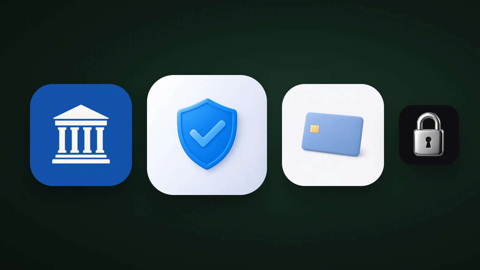
- Banks and neobanks: a building with columns. It says "bank" at once. We spotted none in the top 100, so it could help a new bank stand out, though it reads as traditional.
- Security and protection: a shield with a check. It signals safety, but don't use it to imply insurance, regulation or an official status you don't have.
- Vaults and privacy: a padlock. A metal padlock on a dark background feels secure and premium.
- Cards and payments: a plain card. A card shape works for payments. In our example, a pale blue card on white was faint: use a deeper colour or a darker background.
- Saving and investing: coins. Money symbols were only 5 of the top 100, so coins are a clear, uncrowded idea.
- Budgeting: a wallet. It's familiar, though it's the first idea most budgeting apps reach for. Our guide to app icon ideas has more.
What to avoid in a finance app icon
Three risks matter more in finance than in other categories:
- Looking like an existing bank. Real bank marks are trademarks, and a lookalike can confuse users and cause legal trouble. Search the stores for icons with a similar shape and colour before you commit.
- Implying an official status. Eagles, national emblems and seals can suggest a government or regulated body. Use them only if they're really yours.
- Fragile detail. Banking icons appear in notifications and settings at 20 to 30 px. Our guide to keeping an icon legible at small sizes explains how to test that.
How to design a finance app icon
To design a finance app icon, pick one simple subject or a bold initial, use one or two calm colours, keep it symmetrical, and test it small.
- Decide what the icon should say: safe, modern, friendly, premium.
- Look at the top ten apps in your niche and note their colours and subjects.
- Pick a simple subject they don't use, or a bold letter with a distinctive shape.
- Choose one or two colours, with 3:1 contrast between the mark and the background.
- Test it small, on light and dark wallpapers and in greyscale.
In AI Icon Creator, describe the subject and compare it in a few styles. Flat styles read as calm and precise; metal and glossy styles feel more premium:
Frequently asked questions
What colour should a banking app icon be?
A banking app icon is most often blue or white, with green common for money and growth apps. In the top 100 US finance apps we reviewed, 22 icons were blue, 22 white and 19 green. Blue and white suggest calm and security. Choose one main colour and keep 3:1 contrast with the mark.
What should a finance app icon look like?
A finance app icon should look simple, balanced and clear: one bold mark or letter, one or two colours and plenty of space. In the top 100 US finance apps, 73 used two main colours or fewer, and 45 relied on a name or a letter. Avoid detail that disappears at small sizes.
Should a banking app icon use a shield or a lock?
A banking app icon can use a shield or a lock to signal security, but don't use them to imply insurance, regulation or an official status you don't have. Both are familiar symbols, so make yours distinctive with a simple shape and a colour that fits your brand.
Should a fintech app icon use a letter or a symbol?
A fintech app icon can use a letter if the name is short and distinctive, or a symbol if you want to be recognised by what the app does. Letters and names were 45 of the top 100 finance icons, so a clear symbol can help a new app stand out.
Can I use a real bank's colours or logo in my app icon?
You shouldn't use a real bank's logo or copy its icon, because logos are trademarks and a lookalike can confuse users and cause legal problems. You can use common finance colours such as blue and green, but choose a different shape and check the stores for similar icons.
Ready to try your own idea? Compare a few subjects in a few styles: