

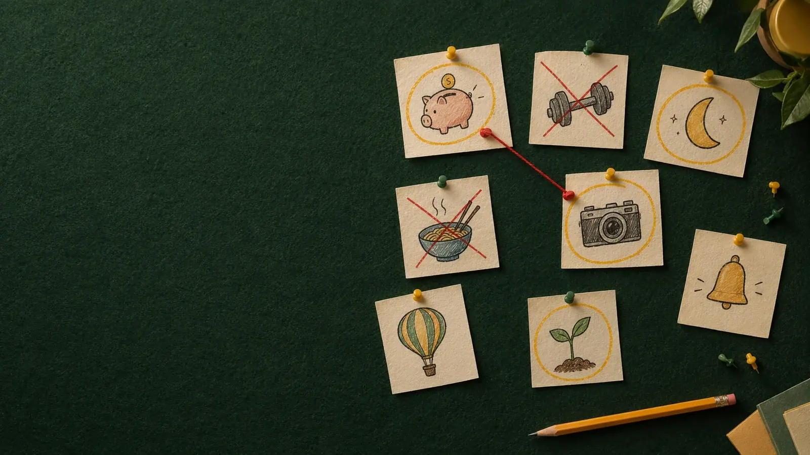
Good app icon ideas come from six places: the object your app is about, the action people take in it, the benefit they get, your initial, a character for your brand, or the feeling you want to create. The best idea is the one that becomes a single, simple shape you still recognise at 32 px, fits your category without copying its most famous icon, and says what the app does in under a second.
Below are 60 app icon ideas for 12 kinds of apps, each shown with a real example made in AI Icon Creator, followed by a method for finding the right idea for your own app.
60 app icon ideas by category
These are the ideas that work well for each category. The first idea in each row is shown in the picture below; the others are worth trying if your competitors already use the first one.

| App category | Idea shown | More ideas to try |
|---|---|---|
| Budgeting and finance | Piggy bank | Coins, wallet, safe, rising bar chart |
| Fitness | Dumbbell | Kettlebell, running shoe, stopwatch, heart-rate line |
| Recipes and food | Bowl of noodles | Chef's hat, whisk, frying pan, lemon |
| Sleep and meditation | Crescent moon | Lotus, candle, cloud, closed eye |
| Photo and video | Camera | Lens, aperture, film frame, flash |
| Plants and gardening | Seedling | Watering can, leaf, flower pot, sun |
| Travel | Hot-air balloon | Paper plane, suitcase, compass, map pin |
| Reminders and to-dos | Bell | Checkmark, alarm clock, calendar page, sticky note |
| Pets | Dog | Paw print, bone, cat face, collar tag |
| Kids and learning | Elephant | Owl, pencil, building blocks, star |
| Mood tracking | Face | Sun and cloud, heart, colour dot, speech bubble |
| Flowers and beauty | Tulip | Rose, mirror, droplet, lipstick |
A few notes on using this list:
- The obvious idea is taken. In most categories, the first idea is what the market leader already uses. Look one column to the right, or combine an idea with a style few competitors use.
- Style changes the feeling. The same dumbbell reads as serious in a flat style and as playful in soft 3D. Our guide to icon styles compares the main options on one subject.
- Characters travel across categories. A friendly animal can front a finance, language or health app and stand out precisely because nobody expects it there.
Want to see one of these ideas as your icon? Try it in a few styles:
How to come up with app icon ideas for your own app
To come up with an app icon idea, start from what your app does and brainstorm in six directions, then keep only the ideas that become a clear shape. This map shows the six directions with an example for each:

1. The object: what your app is about
The object is the thing at the heart of the app: a camera for a photo editor, a book for a reading app, a plant for a gardening guide. It's the most direct kind of app icon idea and the easiest to recognise. The risk is that everyone in your category had the same idea.
2. The action: what people do
An action idea turns a verb into a picture: lifting (a dumbbell), sending (a paper plane), recording (a microphone), growing (a sprout). Actions add energy and suit apps built around a habit or a task.
3. The benefit: what people get
A benefit idea is a metaphor for the result of using your app: saving money becomes a piggy bank, better sleep becomes a moon, focus becomes a target. Benefits are often the most memorable ideas because they describe the promise, not the feature. Our guide to icon metaphors has more examples.
4. The letter: your initial
A letter mark uses the first letter of your app's name as the whole icon. It works when the name is short and distinctive, or when your app does many things and no single object fits. Make the letter bold and give it a distinctive shape, material or colour, or it will look like a placeholder.
5. The character: a face for your brand
A character idea gives your app a mascot, usually a friendly animal. Characters are warm and memorable, which is why they're common in games, education and apps for families, and increasingly in finance and health apps that want to feel approachable.
6. The feeling: the mood you want to create
A feeling idea shows an emotion or a mood more than an object: a face, a colour, a sun behind a cloud. It suits mood trackers, journals and wellbeing apps, where the feeling is the product.
From brainstorm to one app icon
A brainstorm only helps if you narrow it down. This is how the budgeting app in our guide on how to make an app icon went from a list of words to one icon:

- List about 20 words linked to your app: things, actions, results and feelings. Don't judge yet.
- Sketch the most promising 8 as silhouettes, stamp-sized, filled in solid.
- Keep the 3 you still recognise at 32 px. In AI Icon Creator's worked example for a budgeting app, a piggy bank, a stack of coins and a wallet made it this far; only the piggy bank stayed clear when tiny.
- Try each idea in two or three styles. Seeing the same idea as flat, clay or glass often decides it for you.
- Pick one and refine it on three things: silhouette, contrast against light and dark wallpapers, and fit with your brand.
What makes a good app icon idea
A good app icon idea passes four checks:
- One shape. It can be drawn as a single silhouette. Two objects side by side, or a scene, won't survive the Home Screen.
- Readable at 32 px. Details such as the stripes on coins or the text on a book cover disappear; a strong outline doesn't. See how to keep an icon legible at small sizes.
- Right for the category, not a copy of it. People should guess the category, but not confuse you with the leader.
- True to the promise. The idea should match what the app actually does best, so the icon keeps making sense as the app grows.
Apple's Human Interface Guidelines make the same point: find one element that captures the essence of your app and express it simply.
App icon ideas to avoid
- Generic symbols such as a gear, a globe or a lightning bolt, unless your app really is about settings, the world or electricity. They say little and look like a hundred other apps.
- Your app's screenshot or interface. It's unreadable when small and dates quickly.
- Words or slogans. The app's name already appears under the icon.
- A near copy of a famous icon. It confuses people and can get your app rejected or reported.
Frequently asked questions
What are some good ideas for app icons?
Good ideas for app icons are single, simple symbols tied to what the app does: an object (a camera for a photo app), an action (a dumbbell for fitness), a benefit (a piggy bank for saving), a bold initial, a mascot or a mood. The table above lists 60 ideas across 12 categories.
How do I come up with an app icon idea for my app?
To come up with an app icon idea, write down what your app does in five words, then list objects, actions, benefits and feelings linked to it. Sketch the best as silhouettes, keep the ones that are still recognisable at 32 px, and try the finalists in two or three styles.
How do I get app icon inspiration without copying?
Look at a whole category rather than one icon: note the shapes and colours everyone uses, then choose a different idea or style. Galleries of real apps help you see patterns; for your own icon, start from your app's benefit or a character instead of redrawing someone else's symbol.
What makes an app icon stand out on the Home Screen?
An app icon stands out when it has one bold shape, strong contrast between subject and background, and a colour or style that's rare in its category. A distinctive silhouette matters most, because it's what people recognise before they read the app's name.
Can I use a letter as my app icon?
A letter can be a good app icon when your app's name is short and memorable or no single object fits what the app does. Make the letter bold and give it a distinctive treatment, such as a 3D material or an unusual colour, so it doesn't look like a default placeholder.
Have an idea already? Turn it into an icon and compare a few styles: