

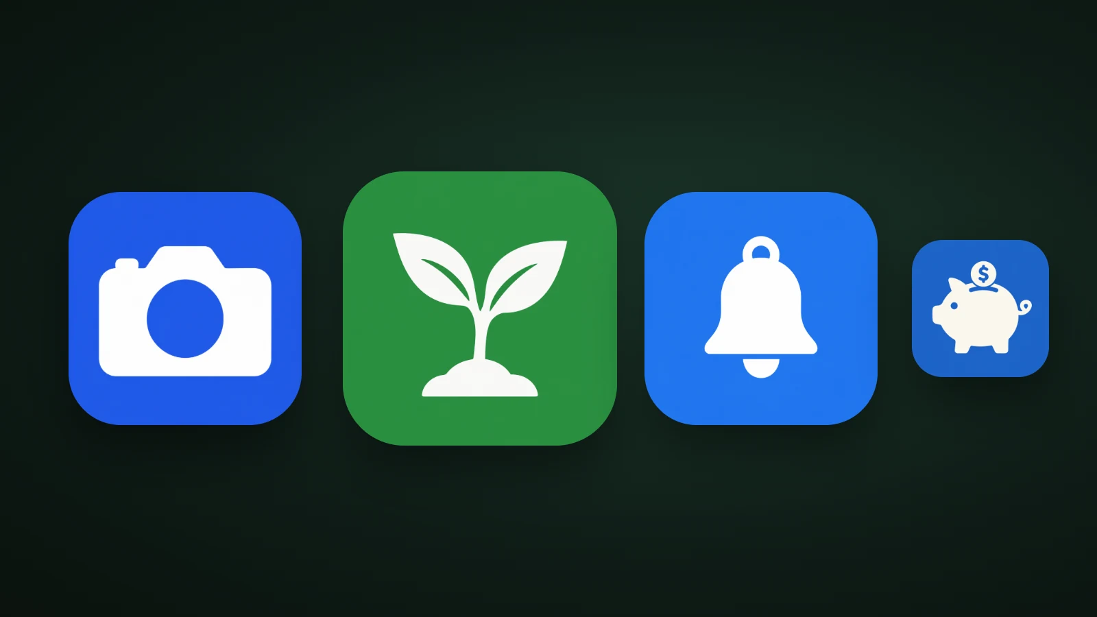
A minimalist app icon uses the fewest parts, colours and effects that still identify the app: one subject, one or two colours, a bold shape and generous empty space. In AI Icon Creator's review of the 100 top free apps in the US App Store on 30 September 2026, 75 icons used two main colours or fewer, while only 11 of the top 100 free games did. Minimal is the norm for apps, and games are the exception.
This guide is for making the icon of your own app. If you want to restyle your phone's Home Screen, you're looking for an icon pack instead.
What makes an app icon minimalist?
A minimalist app icon is defined by how little it contains, not by how it looks. Five traits show up in almost every one:
- One subject. A single object, symbol or letter, with no scene around it.
- Few parts. Only the shapes that make the subject recognisable.
- One or two colours. A background and a subject, sometimes one accent.
- Negative space. Empty areas do part of the drawing, and the icon has room to breathe.
- No text and no effects. No words, no heavy gradients, no textures.
Minimalism is different from flat design. Flat is a style: solid colours and no lighting. Minimalism is an amount: a flat icon can still have twenty parts, and a 3D icon can be minimal if it has one simple object. Our guide to icon styles covers the styles, and this guide is about how much to put in them.
Platform guidance points the same way. Apple's Human Interface Guidelines for app icons ask for a simple design built around one core idea, and Microsoft's app icon guidelines ask for one concept expressed in simple forms.
How many colours do top app icons use?
Most top app icons use two main colours: a background and a subject. To see how common minimalism is in practice, AI Icon Creator measured the main colours of each icon in the US App Store's Top Free chart on 30 September 2026, for all apps and for games. A colour counted if it covered at least 8% of an icon, after similar shades were merged.

Among the top 100 free apps overall, 5 icons used one main colour, 70 used two, 18 used three and 7 used four or more, so 75 of 100 used two or fewer. Among the top 100 free games, 2 used one colour, 9 used two, 14 used three and 75 used four or more. The average was 2.3 main colours for all apps and 4.3 for games.
The lesson depends on your category. If you're making a tool, a utility or a service, a two-colour icon is what people expect, and a busy one will look out of place. If you're making a game, richer colour is normal, and a minimal icon can stand out. Our guide to app icon colours explains how to choose the two.
From nine parts to three: reducing an icon
Minimalism is a process of cutting, and each cut should keep the subject recognisable. The camera below is the same subject at three levels of detail:

In AI Icon Creator's test, one camera was made in a detailed soft 3D style, a simplified flat style and a minimal negative-space style. The detailed version has about nine parts: strap loops, dials, a viewfinder, a flash window, a lens barrel and lens glass. The flat version has about six: the body, a top bump, a lens ring, a lens and a flash dot. The minimal version has three: the body, the top bump and a single hole for the lens.
Measured against its background, the detailed camera reached 2.9:1 contrast, the flat one 4.7:1 and the minimal one 5.7:1. At 20 px the detailed camera turned into a grey blob, the flat one kept its lens ring, and the minimal one stayed clear. Fewer parts made the icon easier to read at every size, not just smaller. Our guide to keeping an icon legible at small sizes explains why.
Techniques for minimalist app icons
Four techniques do most of the work in minimalist app icons:
- Negative space. Let empty areas draw the detail. In the minimal camera, the lens is not a shape but a hole, and the background colour shows through.
- Geometric shapes. Circles, rounded squares and simple polygons are easy to recognise and scale cleanly.
- A tight palette. One background colour, one subject colour, and at most one accent.
- Generous margins. Give the subject room, but let it fill most of the canvas. As a rule of thumb, roughly 60–70% of the width.
The risks of going too plain
A minimalist icon can fail by being too generic, too abstract or too low in contrast. Watch for four problems:
- Looking like everyone else. A white symbol on a blue square is the most common recipe, so add one twist: an unusual colour, a distinctive shape or a memorable detail. Our guide to app icon design best practices explains how to stand out in your category.
- Being too abstract. If people can't guess what the app does, the icon isn't doing its job. Our guide to icon metaphors helps you pick a subject people recognise.
- Low contrast. White on pale grey or grey on grey disappears. Aim for at least 3:1 between the subject and the background.
- Losing personality. If every part has been cut, nothing is left to remember. Keep one feature that is yours.
How to design a minimalist app icon
To design a minimalist app icon, say the idea in three words, draw only what makes it recognisable, cut the colours, use empty space, and test small.

- Say the idea in three words. If you can't, the icon will carry too much.
- Draw only what makes it recognisable. Start from the silhouette and add a part only if the subject stops being recognisable without it.
- Cut the colours to one plus one accent.
- Use empty space instead of extra shapes.
- Test at 20 px, then remove one more thing. If it still reads, keep the simpler version.
In AI Icon Creator, the Clean flat and Edge negative styles, two of the 14 app icon styles, are built for this. Describe one subject and compare them:
For a wider comparison, our guide on how to choose an app icon style covers flat, 3D, glass and character styles side by side.
Frequently asked questions
What is a minimalist app icon?
A minimalist app icon is an icon with the fewest parts, colours and effects that still identify the app, usually one subject, one or two colours and a lot of empty space. It has no text and few or no gradients. Minimalist is about how much the icon contains, and it can be flat or 3D.
How many colours should an app icon have?
An app icon should usually have two main colours: a background and a subject, plus at most one accent. In AI Icon Creator's review of the US Top Free chart on 30 September 2026, 75 of the top 100 apps used two main colours or fewer. Games are the exception, with 75 of 100 using four or more.
Are minimalist app icons better than detailed ones?
Minimalist app icons aren't better in every case, but they read better at small sizes. In AI Icon Creator's camera test, the three-part minimal version stayed clear at 20 px, while the nine-part detailed version became a grey blob. Choose detail only if the icon will mostly be seen large.
Is minimalist the same as flat?
Minimalist isn't the same as flat. Flat is a style with solid colours and no lighting, and minimalist describes how few parts an icon has. A flat icon can be busy, and a 3D icon with one simple object can be minimalist.
How do I make a minimalist logo for my app?
To make a minimalist logo for your app, choose one subject, reduce it to the fewest shapes that keep it recognisable, use one or two colours, and use empty space for detail. Then test it at 20 px and in greyscale. An AI icon generator with flat and negative-space styles makes this quick to try.
Try your own subject in a few styles: