

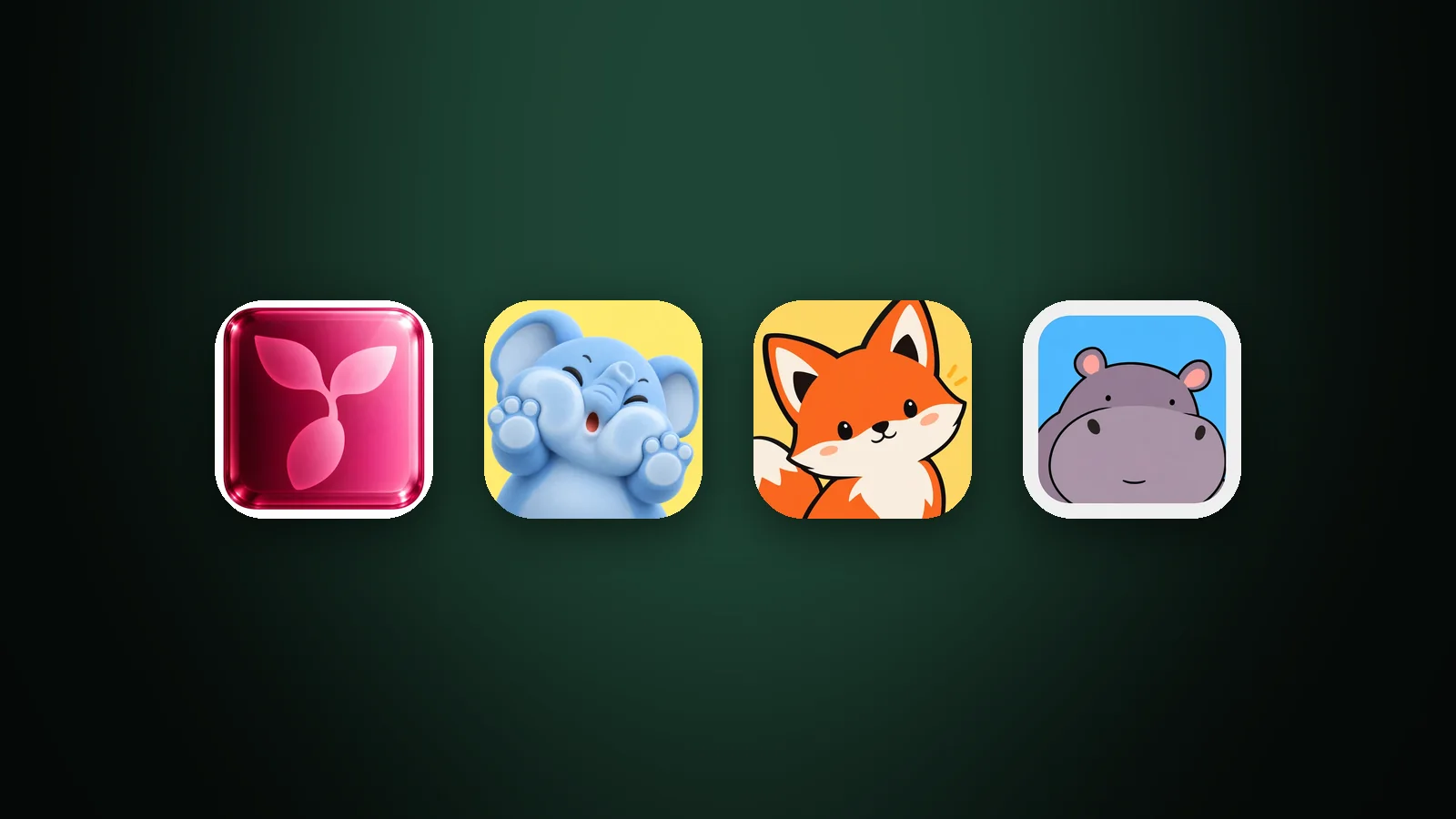
An app icon metaphor is the object, symbol or character that stands in for what your app does. To choose one, list what your app is, does and gives, cross out the metaphors your category already uses, draw three to five candidates in the same style, and keep the one that is still clear as a silhouette and at 32 px. The metaphor decides what people think your app is; the style only decides how it looks.
This guide covers the four kinds of app icon metaphor, a five-step way to choose between them, our test of six candidates for one app, and the symbols to avoid.
What is an app icon metaphor?
An app icon metaphor is a picture that stands for an idea instead of showing it literally. A piggy bank is not a finance app, but it stands for saving, so it can represent one. A moon isn't sleep, but it says "night" and "rest".
A metaphor is different from a style. The metaphor is the subject you draw, such as a piggy bank. The style is how you draw it, such as flat, clay or glass. Choosing the subject first matters, because a clear subject survives any style, while a confusing one won't be saved by a good style. Our guide to icon styles covers the second half.
Four kinds of app icon metaphor
App icon metaphors run from literal to expressive: the thing itself, a related object, a symbol of the result, and a character. Here they are for one app, a budgeting app:

- The thing itself (literal). A calculator for a budgeting app, a camera for a camera app. People understand it instantly, but it's also what most competitors draw, so it rarely stands out.
- A related object (associated). Coins or a wallet: connected to the job, but one step removed. It's still easy to read and is a little less crowded.
- A symbol of the result (symbolic). A piggy bank for saving, a moon for sleep, a sprout for growth. It describes what the user gets, not what the app is, which makes it the most memorable of the three object types.
- A character. A friendly face that turns the product into someone, such as a coin with a smile. Characters are warm and easy to extend into marketing, but they need bold, simple features.
Letters and abstract marks are two more options: a bold initial works when the name is short and distinctive, and an abstract shape works when no single object fits. Both are covered in our guide to app icon ideas.
| Kind of metaphor | Recognised | Stands out | Best for |
|---|---|---|---|
| Literal | At once | Rarely | Tools where clarity matters most |
| Associated | Quickly | Sometimes | Crowded categories with an obvious object |
| Symbolic | Quickly | Often | Apps that sell a result or a feeling |
| Character | Slowly | Yes | Games, kids, social and friendly brand apps |
The table is our assessment, not a rule. A literal icon in a category where nobody uses one can stand out, and a symbol can be too obscure to read.
How to choose an app icon metaphor in five steps
To choose an app icon metaphor, generate a wide list, remove what your competitors use, compare a few candidates in one style, and test each one. The whole process fits into an afternoon.

- List what the app is, does and gives. Write every object, action and result connected to the product. For a budgeting app: wallet, coins, ledger, calculator, chart, piggy bank, savings jar.
- Cross out what your category already uses. Search your category on the App Store and Google Play. If the top ten icons are wallets, the wallet goes first. Our guide to app icon design best practices explains why standing out in your category matters.
- Draw three to five candidates in one style. Keep the style and colours identical, so the only difference is the metaphor.
- Test each candidate. Use the silhouette, small-size and five-second checks below.
- Keep the clearest, most distinctive one. Then choose the style and colours it deserves.
The fastest way to do step 3 is to write each candidate as one short line and generate them side by side. In AI Icon Creator, "a piggy bank", "a wallet" and "a calculator" in the same style take a few minutes:
Test your metaphors: silhouette, 32 px and five seconds
Three quick tests separate a working metaphor from a merely nice picture: fill it with black to check the silhouette, view it at 32 px, and ask someone what the app does. In AI Icon Creator's test of six candidates for a budgeting app, two passed cleanly and four had a specific weakness:

- Piggy bank and stack of coins passed. Both have a distinctive outline, and both stay clear at 32 px. The piggy bank has the extra advantage of being a symbol of the result, not just an object.
- The wallet reads but blends in. Its silhouette is fine, but it's the first idea most budgeting apps reach for.
- The calculator's outline is clear, but its button grid turns into texture at 32 px. Simplifying the grid to fewer, larger buttons would fix it.
- The line chart has thin strokes that fade at 32 px, and a chart could belong to any analytics app. Bolder lines would help, but the metaphor remains generic.
- The coin character's silhouette is a plain blob. A character depends on its face, so test it at small size and make the eyes and mouth bolder. Our guide to keeping an icon legible at small sizes has the fixes.
The third test is the five-second question. Show each candidate to a few people who haven't seen it, take it away, and ask what the app does. If they name the right category, the metaphor works. If they name a different one, it's ambiguous, whatever the design looks like.
Metaphors that age, confuse or don't travel
Some symbols look clear to you and mislead everyone else. Check your favourite candidate against these four problems before you commit:
| Problem | Example | What to do |
|---|---|---|
| Dated | A floppy disk, a rotary phone | Use a modern object; people who never used one may not read it |
| Ambiguous | A heart (like, favourite, health, dating) or a lightning bolt (fast, power, flash) | Add a second cue or choose a more specific object |
| Local | Hand gestures, some animals and objects | Check what it means in your main markets before you use it |
| Lookalike | An icon that resembles a well-known app or a system icon | Change the shape or colour until it's clearly yours |
Lookalikes are also a platform risk. Apple's Human Interface Guidelines for app icons advise against replicating Apple hardware products in an icon, and a mark that's too close to another app's is a poor way to be remembered.
Turn the winning metaphor into a finished icon
Once you have a metaphor, the remaining decisions are style, colour and testing on real Home Screens. Our step-by-step guide on how to make an app icon covers them, and how to choose an app icon style helps you pick a look that suits your metaphor: a simple object works in any style, while a detailed one needs a flat one.
Compare your own candidates side by side:
Frequently asked questions
What is an icon metaphor?
An icon metaphor is a familiar picture that stands in for an idea, so people understand it without reading. A piggy bank for saving, a magnifying glass for search and a moon for sleep are icon metaphors. For an app icon, the metaphor is the subject you draw, and it works best when it's simple and recognisable.
What is the best metaphor for an app icon?
The best metaphor for an app icon is one that people recognise quickly, that has a distinctive silhouette and that your competitors don't already use. There is no universal answer: test a few candidates in the same style and keep the one that still reads at 32 px and that people connect with your app.
Should an app icon be literal or symbolic?
A literal app icon is fastest to understand, and a symbolic one is more memorable and easier to tell apart from competitors. Choose literal when clarity matters most and few apps in your category do it. Choose symbolic when your category is crowded with the same object or when you sell an outcome, such as saving or sleep.
How many metaphors should an app icon have?
An app icon should carry one metaphor, because it's seen at fingernail size for a fraction of a second. Two ideas compete for the same few pixels. If your app does several things, choose the one people come for, or use a neutral mark such as a letter or a simple shape.
Can I use a mascot as my app icon?
You can use a mascot as your app icon, and characters are common in games, education and family apps. Keep to the head or upper body, one clear expression and bold features so the face still reads at 32 px. A mascot also gives you something to reuse in screenshots and marketing.