
Icon style
Sticker icons
Sticker icons are flat illustrations with a dark outline and a thick white border that follows the shape, like a die-cut sticker. In AI Icon Creator they are app icons: one picture that stands for your app, made from a short description of one subject. They are not a chat sticker pack and not a printed sticker.
In the examples below, a music note, an envelope with a heart seal, a sitting cat and a camera are all drawn the same way. A dark outline hugs each shape, a thicker white border runs round that, and a soft shadow lifts the whole shape off a plain blue background. The colours are bright and mostly flat, with a glossy highlight on the note heads, the heart and the camera lens. The envelope is tilted a little.
Social, kids and lifestyle apps are a good fit: a friendly object or animal can stand for the whole app. Pick one subject with a clear outline, since the border traces it. You don't choose colours or a background: both come with the style, so your description only has to name the subject.
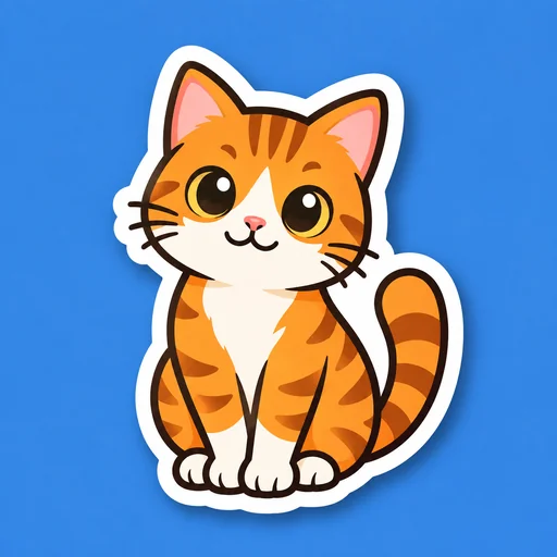
Sticker icons made with this style
Every example was made with this style. Click one to start with the same look.


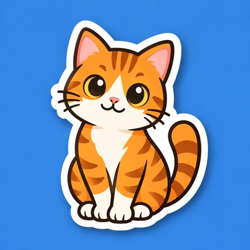
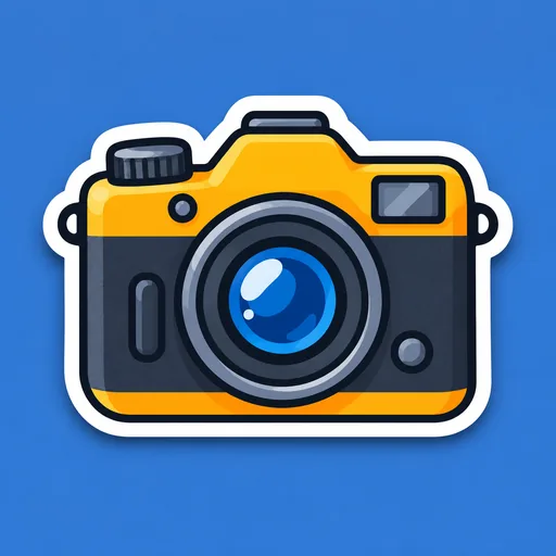
How to make sticker icons with AI
In AI Icon Creator the style draws the outline, the white border and the shadow for you, so the work is in choosing the subject and checking the result.
- 01
Describe one object
The button on this page opens the studio with Die-cut sticker already chosen. Write one object, and add one detail only if it makes the object easier to recognise: “a sitting cat”, “a camera with a top dial” or “a music note”. Pick a shape you would still know as a black silhouette, and see how to describe a subject.
- 02
Check the edge, then fix one part
Look at the edge first: the white border should run all the way round the shape, as in the examples. If one part is off, such as a tail or a lens, edit just that area and describe the change. Each result is kept as its own version, so your first one is still there.
- 03
Check it small, then download
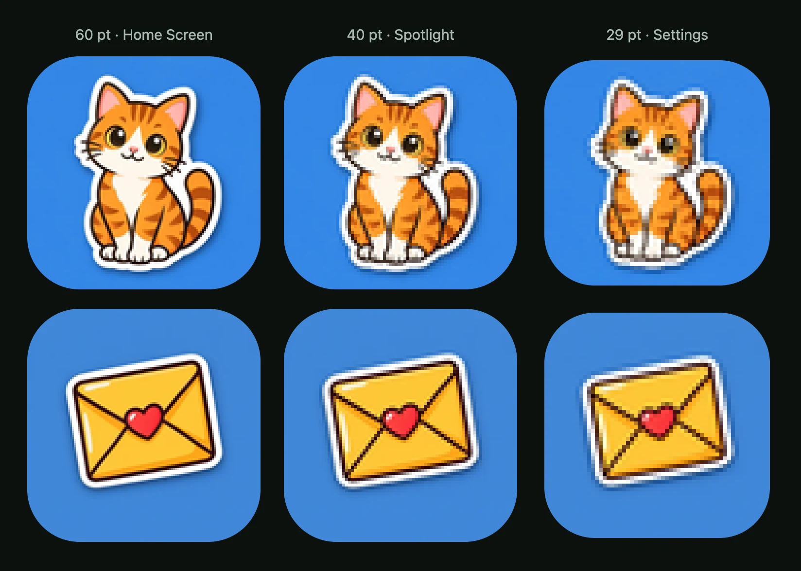
Before you ship it, view the result at 60, 40 and 29 pt, the sizes of an iPhone icon on the Home Screen, in Spotlight and in Settings. If the main shape still reads, download the PNG alone, or the app icon pack for the iOS, Android and web versions. The download and export guide explains each file.
Sticker icons: common questions
What is a sticker icon?
A sticker icon is an icon drawn like a die-cut sticker: a flat illustration with a dark outline and a thick white border that follows its shape. Here it means an app icon, the single picture that represents your app on a phone, rather than a chat sticker pack or a printed sticker. You make one in the Die-cut sticker style by describing a single subject in a short phrase.
Why do sticker icons have a white border?
A sticker icon has a white border because the border creates the die-cut look: a margin that follows the outline of the subject. In the examples it wraps bumps such as the camera's dial and strap loops and fills the narrow gap between the cat's back and tail. It also gives every subject the same light edge, whatever colours are inside. A dark outline just inside it adds a second edge.
Do sticker icons stay readable at small sizes?
Sticker icons stayed readable down to 29 pt in AI Icon Creator's real-size check. We scaled the four approved icons down: 60 pt for the Home Screen, 40 pt for Spotlight, 29 pt for Settings. The white border went from a clear band at 60 pt to a hairline under a point wide at 29 pt. It never broke, so each shape still sat clear of the blue. See testing an icon at small sizes.
Which apps suit sticker icons?
Sticker icons suit social, kids and lifestyle apps, where a friendly object or animal, like the cat or the heart-sealed envelope in the examples, can stand for the whole app. If your app needs a calm or serious tone, such as a finance tool, compare plainer looks first; our guide to choosing an icon style shows how.
Which subjects work best for a sticker icon?
A single object with a simple outline works best for a sticker icon, because the border traces that outline. The cat, camera, envelope and note in the examples each read as one shape. Skip scenes, lettering and fine detail: at 29 pt the cat's whiskers were gone and the envelope's heart seal had shrunk to a tiny red heart.
Can I choose the colours of a sticker icon?
The Die-cut sticker style has no colour setting: its palette and background come built in, so a description only needs the subject. To change one part afterwards, select that area and say what you want different. The change is kept as a separate version, so your first icon is still there.
Related styles

Further reading
- How to Keep an App Icon Legible at Small SizesHow to keep an app icon legible at small sizes: where icons shrink to 20–40 px, three quick tests, and fixes for thin lines, narrow gaps, detail and contrast.
- How to Choose an App Icon Style: Flat, 3D, Glass or Mascot?How to choose an app icon style: which of flat, soft 3D, glass, metal or character icons fits your app, audience and category, with side-by-side examples.
- App Icon Metaphors: How to Choose What Your Icon ShowsHow to choose an app icon metaphor: four types from literal to character, a silhouette and 32 px test, and how to avoid dated or confusing symbols.
- App Icon Design Best Practices: 8 Principles That WorkEight app icon design best practices, from one focal point and the silhouette test to colour, text and platform rules, plus how to test an icon before launch.