
Icon style
Y2K app icons
Y2K app icons are app icons drawn in the glossy, hopeful look of the late 1990s and early 2000s. Picture a puffy object in liquid chrome, with a rainbow sheen on the metal and a few four-point sparkles around it. AI Icon Creator makes one polished icon like that for your app from a short description of its subject. You get a new icon, not a ready-made pack of pictures. Here, “chrome app icons” means the chrome-metal finish, not the Chrome browser's icon.
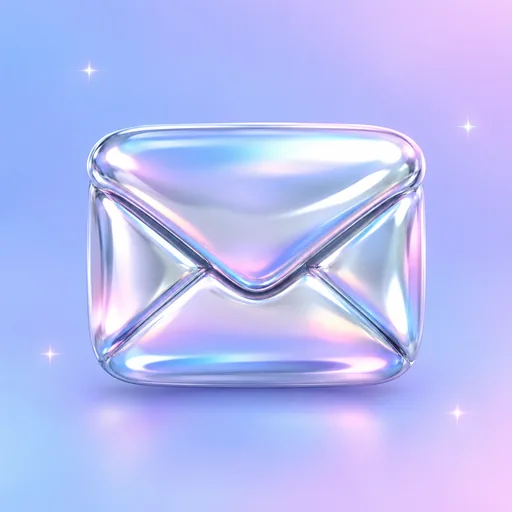
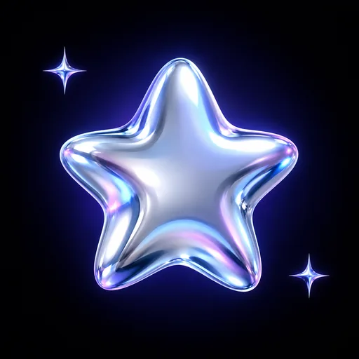
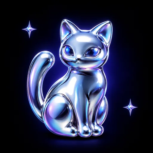
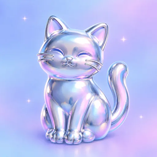
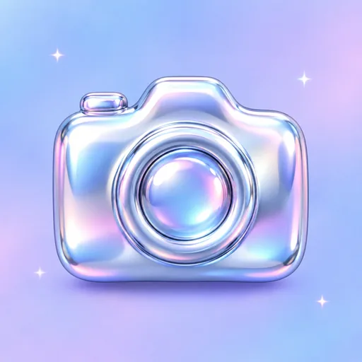
In the examples below, every subject is one puffy object in silver metal, with bright highlights and soft pink, lilac and blue reflections. The style has three looks. Iridescent sets a music note, an envelope, a cat and a camera on a blue-to-lilac gradient. Pink puts a heart and a camera on bright pink. Dark floats a star and a cat in a blue glow on near-black. Pink and Dark add two larger sparkles in opposite corners, while Iridescent scatters smaller ones.
Y2K icons suit music, fashion and social apps with a retro-future feel, and any app whose users like a glossy, nostalgic look. Choose one subject with a chunky outline. Stars and hearts are familiar Y2K symbols and make strong icons, and so do a camera, a music note, an envelope and a cat. Colour and background come with each look, so all you write is the subject.
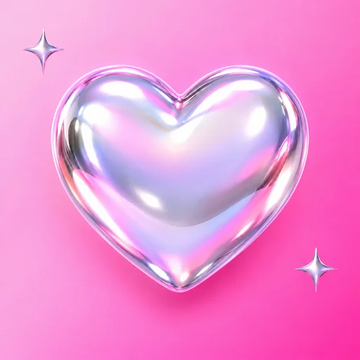
Y2K app icons in all three looks
Every example was made with this style. Click one to start with the same look.
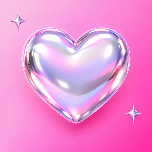
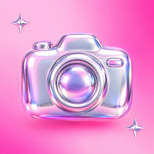
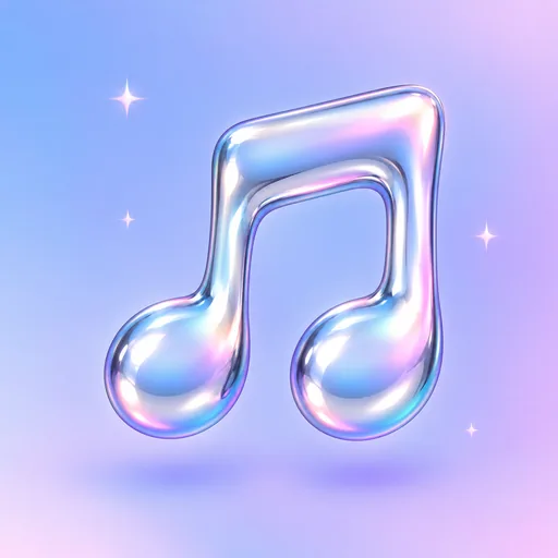
How to make Y2K app icons with AI
In AI Icon Creator, a Y2K icon takes three steps: choose a subject, choose a look, then check it small and download.
- 01
Describe one subject
Name the object and, only if it changes the outline, one detail: “a star with rounded points” or “a sitting cat with a curled tail”. Colours and backgrounds belong to each look, so leave them out, and keep lettering and busy scenes away from a chrome icon, where they turn to noise at small sizes. The studio suggests “a puffy heart” for this style, and our guide on how to describe your subject has more examples.
- 02
Pick a look
Choose Iridescent, Pink or Dark. Iridescent is the soft look, Pink the bold one and Dark the dramatic one, with a blue glow on near-black. Switch looks on the same subject to compare them before you decide.
- 03
Check, edit and download
Judge the icon at Home Screen size before anything else. If a single part needs work, pick that area and describe the change; every edit becomes a new version and the original stays. When it looks right, take the PNG, or the app icon pack that holds the iOS, Android and web files. How to download and export your icon explains each one.
Y2K app icons: common questions
What does Y2K mean in style?
Y2K style means the glossy, high-tech, hopeful look of the late 1990s and early 2000s, named after the year 2000. On an app icon, that means a puffy object in liquid chrome, a rainbow sheen, a soft glow or shadow and small four-point sparkles. That is the finish the Y2K liquid chrome style gives a subject.
What are some Y2K symbols for an app icon?
Stars and hearts are two Y2K symbols that make strong app icons, because each is a single shape. In the examples here, a puffy star on Dark and a puffy heart on Pink carry the style on their own. The four-point sparkle stays a small accent beside the subject. A camera, a music note, an envelope and a cat work too. See app icon metaphors for choosing a subject.
What are chrome app icons?
Chrome app icons are app icons whose subject looks cast in polished chrome: shiny silver metal with bright highlights and reflections. In the Y2K liquid chrome style the metal turns puffy and liquid, with a rainbow sheen, and sits on a bright pink, blue-to-lilac or near-black background. In the examples the metal stays silver in every look, and the background and glow change the mood.
Which Y2K look should I choose?
The right Y2K look depends on mood: Pink is bold, Iridescent is soft and Dark is dramatic. Pink puts silver metal on bright pink and suits fashion and social apps. Iridescent sets pale metal on a pale gradient and suits messaging and camera apps. Pale on pale loses contrast first, as the 3D app icons guide explains, so keep the subject chunky. Dark sets bright metal in a blue glow on near-black and suits music apps.
How do Y2K icons look at real sizes?
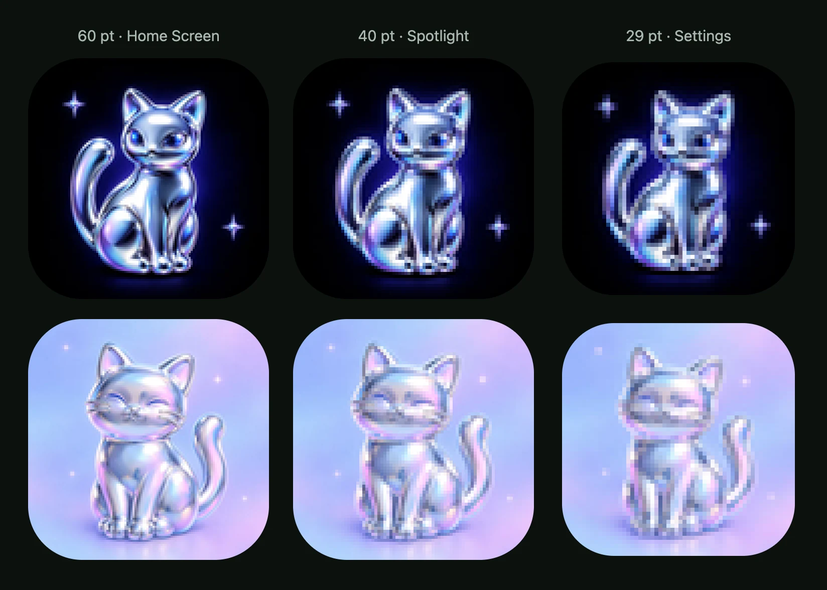
Y2K icons keep their shape at real sizes, but the reflections and sparkles fade. In AI Icon Creator's real-size check, we shrank the eight approved icons to 60, 40 and 29 pt, the iPhone sizes for the Home Screen, Spotlight and Settings. At 29 pt the shapes of all eight were still recognisable, though the rainbow reflections paled and the sparkles on the lighter looks faded to dots. The Dark cat kept its blue eyes, but the Iridescent cat was the faintest and its whiskers blurred away. See small-size legibility.
Is this a Y2K icon pack?
No, the Y2K style makes one new app icon from your description, in the look you pick; it is not a pack of ready-made icons. The app icon pack you download is that one icon in every size iOS, Android and the web need. To make a matching set for several apps, keep the same look and describe a different subject each time.
Related styles
Further reading
- 3D App Icons: How to Make Them and What to AvoidHow to make a 3D app icon: four materials compared at real sizes, the lighting that makes them look right, three ways to build one, and a contrast trap.
- Icon Styles Explained: Types of Icons, with ExamplesA visual guide to icon styles: line, filled, duotone, flat, gradient, 3D, glass, metal and mascot icons, when to use each, and the icon style trends for 2026.
- App Icon Metaphors: How to Choose What Your Icon ShowsHow to choose an app icon metaphor: four types from literal to character, a silhouette and 32 px test, and how to avoid dated or confusing symbols.
- How to Keep an App Icon Legible at Small SizesHow to keep an app icon legible at small sizes: where icons shrink to 20–40 px, three quick tests, and fixes for thin lines, narrow gaps, detail and contrast.