

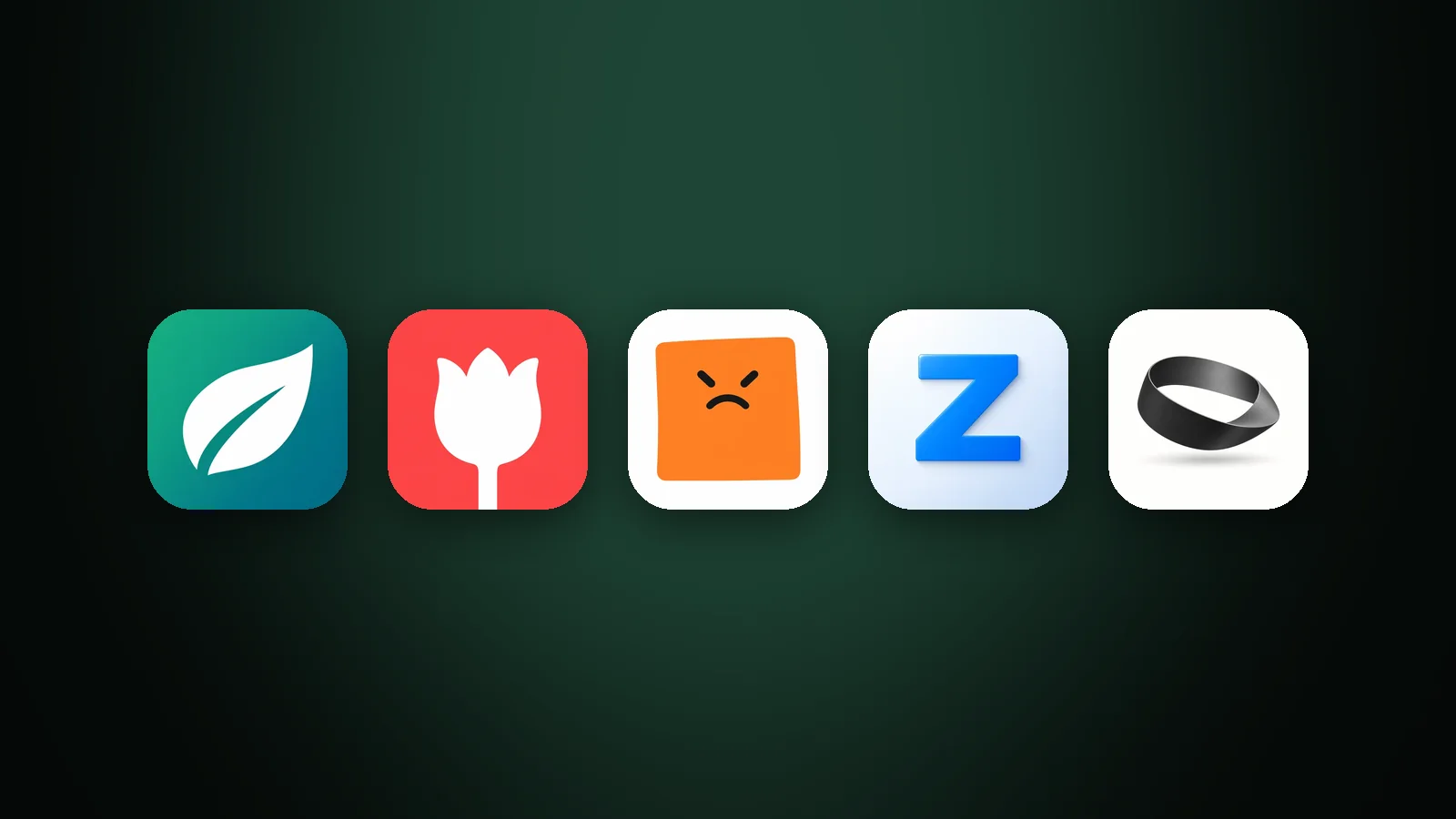
A good app icon follows eight best practices: it has one focal point, a silhouette you recognise in solid black, it works at 32 px, it uses one main colour and an accent with at least 3:1 contrast, it contains no words, it follows the platform's rules, it stands out in its category, and it has been tested on real Home Screens before launch. Each one exists for the same reason: an app icon is seen for a split second at the size of a fingernail.

1. Use one focal point
An app icon should show one object or symbol, not a scene. A single subject can fill the square and keep its shape when shrunk; a scene has to squeeze several small objects into the same space, and all of them blur together.

In AI Icon Creator's example, the same Clay 3D style was used for a single tent and for a camping scene with a tent, pine trees, a campfire, a canoe and a starry sky. At full size the scene is the more charming icon. At 32 px, the size of a browser tab or a settings row, the tent is still a tent and the scene is a dark smudge.
If your app does several things, pick the one people come for. Our guide to app icon ideas shows where to look for that single idea.
2. Design the silhouette first
The silhouette is the outline of your icon when it's filled in solid black, and it's what people recognise first. Test it early: if you can still tell what the icon is in pure black, the shape works; if not, no amount of shading or colour will fix it.

The piggy bank passes easily: ears, snout, tail and coin slot all survive. The stack of coins passes because the gaps between the coins keep the shape readable. The tent is borderline: the dome reads, but the entrance disappears, so a clearer opening would help. The camping scene fails completely.
3. Make sure it works at small sizes
An app icon has to work at 32 px and below, because that's how big it appears in Settings, notifications, search results and browser tabs. Thin lines, narrow gaps and small details are the first to disappear. Keep previewing the icon at its smallest size while you design, not just at the end.
The fixes for the most common problems, such as thin strokes and busy textures, are in our guide to keeping an icon legible at small sizes.
4. Use few, clear colours
A good app icon uses one main colour and one accent, with at least 3:1 contrast between the subject and the background. That contrast is what survives in tinted and dark Home Screen modes, where most of your colour is removed.
Background colour matters too. In AI Icon Creator's test of eight backgrounds on the same icon, mid-tone blue and berry kept at least 3.9:1 contrast against both light and dark wallpapers, while black and pastel backgrounds almost disappeared on one of them. The full results are in our guide to app icon colours.
Want to try these principles on your own subject? Start with one object and a clean style:
5. Keep words out of the icon
An app icon should contain no words, because text is unreadable at small sizes and your app's name already appears under the icon. Apple's Human Interface Guidelines recommend text only when it's essential to your brand, and warn against words like "Play" or "New". The one common exception is a single bold letter for a brand known by its initial.
6. Work with the platform
Every platform takes a full square and applies its own mask and effects, so design a full-bleed, opaque square at 1024 × 1024 px and let the system round the corners. Don't draw your own rounded corners, borders or drop shadows: iOS and Google Play add them, and pre-rounded artwork ends up with a double edge. Keep the subject centred, clear of the edges, so circular Android masks never cut it off.
The exact sizes and safe zones for each platform are in our app icon sizes guide.
7. Stand out in your category
Your app icon competes with the other apps in its category, in search results and on the same Home Screen, so it should look different from them. Search your category, note the colours and shapes the top apps share, and change at least one of them: a different colour, a different metaphor or a different style.
Standing out doesn't mean being unrecognisable. People should still guess the category from your icon; they just shouldn't confuse it with the leader's.
8. Test the icon before and after you ship
Testing an app icon costs little before launch and pays off after it. Start with real Home Screens and people who haven't seen the icon; once your app is live, both app stores let you test icon variants on real visitors.

- Before launch: put the icon on light and dark wallpapers at 60 px and 32 px, next to other apps. Show it to five people for five seconds and ask what the app does.
- On the App Store: product page optimization tests up to three alternate versions of your product page, including alternate app icons, against your original for up to 90 days. Alternate icons must be included in your app's binary and approved by App Review first.
- On Google Play: store listing experiments test variants of your icon, feature graphic and screenshots against your current listing, and report which one gets more installs.
When a variant wins, use it everywhere at once: in the app, on both stores and on your website.
Frequently asked questions
What makes a good app icon?
A good app icon is instantly recognisable at small sizes: it shows one simple subject with a distinctive silhouette, uses one main colour and an accent with strong contrast, contains no words, and looks different from the other apps in its category. It should also follow each platform's shape and size rules.
What are Apple's guidelines for app icons?
Apple's guidelines for app icons ask for a simple design built around one core idea, a full square 1024 × 1024 px image that the system masks and lights, no unnecessary text, illustrations rather than photos, no replicas of Apple hardware, and consistent designs across the default, dark, clear and tinted appearances.
How do I know if my app icon is good?
You know your app icon is good when people who have never seen it can guess what the app does after a few seconds, it's still recognisable at 32 px and in greyscale, and it stands out next to the top apps in your category. After launch, an App Store or Google Play experiment shows whether it converts better than an alternative.
What contrast should an app icon have?
An app icon should have at least 3:1 contrast between its subject and background, the minimum the WCAG accessibility guidelines set for meaningful graphics. Higher is better, because tinted and dark modes reduce your icon to its light and dark values.
How can I follow these best practices without being a designer?
You can follow these best practices without design skills by starting from one simple subject, generating it in a few styles with an AI app icon generator, and running the silhouette, small-size and Home Screen tests on the results. Our step-by-step guide on how to make an app icon walks through the whole process.
Try one subject in a few styles and see which one passes the tests: