

An Android adaptive icon is a launcher icon made of two layers, a foreground and a background, each 108 × 108 dp, which the device masks into its own shape, such as a circle or a squircle. Keep your logo inside the central 66 dp safe zone and make it at least 48 dp across, so no mask cuts it off. Add a monochrome layer if you want your icon to work with themed icons on Android 13 and later.
This guide explains how the layers work, why the shape changes from phone to phone, how to size your logo, how themed icons use your artwork, and how to build and preview an adaptive icon in Android Studio.
What is an Android adaptive icon?
An Android adaptive icon is an icon that changes its shape and effects to match the device that shows it. Unlike a fixed bitmap, an adaptive icon (an AdaptiveIconDrawable) can adapt in three ways, according to the Android adaptive icon guide:
- Different shapes. Each device maker provides a mask, so the same icon can appear as a circle on one phone and a squircle, a shape between a square and a circle, on another.
- Visual effects. Launchers can animate the layers when a user places or moves the icon, for example with parallax. The effects vary by launcher.
- User theming. From Android 13, users can tint icons to match their wallpaper and theme.
Adaptive icons are mainly used on the Home Screen, but they also appear in shortcuts, the Settings app, sharing dialogs and the overview screen. They were introduced in Android 8; our app icon sizes guide lists every Android and iOS size, including the Google Play icon.
Adaptive icon layers and sizes
An adaptive icon has up to three layers, and every layer is 108 × 108 dp. The system combines the background and foreground, applies the mask, and uses the monochrome layer when the user turns on themed icons.

| Layer | Size | What it holds |
|---|---|---|
| Background | 108 × 108 dp | A solid colour, gradient or simple image; fills the layer |
| Foreground | 108 × 108 dp | Your logo, 48–66 dp across, on a transparent layer |
| Monochrome | 108 × 108 dp, optional | The same symbol in a single colour, for themed icons |
Three rules from the Android guide matter most:
- Only the central 72 dp is visible. The outer 18 dp on each side is reserved for masking and for effects such as parallax.
- Keep the logo inside the 66 dp safe zone, the area that no OEM mask ever clips. Make the logo at least 48 dp and no more than 66 dp across.
- Use clean layers. They must not contain masks or shadows around the icon's outline, because the system adds its own. Vectors are preferred to bitmaps, though both work.
In pixels, a 108 dp layer is 108 px at mdpi, 162 at hdpi, 216 at xhdpi, 324 at xxhdpi and 432 at xxxhdpi. Google Play's 512 × 512 px store icon is a separate file; see our sizes guide for its rules.
Android icon shapes: what the mask means for your design
Android icon shapes vary because every device maker chooses the mask its launcher applies: circles, squircles and rounded squares are common. You can't choose the shape, so design for all of them at once: fill the background layer edge to edge, put the logo in the centre, and don't draw your own outline or corners.
Apps can also supply a separate android:roundIcon, which circular launchers use. It's optional, and useful mainly when a circle is a core part of your design, since it lets you enlarge the logo slightly and keep the circular background full bleed. Most apps only set android:icon.
How big should the logo be?
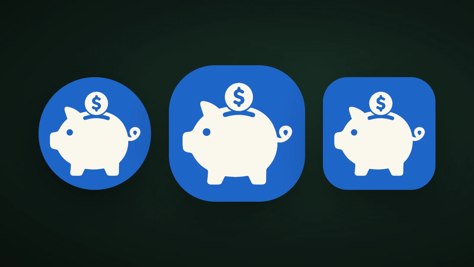
The logo should be between 48 and 66 dp across, centred on the 108 dp layer. Larger and the mask cuts it off; smaller and it turns into a speck. The three placements below use the same foreground under a circular mask:

In AI Icon Creator's test, the same flat piggy bank was placed at 84, 58 and 30 dp on a 108 dp layer and masked to a circle. At 84 dp the mask cut off the snout, tail and coin. At 58 dp, inside the safe zone, the whole pig showed and still filled most of the icon. At 30 dp it was readable but tiny next to other icons. The fix for most designs is simple: scale the artwork until it's around 58–60 dp wide.
Want to try your own symbol? Generate it in a flat style and place it on the layer:
Themed icons and the monochrome layer
A themed icon is an app icon that Android recolours to match the user's wallpaper, and it uses your monochrome layer. From Android 13, if the user turns on themed icons and the launcher supports them, the system tints the monochrome layer with colours taken from the wallpaper and theme. Starting with Android 16 QPR 2, Android also themes icons automatically for apps that don't provide a monochrome layer.

Your colour icon is used instead of a themed one when the user hasn't turned themed icons on, when the launcher doesn't support them, or when your app has no monochrome layer and the device runs a version before Android 16 QPR 2.
Because only the shape of the layer survives, the monochrome layer should be a bold, single-colour version of your symbol, with no gradients, thin lines or small details. Our guide to keeping an icon legible at small sizes explains why. Google's design codelab adds that if you have several apps, you should distinguish them by shape, not only by colour.
Adaptive icon design tips
Google's Design and preview your app icons codelab gives a short list, and it's a good checklist for any adaptive icon:
- Keep the artwork simple and avoid complex shapes. Use a simplified version of your logo if you can.
- Check the contrast between the foreground and the background.
- Avoid heavy drop shadows, which can be mistaken for the system shadow.
- Stay inside the safe zone.
Add one more: test the icon under a circle, a squircle and a rounded square, and in the themed preview. Our guides to app icon colours and app icon design best practices cover contrast and simplicity in more detail.
How to make an Android adaptive icon
To make an adaptive icon, design the foreground and background layers, add an optional monochrome layer, and generate the resources with Android Studio's Image Asset Studio.

- Design the foreground: one bold symbol, 48–66 dp across, on a transparent layer.
- Choose the background: a solid colour, gradient or simple image with strong contrast against the symbol.
- Add a monochrome layer: the same symbol in one colour.
- Generate the icons in Android Studio. In the Project window, switch to the Android view, right-click the
resfolder, and choose New > Image Asset. Set the icon type to Launcher Icons (Adaptive and Legacy), then set the Foreground Layer, Background Layer and Monochrome Layer tabs. If you don't choose a monochrome asset, Android Studio reuses the foreground. - Preview and export. Image Asset Studio previews the icon in different shapes and also generates the legacy, round and 512 × 512 px Google Play Store icons.
The result is an XML file, res/mipmap-anydpi-v26/ic_launcher.xml, that ties the layers together:
<adaptive-icon xmlns:android="http://schemas.android.com/apk/res/android">
    <background android:drawable="@drawable/ic_launcher_background" />
    <foreground android:drawable="@drawable/ic_launcher_foreground" />
    <monochrome android:drawable="@drawable/ic_launcher_foreground" />
</adaptive-icon>
Your app's manifest points at it with android:icon="@mipmap/ic_launcher". The example above reuses the foreground as the monochrome layer, as in Google's documentation; you can supply a separate drawable if the colour version wouldn't work in one colour.
Making the artwork with AI Icon Creator
You can make the symbol in AI Icon Creator and use it as the foreground. Generate it in a flat style, then use the app icon pack: its android/res folder contains an adaptive icon, foreground layers for five screen densities, a background colour, legacy and round icons, and the 512 × 512 px Play Store icon. The whole icon fills the 72 dp visible area, so round and squircle masks trim its corners: keep artwork away from the corners.
For flat styles, the pack also includes a monochrome layer for themed icons, in black on transparent and sized inside the safe zone. For 3D, glass, metal and gradient-background styles there is no clean one-colour shape, so the layer is left out. Android then shows your colour icon, and from Android 16 QPR 2 it themes the icon automatically. The README in the pack says whether yours has a monochrome layer. Our app icon requirements guide lists the checks before you upload.
Frequently asked questions
What is an adaptive icon on Android?
An adaptive icon on Android is a launcher icon built from a foreground and a background layer, which each device masks into its own shape and can animate. It was introduced in Android 8. Adaptive icons can also use an optional monochrome layer, so the icon can be recoloured when users turn on themed icons on Android 13 and later.
What size is an Android adaptive icon?
An Android adaptive icon is made of layers that are each 108 × 108 dp. Only the central 72 dp is visible, and your logo should stay inside the 66 dp safe zone and be at least 48 dp across. Google Play also needs a separate 512 × 512 px store icon.
What is the safe zone of an adaptive icon?
The safe zone of an adaptive icon is the central 66 × 66 dp of the 108 × 108 dp layer, the area that a device maker's mask never clips. Keep your logo inside it. The outer 18 dp on each side is reserved for masking and for effects such as parallax.
Do I need a monochrome layer?
You don't need a monochrome layer, but without one your icon won't be themed on devices before Android 16 QPR 2, and it will show in colour instead. Adding a single-colour version of your symbol lets your icon match the user's wallpaper colours on Android 13 and later.
Can I use the same image for the foreground and monochrome layers?
You can use the same drawable for the foreground and monochrome layers, and Google's documentation does so in its example. It works when the symbol is a single bold shape. If your foreground uses several colours or fine detail, make a separate one-colour version so the themed icon stays clear.
Try a bold symbol for your own app: