

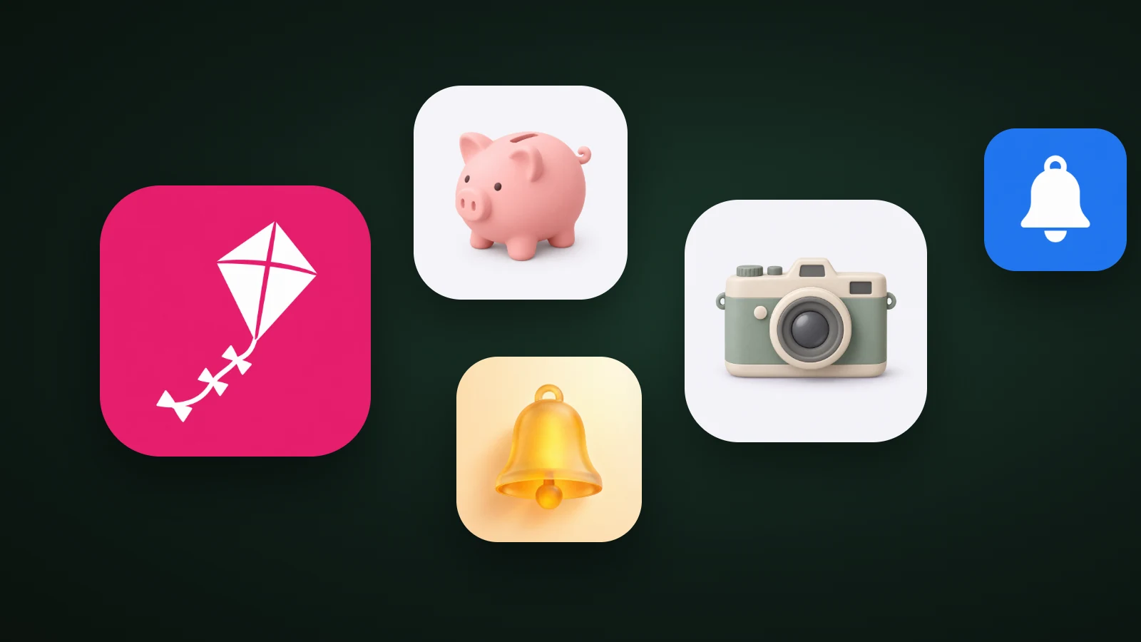
An app icon is the small square image that represents an app on a phone, tablet or computer and in the app stores. It's the first thing people see of your app: on the Home Screen, in search results, in notifications and in Settings, at sizes from about 20 to 60 points. In AI Icon Creator's review of the 100 top free apps in the US App Store on 30 September 2026, 35 icons were abstract marks, 24 a single letter, 18 a symbol or object, 17 a name and 6 a character.
This guide explains what an app icon is, what it's made of, where it appears, how it differs from a logo, a favicon and a badge, and what top apps put in theirs.
What is an app icon?
An app icon is the image that identifies a mobile or desktop app on a device's Home Screen or app list and on its App Store or Google Play page. Apple's Human Interface Guidelines say it appears on the Home Screen and in key locations throughout the system, including search results, notifications, system settings and share sheets, and that a well-designed icon conveys the app's identity clearly and consistently across Apple platforms.
An app icon does four jobs:
- It identifies the app. People find it by shape and colour before they read its name.
- It carries the brand. It's usually the most-seen piece of your brand.
- It's the tap target. It's what people press to open the app.
- It sells the app. On the store page and in search results, it's one of the first things people judge.
What are the parts of an app icon?
An app icon is made of a background, a subject and, for the finished result, whatever the system adds around them: the mask, the badge and the label. You provide the first two as one square image or as layers; the system supplies the rest.

- Background. One colour or gradient that fills the whole square, edge to edge.
- Subject. The symbol, letter or character in front. A good subject is one shape that's clear in solid black.
- Full square. The finished artwork, with no rounded corners. Apple's icons are 1024 × 1024 px, and Google Play's are 512 × 512 px.
- Mask. The system rounds the corners on iOS, or applies a circle, squircle or other shape on Android. Don't draw your own.
- Badge. A small red circle with a number that the system draws on the icon when your app has something new.
- Label. The app's display name, shown under the icon on the Home Screen. It's why the icon itself rarely needs text.
Icons can also be built in layers, a background layer and one or more foreground layers, which the system uses for depth and effects. Our app icon sizes guide explains layers on iOS and Android.
Where does an app icon appear, and how big is it?
An app icon appears in many places, at sizes from 20 to 1024 pixels, so it has to work small. On an iPhone, the Home Screen icon is 60 points (120 or 180 px), Spotlight search shows 40 points, Settings 29 points and notifications 20 points. On Android, the launcher icon is a 48 dp square, drawn from a 108 dp adaptive layer.

The App Store and Google Play use the largest version, 1024 px and 512 px, on your listing page. Xcode makes all the smaller iOS sizes from your single 1024 px image. The full list of sizes is in our app icon sizes guide, and our guide to design principles explains why an icon needs one focal point to survive 20 px.
What do top app icons show?
Top app icons are mostly abstract marks and letters, not pictures. AI Icon Creator's review classified what each of the 100 apps in the US App Store's Top Free chart showed on 30 September 2026, by eye. The icons aren't reproduced here.

- Abstract marks and emblems (35). Shapes that don't depict an object, such as swirls, stars and geometric marks.
- A single letter or lettermark (24). A bold initial, usually on one flat colour.
- Symbols and objects (18). A pin, a play button, a key, a folder.
- Names and wordmarks (17). The brand name as text.
- Characters and mascots (6). Faces, animals and people.
The chart is full of famous brands, so abstract marks and letters work because people already know what they stand for. A new app has to earn that recognition, so a clear symbol tied to what the app does is the safer start. What top icons show changes by category: see our reviews of health and fitness, banking, food and game icons.
App icon vs logo, favicon and badge
An app icon is easy to confuse with several related things. This table separates them.
| Term | What it is | Where it appears |
|---|---|---|
| App icon | The square image that represents an app | Home Screen, search, Settings, store listings |
| Launcher icon | Android's name for the Home Screen app icon, usually adaptive | The Android launcher |
| App Store or Google Play icon | The 1024 px or 512 px version of the same icon | The store listing |
| Logo | Your brand's mark, in any shape, often with the name | Website, ads, store page, documents |
| Favicon | A tiny site icon, 16 to 48 px | Browser tabs and bookmarks |
| Badge | A red number the system draws on the icon | On top of the icon |
The icon is one use of your logo, in a stricter format. Our guide to app logo design shows how to design both from one symbol, and our favicon sizes guide covers the website version.
What makes a good app icon?
A good app icon is simple, recognisable at 32 px, different from its category and consistent with the app's brand. In practice that means:
- One focal point, not a scene.
- A silhouette you can still recognise in solid black.
- One main colour and an accent, with strong contrast between subject and background.
- No words, since the name appears under the icon.
- A look that stands out among the apps in your category.
Our guide to app icon design principles covers each of these with tests.
How is an app icon made?
An app icon can be drawn by a designer, built in a design tool from a template, or generated with an AI app icon generator and then checked at small sizes. Whichever route you choose, the steps are the same: pick one subject, choose a style, make a 1024 px square, and test it at 32 px. Our step-by-step guide on how to make an app icon walks through it.
Try describing your app in one phrase and compare a few styles:
Frequently asked questions
What is an app icon called?
An app icon is also called a launcher icon on Android, a Home Screen icon on iPhone and iPad, and an app store icon when it appears on the App Store or Google Play listing. They're all the same image in different sizes. Some people also call it an app logo, although a logo is your brand's wider mark.
What is an app icon badge?
An app icon badge is the small red circle with a number that the system draws on top of an app's icon to show unread messages or new items. You don't design the badge: your app sends the count, and the operating system draws it. On iOS the badge sits at the icon's top-right corner, so keep key details away from it.
Is an app icon the same as a favicon?
An app icon isn't the same as a favicon, although both are small square images that represent a product. An app icon represents an installed app on a device and in the app stores at 1024 px or 512 px. A favicon represents a website in browser tabs, at 16 to 48 px.
What size is an app icon?
An app icon starts as a 1024 × 1024 px square for iOS, iPadOS and macOS, and 512 × 512 px for the Google Play listing. Android launcher icons use 108 × 108 dp adaptive layers. The system makes the smaller sizes, which run down to about 20 points in notifications.
How do I make an app icon with AI?
To make an app icon with AI, describe one simple subject and the kind of app it's for, generate it in a few styles, choose the one that stays clearest at 32 px, and export it at 1024 px. In AI Icon Creator, you can compare the same subject in several styles side by side and download the sizes each platform needs.
Ready to see your own idea as an icon?