

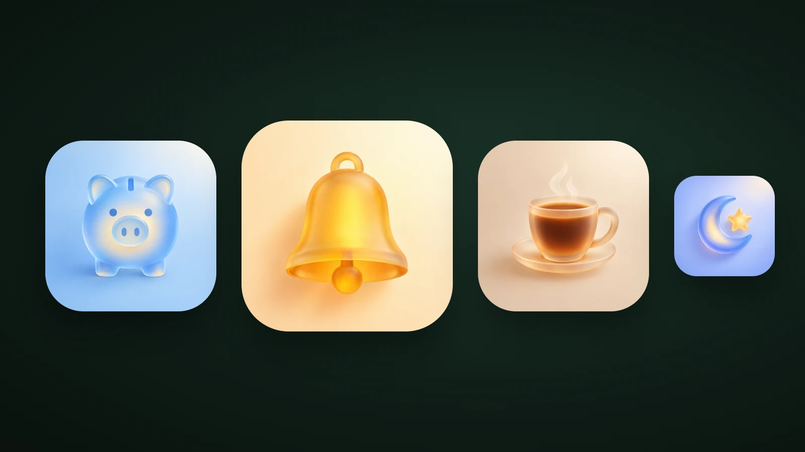
Glassmorphism is a design style that makes interface elements and icons look like frosted glass: translucent, with a blurred background, a thin light border and a soft shadow. It creates depth by letting what's behind an element show through. Its weak spot is legibility. In AI Icon Creator's test of white text on a glass panel over a busy background, blur alone left the lowest contrast at only 1.2:1; adding a 50% dark tint raised it to 4.8:1.
This guide explains what glassmorphism is, how it works, how it differs from Apple's Liquid Glass, and how to use it in app icons without losing readability.
What is glassmorphism?
Glassmorphism is a UI design style that uses different levels of translucency to create depth between foreground and background elements, mimicking frosted glass. That is how the Nielsen Norman Group defines it in its article on glassmorphism best practices. The term was coined by the designer Michał Malewicz of Hype4 Academy, who wanted a name for the many uses of the frosted glass effect in interfaces.
The style has been popular since about 2020, and the same article notes that it's prominent in Apple's and Microsoft's design systems, where glass-like materials separate controls from complex backgrounds. Glassmorphic elements look best in front of gradients or busy backgrounds, where the depth is easy to see.
How does glassmorphism work?
Glassmorphism works by combining two things: opacity and background blur. Nielsen Norman Group describes them as the two main characteristics: lowering an element's opacity shows more of what's behind it, and blurring the background makes those objects hazy, like a shower door or privacy glass. A low-opacity border and gradients add a sense of thickness, especially on simple backgrounds.
On the web, the blur comes from the CSS backdrop-filter property, which applies effects such as blurring to the area behind an element. MDN notes that the element or its background must be transparent or partly transparent for the effect to show, and lists the property as Baseline 2024, meaning it's newly available in the major browsers. A basic glass panel looks like this:
.glass {
  background: rgba(0, 0, 0, 0.5); /* the tint: dark keeps text readable */
  backdrop-filter: blur(16px); /* the frosted effect */
  -webkit-backdrop-filter: blur(16px);
  border: 1px solid rgba(255, 255, 255, 0.4); /* thin light edge */
  border-radius: 20px;
}
Blur alone doesn't make glass readable
Blur alone doesn't make glass readable, because text still sits on top of whatever colours are behind the panel. Nielsen Norman Group lists text readability as one of the most significant problems with glassmorphism, and advises using more blur and meeting contrast requirements. We tested how much each measure helps.

In AI Icon Creator's test, white text was placed on a glass panel over a bright, busy background, built in CSS, and the lowest contrast anywhere behind the text was measured with the WCAG formula:
| Glass panel | Lowest text contrast |
|---|---|
| No blur, light tint | 1.0 : 1 |
| Blur 16 px, light tint | 1.2 : 1 |
| Blur 16 px, 35% dark tint | 3.0 : 1 |
| Blur 16 px, 50% dark tint | 4.8 : 1 |
Blur softened the background but didn't lift the contrast, because the brightest colours behind the panel just spread into the surrounding area. What changed the result was the tint: a darker pane raised the worst case from 1.2:1 to 4.8:1, above the 4.5:1 that the WCAG accessibility guidelines ask for normal-size text. For light text, tint the glass dark; for dark text, tint it light.
Glassmorphism vs Apple's Liquid Glass
Glassmorphism is a design style you build yourself, while Liquid Glass is a material Apple's system renders for you. Apple announced Liquid Glass in June 2025 as a translucent material that reflects and refracts its surroundings and adapts as content and context change. It applies across iOS 26 and Apple's other platforms, including controls, navigation, widgets and app icons.
On the Home Screen, Apple says app icons and widgets are crafted from multiple layers of Liquid Glass, with specular highlights, and that developers can use Icon Composer to make icons that render in light, dark, tinted or clear looks. So on Apple platforms you don't paint the glass yourself. You supply simple layers, and the system adds the highlights and depth. Our app icon sizes guide explains how layered icons and the clear and tinted appearances work.
Glassmorphism is still useful outside Apple's system, in web interfaces, on Android, in marketing art and in icons that you make as a finished image. The two share a look, but they're different tools.
Glassmorphism in app icons
In app icons, glassmorphism means frosted, translucent objects with soft light and a hint of colour inside. It suits calm, light, premium-feeling apps, and it sits naturally next to Apple's glass look.

In AI Icon Creator's test, four glass icons were made in the frosted glass style and measured by comparing the median colour of the object with the background: the piggy bank measured 1.3:1, the bell 1.4:1, the moon 1.8:1 and the coffee cup 1.9:1. All four were below 2:1, yet they didn't all fail at small sizes. At 32 px the amber bell and the blue moon with its yellow star still read, because each has a saturated colour core that stands out. The almost colourless piggy bank faded to a ghost, and in greyscale the cup lost its outline.
The lesson matches the text test: glass needs something solid to hold on to. For icons, that's a coloured core, a bold silhouette, or a saturated background plate. Our guide to 3D app icons compares frosted glass with clay, glossy and chrome materials, and the app icon colours guide explains what tinted and clear modes do to a glass icon.
When to use glassmorphism, and when not to
Glassmorphism works best when used sparingly, on top of colourful or simple backgrounds, for a few elements that need depth. Nielsen Norman Group recommends exactly that, along with letting users reduce transparency or increase contrast. Apple's accessibility settings do this by replacing glass components with solid colour.
- Use it for overlays, navigation bars, cards over images, and premium, calm or creative app icons.
- Avoid it for dense text, small controls over busy content, and any icon that has to be readable in a notification or a tab.
- Always test contrast on the real backgrounds, at small size, and in tinted mode.
Our guide on how to choose an app icon style compares glass with flat, clay and character styles. For the soft, solid cousin of glass, see our guide to claymorphism.
How to make a glass app icon
To make a glass app icon, start from a bold silhouette, give the glass a colour core, put it on a saturated or mid-tone plate, and test it small.

- Start from a bold, simple silhouette. A crescent, a bell or a cup works; a busy scene doesn't.
- Give the glass a colour core, such as an amber bell or a yellow star.
- Put it on a saturated or mid-tone plate. Pale glass on a pale background disappears.
- Test small, in tinted mode and in greyscale. Our guide to keeping an icon legible at small sizes shows how.
In AI Icon Creator, choose the frosted glass style, one of the 14 app icon styles, describe only the object, and compare it with other styles:
Frequently asked questions
What is glassmorphism?
Glassmorphism is a design style that makes interface elements and icons look like frosted glass, using translucency, a blurred background, a thin light border and a soft shadow. The term was coined by designer Michał Malewicz. It's used for overlays, cards and app icons, and it depends on colourful or simple backgrounds to show its depth.
Is glassmorphism still popular?
Glassmorphism is still popular. Nielsen Norman Group notes that it's prominent in Apple's and Microsoft's design systems, Apple's Liquid Glass brought translucent icons to iOS 26, and Google Ads data shows roughly 4,400 to 6,600 monthly US searches for "glassmorphism" in the year to August 2026.
What are the downsides of glassmorphism?
The main downside of glassmorphism is readability: text on translucent panels can fall over bright or busy colours, so contrast varies across the panel. In AI Icon Creator's test, blur alone left white text at 1.2:1 contrast. Use a tint, more blur, and settings that let people reduce transparency.
Is Liquid Glass the same as glassmorphism?
Liquid Glass is not the same as glassmorphism, though they look alike. Glassmorphism is a design style you build yourself with blur and transparency, while Liquid Glass is Apple's material in iOS 26 and its other platforms, which the system renders with highlights that respond to context.
How do I make a glassmorphism icon?
To make a glassmorphism icon, choose a bold, simple subject, use a frosted glass style, give the glass a saturated colour core, and place it on a mid-tone or saturated background. Then check it at 32 px, in greyscale and in tinted mode. An AI icon generator lets you compare several styles quickly.
Ready to try? Make your subject in a glass style and compare: