

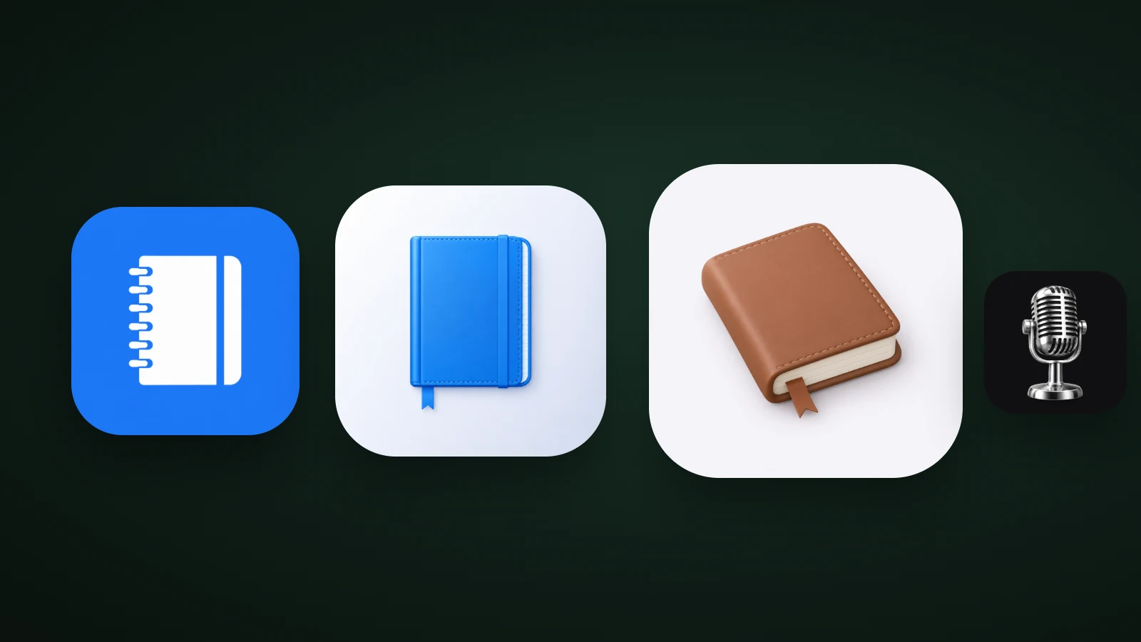
Skeuomorphism is a design approach in which digital things imitate real-world objects: their shapes, textures, materials and shadows. In app icons, a skeuomorphic icon looks like a real object, such as a leather notebook, a chrome microphone or a camera, with light and material. Apple moved away from the style with iOS 7 in 2013, but its ideas are back in today's soft 3D, glass and metal icons. In AI Icon Creator's test of four such icons, all four stayed recognisable at 32 px, but the details that made them look real, such as stitching and grille lines, disappeared first.
This guide explains what skeuomorphism is, how it rose and fell, what replaced it, and how to use it in an app icon today.
What is skeuomorphism?
According to Wikipedia, a skeuomorph is a derived object that keeps decorative features from parts the original needed in order to work. In interfaces, skeuomorphism means making digital elements look and behave like the physical things they replace.
The Nielsen Norman Group's article on skeuomorphism separates two meanings that people often mix up:
- A functional learning aid. An interface element resembles something from the real world so that new users understand it. The trash bin, the folder, the paper document and the floppy disk for "save" all work this way. NN/g notes that in this sense skeuomorphism "has never been truly dead": macOS still uses a folder and a sheet of paper with a folded corner.
- A visual-design trend. The excessive use of realistic textures, shadows and gradients that weren't needed for the design to work. This is what most people mean today, and it's what went out of fashion.
A short history: from leather notepads to iOS 7
Skeuomorphic design helped people move from physical tools to digital ones, peaked in the early 2010s, and gave way to flat design after Apple announced iOS 7 in 2013.

According to NN/g, skeuomorphism was at its peak in the early 2010s, when e-readers were drawn as wooden bookshelves and note-taking apps came with leather binding, faux-ripped pages and shadowed indentations. Wikipedia adds that Apple, under Steve Jobs, was known for wide use of skeuomorphic design in Mac OS X and its apps. After Jobs's death, Scott Forstall, described as the leading proponent of that visual style, resigned, and designer Jonathan Ive took over part of his responsibilities. With the announcement of iOS 7 at WWDC in 2013, Apple officially shifted to a simpler design.
The criticism was consistent. The heavy textures added clutter and slower load times, made some interactions clunky, and looked dated once the novelty wore off. Flat design replaced them. Flat then had its own problem: without any shadows or texture, interfaces had weak signifiers, meaning it was harder to tell what could be pressed. NN/g describes neumorphism as the next step, reintroducing subtle skeuomorphic elements.
Skeuomorphism vs flat, 3D, clay and glass
Skeuomorphism sits at one end of a scale that runs from flat shapes to realistic objects, and most modern styles are somewhere in between. This table compares the ones app icons use:
| Style | What it imitates | Detail level | Best for |
|---|---|---|---|
| Flat | Nothing: bold shapes and flat colour | Low | Tools, finance, anything that must read small |
| Skeuomorphism | A real object, with its materials | High | Hardware-like apps, audio, camera, nostalgia |
| Soft 3D | A soft, simplified object | Medium | Consumer and lifestyle apps |
| Claymorphism | Modelling clay | Medium | Friendly, playful apps |
| Glassmorphism | Frosted or clear glass | Medium | Calm, premium, layered looks |
Our guides to icon styles, 3D app icons, claymorphism and glassmorphism look at each of the others in detail.
Skeuomorphic app icons today
Skeuomorphic app icons today are realistic-looking objects that keep their materials but simplify their shapes. Apple's own direction shows the trend: in June 2025 it introduced Liquid Glass, a translucent material with highlights that reflects its surroundings, and described app icons as crafted from multiple layers of it. The 2012 look of stitched leather and felt hasn't returned, but light and material have.

In AI Icon Creator's test, one notebook was made at three levels of realism: a flat version, a glossy 3D version with an elastic band and bookmark, and a detailed leather version with stitched edges, paper and a ribbon. A chrome vintage microphone was added as a metal example. All four were shrunk to 60, 32 and 20 px, and the contrast of each object against its background was measured with the WCAG formula: 4.2:1 for the flat notebook, 3.2:1 for the glossy one, 3.9:1 for the leather one and 7.1:1 for the microphone.
Realism didn't cost contrast here; it cost detail. At 32 px every icon was still recognisable, but the elements that made it look real were the first to go: the elastic band and bookmark merged into a stripe, the stitching and page edge disappeared from the leather book, and the microphone's grille lines turned into grey texture. At 20 px the tall, narrow microphone shrank to a sliver. What survived in every case was the silhouette and the main colour.
That's the practical lesson for skeuomorphic icons today: the silhouette carries the icon, and the realism is a bonus for large sizes. Choose objects with a bold, recognisable shape, and treat stitching, screws and grilles as decoration that will vanish. Our guide to keeping an icon legible at small sizes explains why.
How to make a skeuomorphic app icon
To make a skeuomorphic app icon, pick one object with a clear real-world form, give it one material, light it once, cut detail until it reads, and test it small.

- Choose one object with a clear real-world form. A notebook, a camera, a microphone or a clock. Objects that people can name at once work best. Our guide to icon metaphors helps you choose.
- Choose the material. Leather, metal, glass, plastic or wood. Give the object one main material, not five.
- Light it once. One light from the top left, gentle shading, and a small contact shadow that stays inside the icon.
- Cut detail until it reads. Keep the features that identify the object and drop the rest.
- Check contrast and test small. Aim for at least 3:1 between the object and the background, then view it at 60, 32 and 20 px and in greyscale.
In AI Icon Creator, you describe the object and choose a style. The soft 3D, glossy, metal and glass styles, from the 14 app icon styles, give the material and light. Compare several:
When to use skeuomorphism, and when not to
Skeuomorphism suits apps that are about a physical thing or want a tactile, nostalgic feel. It's a poor fit for apps that need to be readable at a glance in a crowd of other icons.
- Use it for audio and music tools, cameras, journals and notebooks, games with a physical theme, and brands that want a crafted, premium look.
- Avoid it for abstract or service apps with no obvious object, very small placements such as notifications and browser tabs, and categories where every competitor already looks the same.
- Always check that the icon works as a silhouette. Our guide on how to choose an app icon style compares skeuomorphic looks with flat, clay and glass.
Frequently asked questions
What is skeuomorphism?
Skeuomorphism is a design approach in which digital elements imitate real-world objects through their shape, texture, material and shadow, such as a trash bin icon, a stitched leather notebook or a floppy disk for "save". It helps new users recognise what an element does, but heavy realism adds clutter and looks dated.
Is skeuomorphism outdated?
Skeuomorphism as a heavy visual trend is outdated: Apple shifted away from it with iOS 7 in 2013. Skeuomorphism as a learning aid is not, because icons such as the folder and the paper document still rely on real objects. Today's soft 3D and glass icons bring back some of its depth without the clutter.
Did Steve Jobs like skeuomorphism?
Under Steve Jobs, Apple was known for using skeuomorphic designs widely in Mac OS X and its apps. After his death, Scott Forstall, a leading supporter of that style, resigned, and Jonathan Ive took on part of his responsibilities. Apple announced the shift to a simpler design with iOS 7 at WWDC in 2013.
What replaced skeuomorphism?
Flat design replaced skeuomorphism, with clean colours and no realistic textures. Flat interfaces had weak signifiers, so styles such as neumorphism, claymorphism and glassmorphism later brought back soft light and shadow. In app icons, soft 3D, glass and metal styles now carry much of that depth.
Should I use a skeuomorphic style for my app icon?
Use a skeuomorphic style for your app icon if your app is about a physical object and you want a tactile, crafted look. Choose an object with a bold silhouette, give it one material, and check it at 32 px. If your app is abstract, a flat or soft 3D style is usually easier to recognise.
Try your own object in a few styles: