

An app logo is the mark that represents your brand everywhere: on your website, store page, ads and splash screen. An app icon is that mark's square, full-bleed, wordless form for the Home Screen. The best way to design an app logo is to start with one symbol and derive the icon, the horizontal lockup with the name and the small favicon from it. In AI Icon Creator's review of three US App Store top charts, only 6 of 99 top Productivity icons showed the app's name, against 40 of 100 in Food & Drink, so the right amount of text depends on how well known your brand already is.
This guide explains the difference between a logo and an icon, what top apps do, why a full logo doesn't fit in an icon and how to design both together.
What is the difference between an app logo and an app icon?
An app icon is a square image that represents your app on a device and in the app stores, while an app logo is your brand's identifying mark, which can take any shape and can include the name. The icon is one use of the logo, and it has stricter rules.
| App logo | App icon | |
|---|---|---|
| Where it appears | Website, store page, ads, splash screen, documents | Home Screen, search, notifications, Settings, store listings |
| Shape | Any: symbol, wordmark or lockup | A full square that the system masks |
| Text | Often includes the name | Usually none |
| Background | Transparent or any colour | Opaque, full-bleed |
| Format | Vector (SVG or PDF) is best | PNG at 1024 × 1024 px for iOS and 512 × 512 px for Google Play |
| Smallest size | Set by you | About 20 to 32 px in lists and notifications |
The two should look like one brand, but they are different files made for different jobs. Our app icon sizes guide lists the exact icon sizes for each platform.
What do top apps put in their icons?
Top apps put very different amounts of text in their icons, depending on their category and how well known they are. AI Icon Creator's review classified what each icon shows, by eye, in three US App Store Top Free charts on 30 September 2026. The icons aren't reproduced here.

- Food & Drink: 40 of 100 icons showed the name as text and 21 a single letter. Most of the chart is restaurant chains whose names people already know.
- Finance: 25 showed the name and 20 a letter.
- Productivity: only 6 of 99 showed the name and 18 a letter. Most were pictures.

Productivity is the closest to what a new app faces. The 99 icons were 41 symbols and objects, such as a key, a cloud or a shield, 28 abstract marks, 18 letters, 6 names and 6 characters. Names work in food and finance because those brands are already known and the icon is a reminder. A new app has nothing to remind people of, so a symbol has to do the work. Our guide to icon metaphors helps you choose one.
Why a full logo doesn't fit in an app icon
A full logo, with a symbol, a name and a tagline, doesn't fit in an app icon because the text becomes unreadable at the sizes icons are seen at. Apple's Human Interface Guidelines say to include text only when it's essential to your experience or brand, that text in icons is often too small to read easily and can make an icon cluttered, and that your app's name usually appears nearby anyway. They suggest a mnemonic such as the first letter of the name instead.

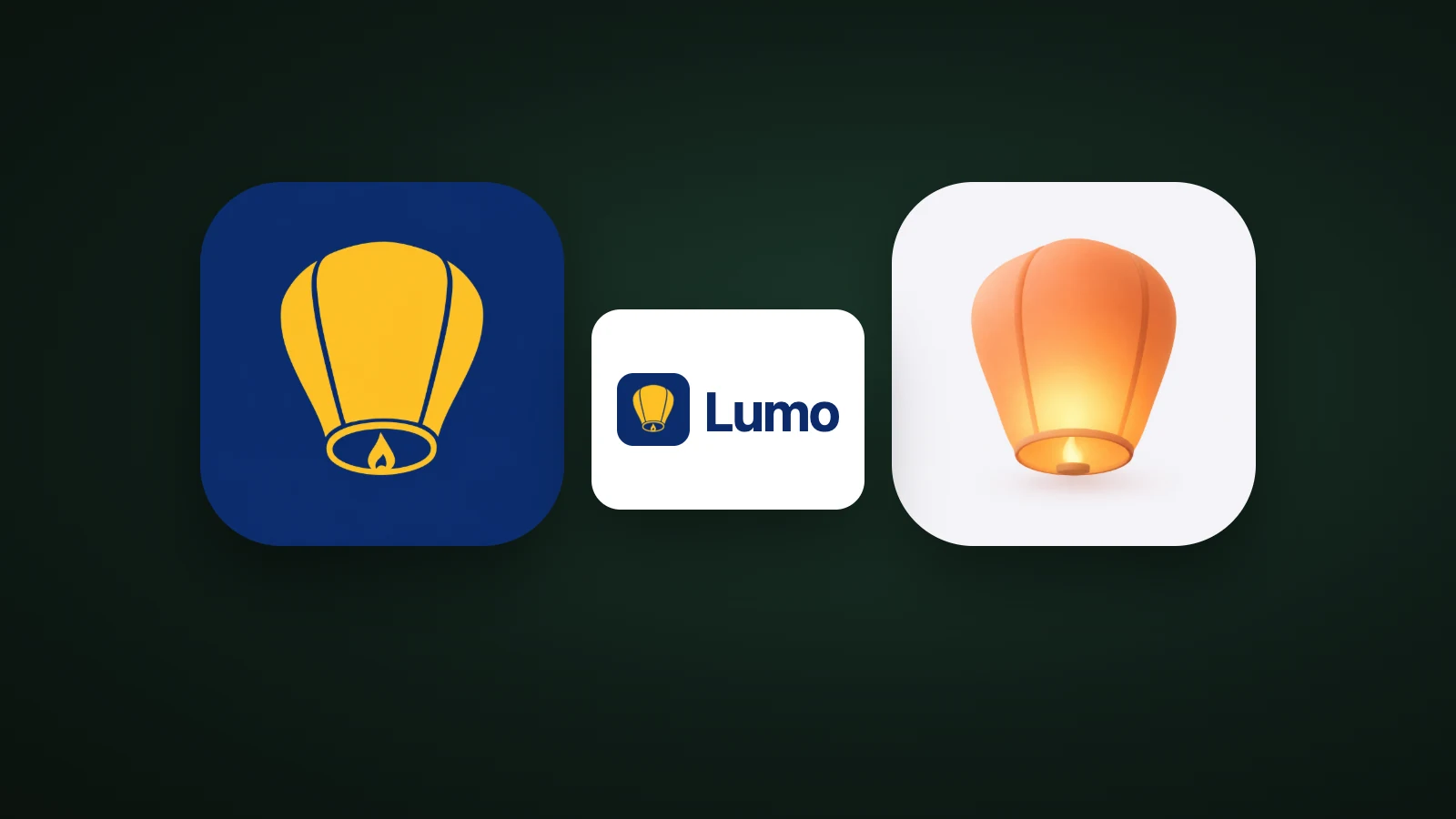
In AI Icon Creator's test, a made-up brand called Lumo was shown twice: as an icon that repeated the whole logo, with the lantern, the name and a tagline, and as the lantern alone. At 60 px, the size on a Home Screen, the tagline was already a smudge. At 32 px the name was barely readable. The lantern alone stayed a lantern at 20 px. Our guide to keeping an icon legible at small sizes has more examples.
One mark, three forms
A brand needs one symbol used in three forms: the app icon, the logo lockup and the small favicon or avatar. The symbol is the same in each; only the frame and the amount of text change.

- App icon. The symbol alone on a full square, at 1024 × 1024 px. It can be richer than your logo: the same lantern can be flat, clay or glossy. Our guide to choosing an app icon style compares them.
- Logo lockup. The symbol beside the name, horizontally, on transparent or white. This is what goes on the website header and the store page.
- Favicon and avatar. The symbol alone again, at 32 px and in a circle. Our favicon sizes guide lists the files a website needs, and the free favicon converter makes them from one image.
Try your own symbol in a few styles:
How to design an app logo and icon together
To design an app logo and icon together, choose the symbol first, then build the icon, the lockup and the small forms from it, and test all three together.

- Write the brand in three words, such as warm, simple and reliable. You'll check every choice against them.
- Design the symbol first. Use one shape that means something to your users, and check it in solid black. If it works as a silhouette, it works everywhere.
- Turn the symbol into the app icon: a full square with no words. You can go richer than the logo, with the same shape in flat or 3D.
- Build the lockup and the small forms. Put the name beside the symbol for the website and store page, and use the symbol alone for the favicon and avatar.
- Test all three together. The colours should match, the icon should work at 32 px, and the lockup should work on light and dark backgrounds.
Our step-by-step guide on how to make an app icon covers step 3 in detail.
Common app logo mistakes
- Putting the whole logo in the icon. The name and tagline vanish at small sizes. Use the symbol, or one letter if your brand is known by its initial.
- Designing the lockup first. A wide logo with a name is hard to turn into a square. Start from the symbol.
- Two different marks. An icon and a logo that don't share a shape or colour make the brand look like two products.
- Too much detail. Fine lines and gradients are the first things to disappear at 32 px. Our guide to minimalist app icons shows how few colours the top apps use.
- Copying a known brand. A shape and colour close to an established app can confuse people and cause legal trouble.
Frequently asked questions
Is an app logo the same as an app icon?
An app logo isn't the same as an app icon, although the two share a symbol. The logo is your brand's mark in any shape, often with the name, while the app icon is its square, full-bleed, wordless version for the Home Screen and app stores. Design the symbol once and adapt it to both.
Can I use my company logo as my app icon?
You can use your company logo as your app icon if it's a simple symbol that's still recognisable at 32 px, but a logo with a name or a tagline should be reduced to its symbol or an initial first. Put the symbol on a full square, and don't add rounded corners or shadows: iOS and Google Play add them.
Should my app icon include the app name?
Your app icon shouldn't include the app name in most cases, because the name already appears under the icon and text is hard to read at small sizes. Apple recommends text only when it's essential to your experience or brand. In the top Productivity chart, only 6 of 99 icons showed a name.
What size should an app logo be?
An app logo doesn't have one size, because it appears on many surfaces, so it should be a vector file such as SVG that scales to any size. The app icon derived from it has fixed sizes: 1024 × 1024 px for iOS and 512 × 512 px for Google Play. The favicon needs its own small files.
How do I make an app logo with AI?
To make an app logo with AI, describe one simple symbol for your app, generate it in a few styles, pick the one that's clearest at 32 px and then add the name beside it to make the lockup. In AI Icon Creator you can compare the same symbol in any of the styles, side by side.
Ready to find your symbol?