

A good food app icon is warm, simple and instantly edible-looking: one dish or symbol, one warm main colour and no more detail than survives at 32 px. In AI Icon Creator's review of the 100 top free Food & Drink apps in the US App Store on 30 September 2026, 40 icons were a name and 21 a single letter, so names and letters made up 61 of them. Only 14 showed food or a utensil, and red, orange and yellow edges covered 36 of the 100. New apps don't have the name recognition those brands do, so their icons have to work as pictures.
This guide shows what the category looks like, which colours it uses, how the same dish changes across styles, why food detail disappears at small sizes and which icon ideas suit which kind of food app.
What do food and drink app icons look like?
Food and drink app icons are mostly names, letters and mascots, not pictures of food. AI Icon Creator's review looked at the 100 apps in the US App Store's Top Free chart for Food & Drink on 30 September 2026, most of them restaurant chains, coffee shops and delivery apps. We classified what each icon shows by eye. The icons aren't reproduced here.

- Names and wordmarks (40). The brand name on a solid colour, common for chains people already know.
- A single letter or lettermark (21). A bold initial or a monogram in a circle or square.
- Characters, mascots and faces (15). People, animals and cartoon faces, including a rooster, a panda and a goose.
- Food or utensil symbols (14). A slice, a pepper, a burger, a spoon and fork, a plate.
- Abstract marks and emblems (10). Shapes that don't depict food at all.
Text-led icons dominate because most of the chart belongs to established restaurant brands. A name works when people already know it; a new app has to earn that recognition, and a small clear picture is the faster way. Our guide to icon metaphors explains how to choose one.
Which colours do food app icons use?
Food app icons lean on warm colours and white. In the same chart, we measured the median colour of each icon's outer edge: 34 were white or near white, 20 red, 11 blue, 11 orange, 6 black or very dark, 5 green, 5 yellow, 3 teal, 3 pink and 2 purple.

Red, orange and yellow together cover 36 of the 100, and white adds 34 more, so 70 icons sit on a warm colour or white. Colour was also restrained: 12 icons used one main colour, 47 used two and 28 used three, so 87 used three or fewer. Our guide to minimalist app icons explains how main colours were counted.
The gap is at the other end. Green, teal and purple covered only 10 of the 100 icons, even though green is a natural colour for fresh, healthy or plant-based food. A grocery, salad or meal-kit app that uses green sits apart from most of the chart; a burger or pizza app in red joins the crowd, so it needs a distinctive shape instead. Our guide to app icon colours has measured contrast for eight backgrounds.
Should a food app icon show food?
A food app icon doesn't have to show food, but a picture of one dish is the quickest way for a new app to say what it does. In AI Icon Creator, the same subject, "a slice of pizza", was made in three styles, and each one told a different story.

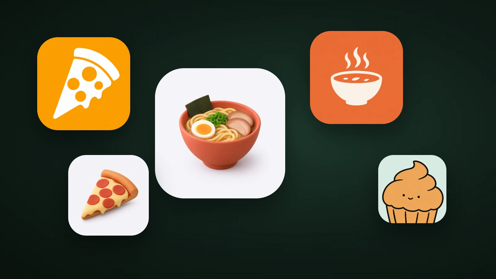
- Flat turned the slice into a white shape on orange. It's bold, readable at 32 px and cheerful, and the orange does the work of saying "food".
- Clay 3D kept natural colours: golden cheese, red pepperoni and a toasted crust. It looks the most edible, and it also stays recognisable at 32 px because the slice has a distinct triangle shape.
- Glossy 3D came out blue on Auto colours. The shape is still a pizza slice, but a blue slice doesn't look like something to eat. Setting the colour yourself fixes that.
Food is one of the categories where natural colours carry the meaning. A blue or purple dish reads as a toy or a tech product unless the shape is unmistakable. Our guide to claymorphism icons explains why the soft clay look suits food, and our guide to choosing an app icon style compares the other families.
Try your own dish in a few styles:
Why food detail disappears at small sizes
Food photographs and rich 3D dishes lose their detail long before an icon reaches 32 px, because appetising food is made of many small parts: toppings, sauce, garnish, steam. An app icon appears at 60 px on a Home Screen and at 32 px or less in Settings, notifications and search results.

In AI Icon Creator's test, a clay 3D ramen bowl with an egg, seaweed, noodles, spring onion and pork looked delicious at full size. At 32 px the toppings blurred into a small patch, and the red bowl carried the icon. A flat bowl with three curls of steam kept its shape at 20 px. Both are bowls, but only the second is designed for small sizes.
If you love the rich look, keep it and cut the content: a bowl with two toppings, a burger with three layers, a cake with one candle. Apple's Human Interface Guidelines ask for a simple design built around one core idea and recommend illustrations over photos, and both points apply doubly to food. Our guide to keeping an icon legible at small sizes has a checklist.
Four food app icon ideas
Each kind of food app has a subject people expect. Here are four, with a note on when each works:

- Restaurants and delivery: one dish as a bold shape. Pick the dish your cuisine is known for, and use a flat or clay style so it stays clear small.
- Recipes and cooking: a bowl, a pot or a utensil. Steam adds warmth without adding detail. A chef's hat is the first idea most cooking apps reach for, so it's easy to confuse with others.
- Bakeries and desserts: a friendly character. A cupcake with a face gives a small brand personality, and characters were 15 of the top 100. Our guide to app icon ideas shows how characters compare with objects.
- Cuisine and discovery apps: a rich 3D dish. It reads as delicious, but cut the toppings to two or three so it survives small sizes.
What to avoid in a food app icon
Four mistakes come up again and again:
- Looking like a chain. Real restaurant marks are trademarks. A red, yellow or striped icon with a similar mascot or letter can confuse people and cause trouble. Search the stores for icons with a similar shape and colour before you commit.
- A whole plate. A dish with fork, knife, garnish and steam turns to noise at 32 px. Show the dish or the utensil, not the table.
- Text. Names, prices and offers are unreadable at icon sizes, and Google Play's icon specifications rule out graphics that suggest deals or rankings.
- Off-colour food. Blue, purple or grey food looks unappetising. Keep food colours natural, or move the surprise to the background.
How to design a food app icon
To design a food app icon, pick one dish or utensil, give it a warm or fresh main colour, choose a style that keeps food colours natural and cut detail until it works at 32 px.

- Pick one dish, ingredient or utensil, the one thing people come to your app for.
- Choose one main colour. Red, orange and yellow are the category's language; green, teal and purple are rare.
- Try flat, clay and glossy on the same subject and check that the food colours stay natural.
- Cut detail until it works at 32 px, then test on light and dark wallpapers.
- Compare it with the top ten in your niche, so it looks like food without looking like a chain.
In AI Icon Creator you can describe the dish, compare it in a few styles and adjust the colours. Here is a recipe-app example:
Frequently asked questions
What colour should a food app icon be?
A food app icon works best in a warm colour such as red, orange or yellow, or on white, because those colours covered 70 of the top 100 US Food & Drink icons on 30 September 2026. If your niche is fresh or plant-based, green is rarer and can help you stand out. Keep contrast high so the icon survives dark and tinted modes.
Should a food delivery app icon show food?
A food delivery app icon can show one dish, a utensil or a simple symbol, but the top delivery apps mostly use names, letters and abstract marks because their brands are already known. A new delivery app has no such recognition, so one clear dish such as a pizza slice or a bowl helps people understand it immediately.
What makes a good restaurant app icon?
A good restaurant app icon shows one distinctive dish, symbol or letter, uses one or two brand colours and stays clear at 32 px. It should match your signage and menu, so guests recognise you on their Home Screen, and it should not resemble a bigger chain's mascot or colours.
Can I use a photo of food as my app icon?
You shouldn't use a photo of food as your app icon, because photos lose their detail at small sizes and look different on every wallpaper. Apple's Human Interface Guidelines recommend illustrations over photos. A simple illustration or soft 3D render of the dish keeps the appetite appeal and stays readable at 32 px.
How do I make a food app icon with AI?
To make a food app icon with AI, describe one dish or utensil and the kind of app it's for, generate it in a few styles, and check the results at 32 px and on light and dark wallpapers. In AI Icon Creator you can compare the same dish in any of the 14 app icon styles side by side.
Ready to try your own dish?