

Most health and fitness app icons are built from letters or a logo, with a smaller group using a heart, a person, food, a leaf or a moon. In AI Icon Creator's review of the 100 top free Health & Fitness apps in the US App Store on 30 September 2026, 39 used letters, wordmarks or brand logos, 15 an abstract shape, 8 a person, and 7 each a heart, food or a leaf, flower or mountain. Only 7 had a green background; 25 were white and 20 blue. That leaves room for a clear, simple symbol that stands out.
This guide shows what the category looks like, what the colours say, and six icon ideas for different kinds of health and fitness apps.
What do health and fitness app icons look like?
Health and fitness app icons are dominated by letters and abstract marks rather than pictures. AI Icon Creator's review looked at the 100 apps in the US App Store's Top Free chart for Health & Fitness on 30 September 2026. We took each icon's colours by measurement, and classified what it shows by eye. The icons themselves aren't reproduced here.

- Letters, wordmarks and brand logos (39). Well-known brands and clinics lean on their name or logo, and many newer apps use a single bold letter.
- Abstract shapes and rings (15). Geometric marks, rings and gradients.
- Person figures (8). A runner, a walker, someone stretching or doing a push-up.
- Hearts and pulse lines (7). The classic health symbol, and a crowded one.
- Food and fruit (7). Carrots, avocados and apples for nutrition and calorie apps.
- Leaves, flowers and mountains (7), moon and sun (6), equipment and devices (6) and mascots (5) make up the rest.
The takeaway is that letters and abstract marks make up more than half the chart, while recognisable objects are a minority. A simple, clear symbol is a way to look different from most of them, which is the advice in our guide to app icon design best practices and in Apple's Human Interface Guidelines, which ask for a simple design built around one core idea.
Which colours do health and fitness app icons use?
White is the most common edge colour among the top health and fitness icons, followed by blue and black. Green, which many people associate with health, is much rarer than you'd expect.

We measured the median colour of each icon's outer 6 px: 25 icons were white or near white, 20 blue, 16 black or very dark, 9 orange, 9 red, 7 green, 5 teal, 4 grey, 3 purple and 2 yellow or pink. So 41 of 100 use a white or near-black background, and blue plus teal make up 25. Only 7 lead with green.
What that suggests:
- White and blue signal calm and trust, which suits health monitoring, medical and wellbeing apps, and it also makes those icons look alike.
- Black and dark backgrounds signal premium and focus, and suit performance and training apps, and sleep apps at night.
- Orange and red signal energy, and are common for workouts and running. Together they make up 18 of the 100.
- Green is a real gap. It's less used than the "healthy" stereotype suggests, so a well-made green icon can stand out.
Whatever you pick, check the contrast between the subject and the background, and how the icon looks on light and dark wallpapers. Our guide to app icon colours has measured contrast for eight backgrounds.
Six health and fitness app icon ideas
The best health and fitness app icon shows one simple subject that matches what the app does. Here are six, one for each kind of app:

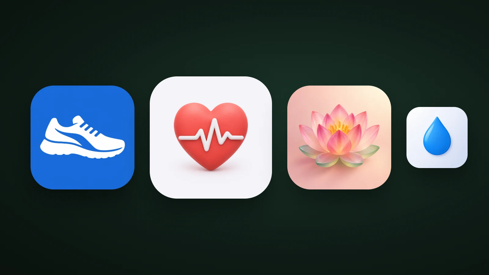
- Strength and workouts: a dumbbell. Bold equipment reads at small sizes. Red and orange backgrounds are used by 18 of the top 100, so a blue or green version would stand out.
- Running and steps: a running shoe. One bold shape on a strong colour reads best small. A shoe is also more distinctive than the person figures in 8 of the top 100.
- Heart and vitals: a heart with a pulse line. It's instantly understood but crowded, since 7 of 100 use a heart. Change the colour or the shape, or add a second idea.
- Meditation and yoga: a lotus. A soft glass or clay lotus feels calm. Keep the petals bold enough to read at 32 px; our guide to glassmorphism shows why soft glass needs a saturated core.
- Sleep: a crescent moon. Deep blue or purple backgrounds are common. A star or a warm colour core keeps the moon readable.
- Hydration and nutrition: a water drop, or one piece of fruit or vegetable. Keep it to one object on a clean background.
For more ideas by category, see our guide to app icon ideas, and for how to choose between them, our guide to icon metaphors.
Health apps vs fitness apps: how the icons differ
Health app icons usually aim for trust and calm, while fitness app icons aim for energy and motivation. A health app, such as a medical, vitals or clinic app, does well with a clean symbol, plenty of white space and cool colours. A fitness app, such as a workout, running or gym app, can use stronger colour, bolder shapes and motion.
Two cautions apply to health apps. Don't use protected emblems such as the red cross, which is restricted in many countries and can imply an official or medical affiliation. And don't copy the heart-on-white look of well-known health icons: a heart on a white background is also the look of the Health app built into iPhones, so it invites confusion.
How to make a health or fitness app icon
To make a health or fitness app icon, pick one subject for what your app does, choose a colour that differs from your closest competitors, and test it small.
- Look at the top ten apps in your sub-category on the App Store and Google Play. Note their subjects and colours.
- Pick one subject that they don't use. If all of them use hearts, try a different symbol.
- Choose a style and a colour that fit the feeling: calm, energetic, premium. Our guide on how to choose an app icon style helps.
- Test small. View it at 60, 40 and 20 px, in greyscale and on light and dark wallpapers. Our guide to keeping an icon legible at small sizes has the checks.
In AI Icon Creator, describe the subject and compare it in several styles:
Frequently asked questions
What colour should a health app icon be?
A health app icon is most often white or blue, which signal calm and trust, but that also makes many of them look alike. In the top 100 US Health & Fitness apps we reviewed, 25 had white edges and 20 blue, and only 7 green. Choose a colour that differs from your closest competitors and keeps 3:1 contrast with the symbol.
What should a fitness app icon look like?
A fitness app icon should show one bold, simple subject, such as a dumbbell, a shoe or an abstract mark, on a strong colour that suggests energy. Red, orange and dark backgrounds are common. Avoid detail: the icon has to stay readable at 20 to 30 px in Settings and notifications.
Should a health app icon use a heart?
A health app icon can use a heart, but it's a crowded choice: 7 of the top 100 US Health & Fitness icons in our review used one. If you use a heart, make it distinctive with a different colour, an unusual shape or a second idea such as a leaf or a pulse line, and avoid the plain heart on white.
Should I use a letter or a symbol for my health app icon?
Use a letter if your app has a short, distinctive name and a strong brand; use a symbol if you want to be recognised by what the app does. Letters and logos were 39 of the top 100, so a clear symbol can help a new app stand out.
How do I design a wellness or meditation app icon?
To design a wellness or meditation app icon, choose one calm subject, such as a lotus, a moon, a leaf or a simple circle, in a soft style with gentle colours. Then make sure it holds up: pastel on pastel loses contrast, so use a saturated core or a mid-tone background.
Ready to try your own idea? Compare a few subjects in a few styles: