

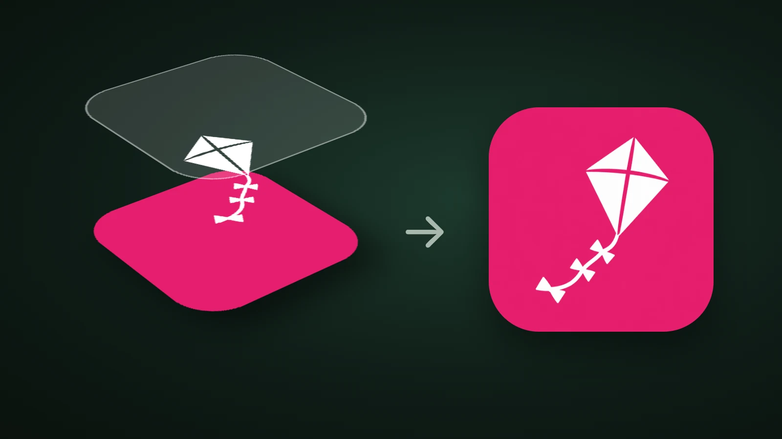
Icon Composer is Apple's app for building layered app icons with the Liquid Glass material. You import your artwork as separate layers in SVG or PNG format, group them, adjust the glass effects, choose how the icon looks in Default, Dark and Mono, and save one file that Xcode uses for iPhone, iPad, Mac and Apple Watch. As of 30 September 2026, Apple's page says it requires macOS Tahoe 26.4 or later. You don't need it to ship an icon: a single 1024 × 1024 px image still works. You need it when you want control over the layers.
This guide explains what Icon Composer does, whether you need it, how to prepare artwork for it and how to get from layers to an icon in Xcode.
What does Icon Composer do?
Icon Composer turns layered artwork into a single icon file that the system renders for every platform, appearance and size. According to Apple's Icon Composer page and its Xcode documentation, it lets you:
- Build a layered icon from a single design for iPhone, iPad, Mac and Apple Watch, with consistent enclosure shapes and a shared grid.
- Apply Liquid Glass to each layer: specular highlights, blur, refraction, translucency and shadows.
- Control appearances in one file: how the icon looks in Default, Dark and Mono, with previews of clear and tinted variants.
- Export a flattened version for marketing and communication.
- Add the file to Xcode, where it replaces any existing icon asset catalog. For earlier OS releases that don't have the Liquid Glass material, Xcode generates similar-looking images from the file at build time.
Apple's documentation adds that in the versions of iOS, iPadOS, macOS and watchOS earlier than 27, specular highlights show when you choose Inside or Outside, while refraction settings have no visible effect. Check Apple's pages after each WWDC, because these details change with each release.
Do you need Icon Composer?
You don't need Icon Composer to make a valid iOS app icon, but it's the way to get the layered Liquid Glass look that Apple designs for. A flat 1024 × 1024 px PNG in your asset catalog still works, and Xcode generates the smaller sizes from it. Use Icon Composer when you want depth, or your own dark and mono looks.
| Single 1024 px PNG | Icon Composer file | |
|---|---|---|
| Source | One flat image | SVG or PNG layers, up to four groups |
| Liquid Glass effects | Applied by the system to the flat image | Tuned by you, layer by layer |
| Dark, tinted and clear looks | Generated by the system | Previewed and adjustable in one file |
| Where it lives in Xcode | Asset catalog AppIcon | An Icon Composer file that replaces the catalog icon |
Our app icon sizes guide lists what each platform expects, and our guide to Android adaptive icons covers the Android side, which uses layers too.
What does the Icon Composer window look like?
Icon Composer's window has three parts: a sidebar for layers and groups, a canvas for previews, and inspectors for styling. Apple's documentation describes the sidebar on the left, the canvas in the middle and the inspectors on the right.

- Sidebar. Groups and layers, drawn back to front. You can have at most four groups, and groups let you apply common settings to several layers.
- Canvas. A preview of the icon. Controls below it switch platform (iOS, macOS, watchOS) and appearance (Default, Dark, Mono). Toolbar controls change the background, add a grid, set the preview size, zoom and turn effects on or off.
- Style inspector. Three sections: Color (fill and opacity), Liquid Glass (specular, blur, refraction, translucency, shadow) and Composition (position and scale, which can vary by platform).
For a group, you choose between Individual, which applies effects to each layer separately, and Combined, which treats the layers as one object. Specular highlights can be Off, Automatic, Inside or Outside.
How do you prepare artwork for Icon Composer?
To prepare artwork for Icon Composer, draw each part of the icon as its own layer on a 1024 × 1024 px canvas, remove effects and backgrounds, and export SVG files. Apple's Xcode documentation gives these rules:
- Canvas: 1024 × 1024 px for iPhone, iPad and Mac, and 1088 × 1088 px for Apple Watch. Start from Apple's template, which has the latest grid.
- Layers: in order from back to front, named with numbers so they sort correctly in the sidebar.
- Separate what you'll change: put colours, text and other graphics on separate layers if you want to vary them by platform or appearance.
- Text: convert to outlines, because SVG doesn't keep fonts.
- Remove effects: take out blurs, shadows, and specular, opacity and translucency settings, and remove background colours and gradients. You add them back in Icon Composer, where you can preview them.
- Format: SVG whenever possible, and PNG or another supported raster format for anything SVG can't hold. Don't export the canvas mask, because the system applies it.
The effects rule is the important one, and it decides which kind of artwork works. A layer is supposed to be the plain shape, so Liquid Glass can add the light.

In AI Icon Creator's test, a flat kite icon and a clay piggy bank icon were each cut out from their backgrounds. The flat kite became a clean white layer with nothing else. The clay piggy bank came out with its soft floor shadow and its shading, which are painted into the pixels. As a layer, that shading would sit under Liquid Glass's own highlights and shadows, so the icon would get lit twice. Flat and graphic artwork is the better source for layers. Our guide to glassmorphism icons explains why glass wants simple shapes underneath.
Making layers from an AI icon
You can make the layers for Icon Composer from an icon made in AI Icon Creator in two ways. Start with a flat style, such as Clean flat, where the subject sits on a plain ground. Then either download the SVG, which is offered for some styles (glass and metal aren't converted) on Pro and Max plans and credit packs, and split it into a background and a subject in a vector editor, or download the PSD layers, which are redrawn by AI so you should check them, and export each layer as a PNG. Our help article on downloading and exporting lists what each format is for.
Try a flat subject you could split into a background and one shape:
How do you go from layers to an icon in Xcode?
To go from layers to an icon in Xcode, import the files into Icon Composer, group them, set the looks, save the file and add it to your project.

- Open Icon Composer. In Xcode, choose Xcode > Open Developer Tool > Icon Composer. You can also download it separately from Apple's developer site. Save the file with a name you'll use later, such as
AppIcon. - Import the layers. Drag the SVG or PNG files into the sidebar. Each becomes a layer, and folders become groups. Arrange them into no more than four groups, back to front.
- Choose your platforms. Click the Document button and switch off any platform you don't support, such as watchOS.
- Set the looks. Select each appearance in the canvas and adjust the Style inspector. Colour settings help most for the Dark and Mono looks, and the Liquid Glass settings shape the material. Our guide to app icon colours explains what dark and tinted modes do to your colours.
- Add the file to Xcode. Drag it into the Project navigator, then open the target's General tab and make sure the App Icon name matches the file name without its extension.
- Build and check on a real device, in light, dark and tinted modes.
Common Icon Composer mistakes
- Leaving effects in the artwork. Baked-in blurs, shadows and gradients fight with Liquid Glass. Export plain shapes.
- Live text. SVG doesn't preserve fonts, so convert text to outlines.
- Exporting the mask. The system crops the icon for you.
- Too many groups. More than four isn't supported. Merge layers that share settings.
- A mismatched name. Xcode looks for the icon by the App Icon name in the target, so it has to match the file name.
- Only checking the default look. Preview Dark and Mono, and check the icon at 32 px. Our guide to how to make an app icon covers the small-size test.
Frequently asked questions
What does Icon Composer do?
Icon Composer takes your layered artwork in SVG or PNG format and turns it into one multi-layer icon file with Liquid Glass effects for iPhone, iPad, Mac and Apple Watch. You set how the icon looks in Default, Dark and Mono, then add the file to Xcode, which renders every size from it.
Is Icon Composer free?
Apple provides Icon Composer with Xcode, and it can also be downloaded separately from Apple's developer site. Apple's Icon Composer page lists no price, and it says the app requires macOS Tahoe 26.4 or later. You'll still need an Apple Developer Program membership to publish the app on the App Store.
Does Icon Composer work on Windows?
Icon Composer doesn't work on Windows, because it's a Mac app that requires macOS Tahoe 26.4 or later. You can draw the layers in any design tool on any system, export them as SVG or PNG, and then import them on a Mac.
What file formats does Icon Composer accept?
Icon Composer accepts SVG and PNG files as layers. Apple recommends SVG whenever possible, because vector shapes scale best, and PNG or another supported raster format for layers that use features SVG doesn't support. Save your finished icon as an Icon Composer file, not as an image.
Do I need Icon Composer to make an iOS app icon?
You don't need Icon Composer to make an iOS app icon, because Xcode can generate every size from a single 1024 × 1024 px image. Use Icon Composer if you want a layered Liquid Glass icon and your own control over the Default, Dark and Mono looks.
Ready to draw the first layer? Start with one simple subject: