

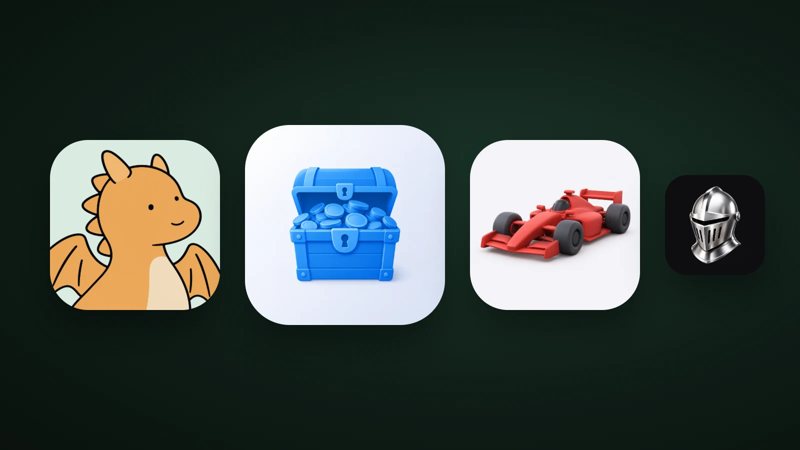
A good game app icon puts one hero in the frame, usually a character with a clear face, in rich, saturated colour with strong contrast against the background. In AI Icon Creator's review of the 100 top free games in the US App Store on 30 September 2026, 36 icons showed a character, face or person, 28 showed puzzle pieces or tiles, and 17 a scene, vehicle or object. Colour was richer than in other apps: 75 of the 100 game icons used four or more main colours.
This guide shows what the top games do, how game icons differ from other app icons, four icon ideas by genre, and how to test yours.
What do top game app icons show?
The most common subject in top game icons is a character. AI Icon Creator's review looked at the 100 games in the US App Store's Top Free Games chart on 30 September 2026. We classified each icon by eye, one main subject each. The icons aren't reproduced here.

- Characters, faces and people (36). Cartoon heroes, animals, mascots and portraits, usually big and close.
- Puzzle pieces, tiles and boards (28). Match-3 candies, mahjong tiles, blocks, cards, word grids and sorting bottles.
- Scenes, vehicles and objects (17). A bus, a car, a ball, a chess piece.
- Title lettering (14). The game's name as the main element, common in casino-style and sports games.
- Logo marks and symbols (5). A simple mark on a dark or flat background.
The takeaway is that the biggest group is a face or character, because a face gives an icon personality and reads quickly at small sizes. Puzzle games follow with tidy, colourful pieces, and only a few games rely on an abstract mark.
How are game icons different from other app icons?
Game icons use more colour, more saturation and more characters than other apps. We compared the same day's overall top 100 free apps with the top 100 free games:
- More main colours. 75 of the top 100 free games used four or more main colours, while 75 of the top 100 apps overall used two or fewer. Our guide to minimalist app icons has the full chart.
- More saturation. The average saturation was 56% for games and 48% for all apps, and 65 of 100 game icons averaged 50% or more, against 46 of 100 apps overall.
- More characters and lettering. Faces and titles are common in games, and rare among tools and services.
The reason is competition for attention. A game icon has to stand out in a store list full of other games, and it has to promise fun, not utility. Bright colour, a friendly face and a sense of motion do that in a fraction of a second.
What makes a game icon pop
A game icon pops when it has one focal character, a clear expression, a bold outline or shape, and strong contrast with its background. These four checks work for almost any style:

- One focal character. A single hero fills the frame. A scene with many small figures turns to noise at 32 px. Our guide to app icon design best practices explains why one focal point works.
- A clear expression. Two eyes and a mouth are readable at very small sizes, and they give the game personality.
- A bold outline or shape. A thick line, or a strongly lit shape, keeps the silhouette when the icon is small.
- Contrast with the background. A warm character on a cool background, or the reverse, separates in a moment. Aim for at least 3:1 between the hero and the background. Our guide to app icon colours shows how to measure it.
Game app icon ideas by genre
Each genre has a subject people expect, and the best icons show it at its most recognisable:

- Casual and adventure: a character. A big-faced hero, an animal or a mascot. A dragon like this one is friendly and instantly readable.
- Racing and driving: a vehicle. One vehicle at a dynamic angle, in a strong colour.
- RPG, action and strategy: a single powerful object. A helmet, a sword or a shield. Metal and dark backgrounds signal seriousness.
- Rewards and collecting: a chest or coins. Bright, glossy and simple.
- Puzzle: the pieces. Show one or two tidy, colourful pieces or a small board, not a full grid. A full grid of many small pieces is hard to read at small sizes, even though puzzle subjects appear in 28 of the top 100.
If you'd like more subjects to start from, our guide to app icon ideas has ideas for twelve kinds of apps, and our guide to icon metaphors helps you choose between them.
Text in a game icon
Text in a game icon is common but risky. Title lettering was the main element in 14 of the top 100 icons, yet text becomes unreadable at small sizes. If you use it, keep it to one short word, in large, bold letters, and check it at 32 px. Apple's Human Interface Guidelines ask for a memorable icon that expresses the purpose and personality of your app or game, and generally advise against unnecessary text.
Google Play has firm rules about what an icon can say. Its icon design specifications don't allow text or graphics that indicate rankings, promote deals or install incentives, show participation in a Play programme, or otherwise mislead users. The same page asks for a 512 × 512 px, 32-bit PNG in sRGB, up to 1024 KB, as a full square: Google Play applies its own rounded corners, with a radius of 30% of the icon's size, and its own shadow, so don't add either. Our app icon sizes guide covers every size.
How to design a game app icon
To design a game app icon, pick the hero of your game, match the genre and mood, push the colour and contrast, and test it small next to the top games in your genre.

- Pick the hero of the game. One character, vehicle or object.
- Match the genre and the mood. Bright and friendly for casual, dark and metallic for action, glossy for rewards.
- Push the colour and the contrast.
- Test it small, at 60 and 32 px, next to the top games in your genre. Our guide to keeping an icon legible at small sizes has the checks.
- Run an icon experiment. Both stores let you compare icon versions on real visitors, and the results decide better than opinion. Our guide to app icon design best practices explains how.
In AI Icon Creator, describe your hero and compare it in several of the game-friendly styles:
Frequently asked questions
What makes a good game app icon?
A good game app icon shows one hero, usually a character with a clear expression, in rich colour with strong contrast against the background, and stays readable at 32 px. In the top 100 US free games we reviewed, 36 icons used a character, and 75 used four or more main colours.
Should a game icon have a character on it?
A game icon should have a character if your game has a memorable one, because a face gives the icon personality and reads quickly at small sizes. Characters were the most common subject in the top 100 free games, at 36 of 100. If your game has no character, use one strong object or the game's key piece.
Should a game icon include the game's name?
A game icon can include the game's name, but it's risky: text becomes hard to read at small sizes, and Apple's guidelines advise against unnecessary text. In the top 100 games, 14 used title lettering as the main element. If you use it, keep it to one short word in large, bold letters.
What size should a game app icon be?
A game app icon is designed as a 1024 × 1024 px square for the App Store, and a 512 × 512 px, 32-bit PNG for Google Play, up to 1024 KB. Both stores apply their own rounded corners, so deliver a full square. Google Play's radius is 30% of the icon's size.
How do I design an icon for a puzzle game?
To design an icon for a puzzle game, show one or two colourful, tidy pieces, such as a tile, a candy or a block, rather than the whole board. Keep the colours bright and the shapes bold so the icon reads at 32 px. Puzzle pieces were the second most common subject in the top 100 free games, at 28 of 100.
Try a hero for your own game: