
AI Icon Creator has 14 app icon styles in four groups: flat and graphic, dimensional, materials and characters. The style decides how your icon is drawn; your description decides what it shows. Pick the style that matches your app's personality and how small the icon needs to read.
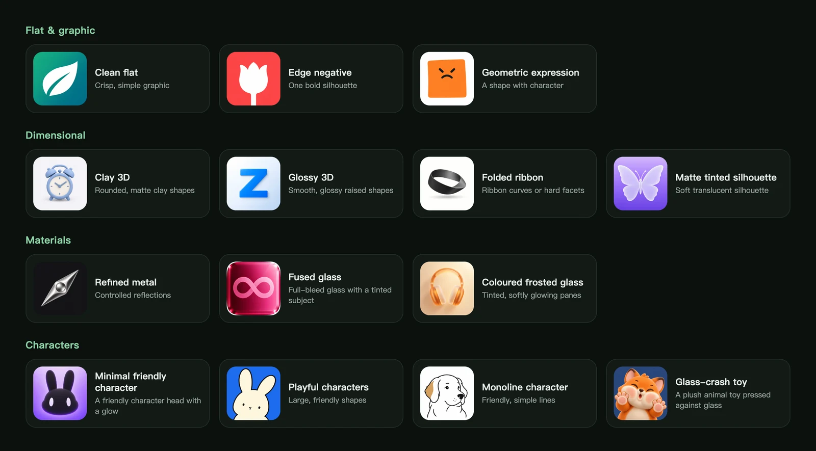
Flat and graphic styles
Bold shapes with no lighting or texture. These are the easiest styles to recognise at small sizes, which makes them a safe choice for tools and brands.
| Style | What it looks like | Good for |
|---|---|---|
| Clean flat | One crisp, simple graphic on a solid or gradient background | Utilities, productivity and brand-first apps |
| Edge negative | A single bold silhouette that touches one edge of the icon | Bold brands that must read at tiny sizes |
| Geometric expression | A simple shape with a hand-drawn face | Habit, mood and quirky indie apps |
Dimensional styles
Soft volume and light, without going photorealistic.
| Style | What it looks like | Good for |
|---|---|---|
| Clay 3D | Rounded, matte clay shapes | Wellness, lifestyle and calm consumer apps |
| Glossy 3D | A smooth, glossy symbol raised off a pale background | Letter marks, launchers and system-style tools |
| Folded ribbon | A continuous ribbon, or hard folded facets | Developer tools, design apps and abstract brands |
| Matte tinted silhouette | A soft, translucent silhouette | Music, meditation and ambient apps |
Material styles
Rich surfaces that stand out on a home screen.
| Style | What it looks like | Good for |
|---|---|---|
| Refined metal | Controlled chrome and silver reflections | Finance, security and pro tools |
| Fused glass | Full-bleed glass with a tinted subject | Creative, media and premium consumer apps |
| Coloured frosted glass | Tinted, softly glowing frosted panes | Weather, travel and photo apps |
Character styles
Friendly mascots with personality. They work best when your subject is an animal, an object with a face, or a mascot.
| Style | What it looks like | Good for |
|---|---|---|
| Minimal friendly character | A friendly character head with a glow | Companion, kids and journaling apps |
| Playful characters | Large, friendly shapes | Games, social and playful utilities |
| Monoline character | Friendly, simple black lines with a small accent colour | Pets, notes and friendly everyday apps |
| Glass-crash toy | A plush animal toy pressed against glass | Kids, games and mascot-led brands |
Glass-crash toy works best with furry animals such as rabbits, cats, bears or foxes.
Renderings: two looks within one style
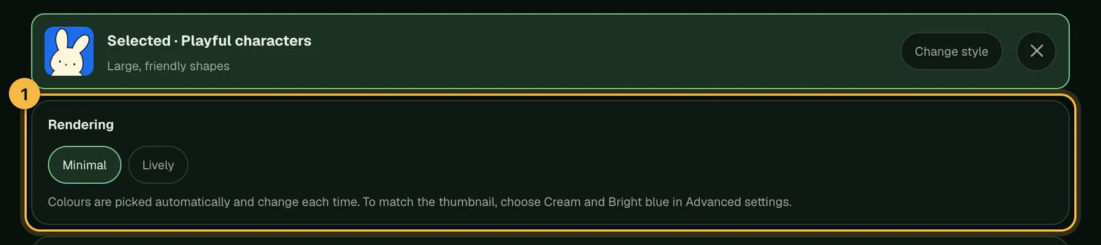
A few styles come in more than one rendering. Selecting the style picks the rendering shown in its thumbnail, and the other choices appear under the style:
- Refined metal: Mirror-silver symbol, Black-silver membrane or Bevelled panel.
- Minimal friendly character: Black matte or White face, bold outline.
- Playful characters: Minimal or Lively.
- Folded ribbon: Ribbon curves or Hard facets.
How to choose an app icon style
- Start from how small it will be. If the icon must work at 29–40 px, flat and graphic styles hold up best. Our guide to keeping icons legible at small sizes explains why.
- Match your app's personality. A banking app and a kids' game need very different feelings. How to choose a style for your app icon goes through common app categories.
- Try two or three styles with the same subject. Generating the same description in a few app icon styles side by side is the fastest way to decide.
Favourites and the full library
Hover a style and tap the heart to save it to Favorites; your recently used styles also appear under Recent in the library. Both are saved in your current browser. To see every style with larger samples, open Browse all 14 styles in the studio or visit the style library.
Frequently asked questions
Which app icon style is easiest to read at small sizes?
Clean flat and Edge negative. They use one bold shape and strong contrast, so they stay recognisable on a crowded home screen.
Why do some styles have no advanced settings?
For Clay 3D and Monoline character, the colours are always chosen by the model to keep the look consistent. Other styles let you set colours, backgrounds or expressions; see colours and advanced settings.
Can I use the same subject in different styles?
Yes. Your description stays in the box when you switch styles, so you can generate it again in another style straight away.
Did not find an answer?
Open a ticket and tell us what happened. We will reply as soon as we can.