
Icon style
Aesthetic app icons
Aesthetic app icons are icons designed to match, so a Home Screen reads as one calm design instead of a mix of logos: one background tone, one drawing style and one palette across every app. In the studio this style is called Minimal line. It draws each icon in one even line, with no fill, on a calm plain background, in one of three looks: Light, Dark or Black & white.
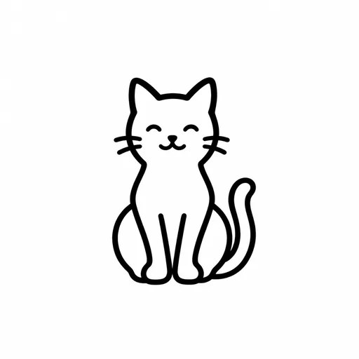
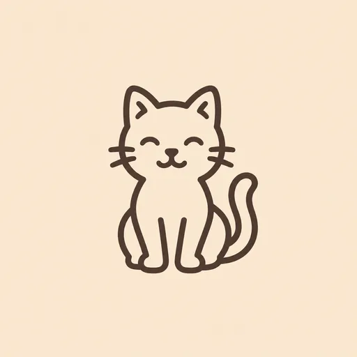
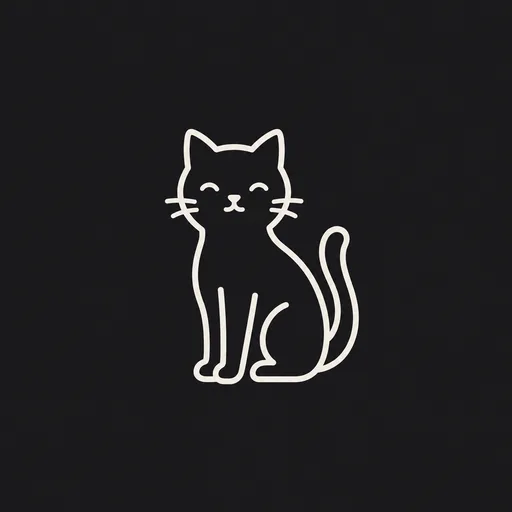
In the gallery below, a cat, a camera, an envelope and a music note are drawn as outlines only, so the background shows through every shape. Black & white is a black line on white. Light puts a slate line on pale blue or a brown line on peach and cream. Dark is a warm white line on near-black.
Use these minimal app icons to theme an iPhone Home Screen, or for a productivity or tools app. For each app, choose something with a simple, recognisable silhouette; each look brings its own colours and background, so the description only needs the subject. Then add the downloaded icons with Apple's Shortcuts app (the steps are in the questions below). Designing the icon for your own app instead? Read minimalist app icons.

Aesthetic icons in Black & white, Light and Dark
Every example was made with this style. Click one to start with the same look.





How to make aesthetic app icons with AI
A matching set takes three steps in AI Icon Creator. Apple's Shortcuts app then puts it on your Home Screen.
- 01
Describe one subject per app
Describe the object and at most one detail that changes its silhouette, such as “an envelope with a pointed flap” or “two music notes joined by a beam”; the studio's example for this style is “a leaf with a centre vein”. Pick the object that stands for the app, and leave colours and backgrounds out. Keep it simple, because fine detail shrinks to specks at small sizes (see fixes for thin lines and detail).
- 02
Pick one look and keep it
Choose Black & white for the strongest contrast, Light for a soft pastel Home Screen or Dark for a dark wallpaper, then use that one look for every icon. Don't mix looks in one set: the colours differ, and each look draws a subject a little differently, so the Black & white camera has one lens ring where the Light and Dark cameras have two. Try your subject in each look before you decide.
- 03
Check the set and download
Look at the icons together: if one line is heavier or paler than the rest, generate that subject again, or select just the part that is wrong. Download each PNG, then add the icons to your Home Screen with Apple's Shortcuts app, using the steps in the questions below. Download and export explains the options.
Questions about aesthetic app icons
How do you get aesthetic app icons?
You get aesthetic app icons by making one matching picture for each app and adding each to your Home Screen as an icon. Open AI Icon Creator, choose the Minimal line style, pick Light, Dark or Black & white, describe a subject for each app and download the PNGs. Keep the same look for every icon and the whole screen reads as one design.
What app makes your apps aesthetic?
On an iPhone, the app that makes your apps aesthetic is Apple's Shortcuts, which lets you use your own pictures as Home Screen icons. Create a shortcut that launches an app, then, following Apple's Shortcuts User Guide, open its Details and choose Add to Home Screen. In the Name and Icon area, tap the icon, choose Take Photo, Choose Photo or Choose File, and tap Add. Repeat for each app, with icons from one look.
What are some aesthetic icons for iPhone?
Good aesthetic icons for iPhone are simple, matching pictures that show what each app does. A camera, an envelope and a music note suit the Camera, Mail and Music apps, a cat suits a pets app and a leaf suits a plants or wellbeing app. In Minimal line each comes out drawn in one even line, in Light, Dark or Black & white.
How do I make black and white app icons?
To make black and white app icons, choose the Minimal line style, pick the Black & white look and describe a subject for each app. Each icon is a black line on a white background with no fill, and a set matches as long as you stay in that look. For a dark wallpaper, Dark draws a warm white line on near-black.
How do I make a set of aesthetic icons match?
Make a set of aesthetic icons match by staying in one look and comparing the line weight. In our examples Black & white and Dark each keep one pair of colours, while Light moves between pale blue, peach and cream. Inside each icon the line is even, but across icons it varies: the camera's line is heavier than the cat's in Black & white and Dark, and the music note's line is the heaviest in Light.
How well do minimal app icons hold up at small sizes?
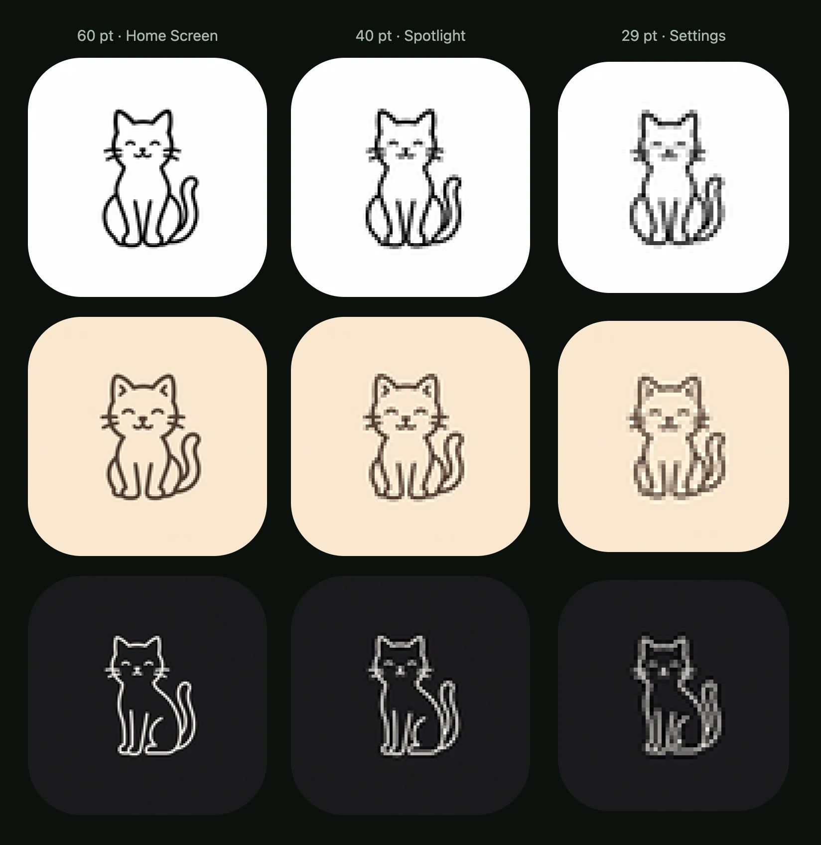
Minimal line icons keep their main shape down to 29 pt, but thin lines go faint and fine details turn to specks. In AI Icon Creator's real-size check, we shrank the eight approved icons to 60 pt (Home Screen), 40 pt (Spotlight) and 29 pt (Settings). All read clearly at 60 and 40 pt. At 29 pt, Black & white stayed black, most Light lines paled and the Dark cat's thin line turned grey and patchy.
Related styles



Further reading
- Minimalist App Icons: How to Design One That Stands OutHow to design a minimalist app icon: how top US apps use colour, a camera cut from nine parts to three, negative space, and the risks of going too plain.
- App Icon Colours: How to Choose Colours That Stand OutHow to choose app icon colours: brand, category, contrast and wallpaper tests, gradients, and what dark and tinted modes do, with data from an 8-colour test.
- How to Keep an App Icon Legible at Small SizesHow to keep an app icon legible at small sizes: where icons shrink to 20–40 px, three quick tests, and fixes for thin lines, narrow gaps, detail and contrast.
- Icon Styles Explained: Types of Icons, with ExamplesA visual guide to icon styles: line, filled, duotone, flat, gradient, 3D, glass, metal and mascot icons, when to use each, and the icon style trends for 2026.