
Icon style
Neon app icons
Neon app icons are app icons that draw one subject as a glowing neon tube: a thin line of coloured light with a halo around it, on a dark wall. Describe your subject in a few words and AI Icon Creator makes one finished icon in that look, for music, nightlife and entertainment apps. You get one icon for your own app, not a set of ready-made interface icons to browse. It is not a physical neon sign and not a sign generator.
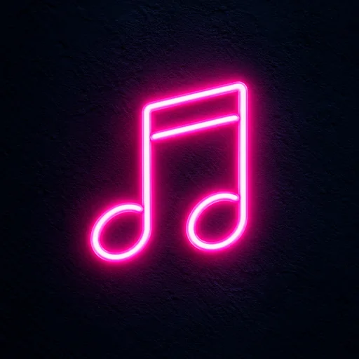
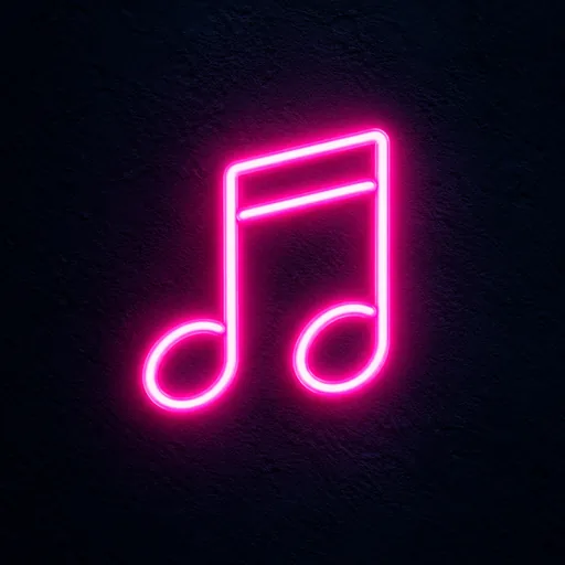
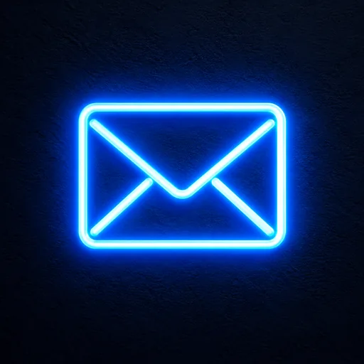
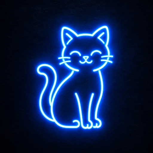
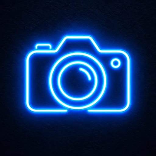
Each of the four examples below draws its subject as an outline of light, not a solid shape: a music note, an envelope, a sitting cat and a camera. The music note is two notes joined by a double beam, the envelope has a V-shaped flap, the cat has whiskers and a curled tail, and the camera has a lens of two rings. The music note is hot pink and the other three are blue. In all four, the centre of the tube is almost white and the colour sits in the glow around it, on a near-black background with a faint, rough texture like a wall.
Choose one subject with a simple, clear outline, like those four. Neon icons are made of thin lines, and thin lines are the first thing to fade when an icon shrinks. Our guide to small-size legibility explains why and gives three quick tests you can run on the result.
Neon icons made with this style
Every example was made with this style. Click one to start with the same look.
How to make neon app icons with AI
Neon tube has one look and no colour setting, so the subject you describe is the only thing you steer.
- 01
Pick one simple subject
With Neon tube selected in the studio, name one object, such as “a music note”, “an envelope” or “a camera”, and add a detail only when it changes the silhouette, like the curled tail in “a sitting cat with its tail curled up”. Skip colours, backgrounds and scenes, because the style draws the tube, the glow and the wall itself. How to describe a subject has more examples.
- 02
Check it at real size
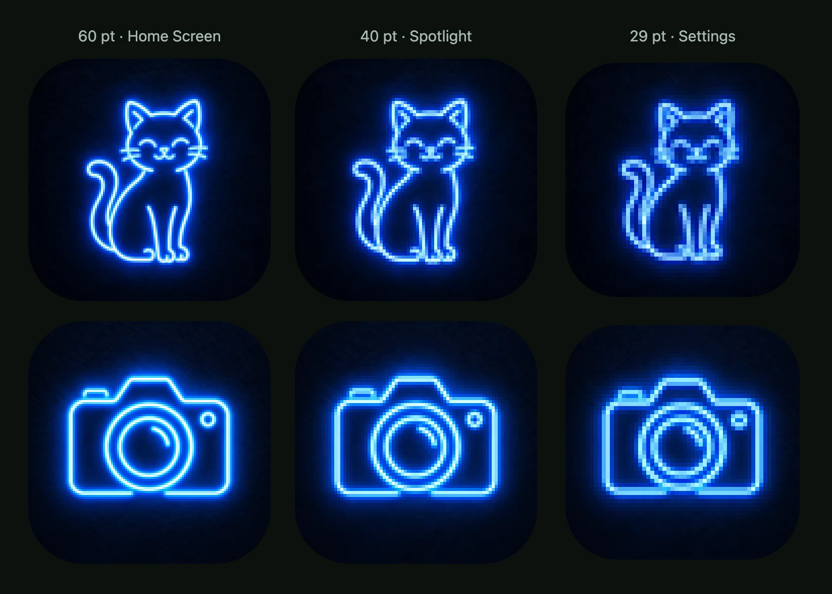
Look at the result at 60 pt, the Home Screen size, and at 29 pt, the Settings size; the iOS, Android and web size chart covers the rest. In our check the glow thinned to a faint haze and fine details such as whiskers merged, so try a simpler subject if the line is unclear at 29 pt.
- 03
Adjust one part, then download
To fix one part, pick just that part and say what it should become; each edit is a new version, and your first icon stays available. When you are happy, download a PNG for mockups and slides, or the app icon pack, which holds the iOS, Android and web files. The download guide shows what each file is for.
Neon app icons: common questions
What are neon app icons?
Neon app icons are icons that draw their subject as a glowing neon tube on a dark background. With the Neon tube style you say what to draw in a few words and get one finished icon: a pale line with a pink or blue glow around it. It is one icon for your own app, not an icon library to browse.
How do I make a neon app icon with AI?
To make a neon app icon with AI, pick the Neon tube style in AI Icon Creator, type the object you want, such as “a music note”, and generate. The style supplies the tube, the glow and the dark wall, so there is nothing else to set. When it reads well at small size, download it as a PNG, or as an app icon pack.
What colour is neon?
Neon has no single colour, and the Neon tube style chooses the colour for you. In the examples, the music note is hot pink and the envelope, cat and camera are blue. In all four, the middle of the tube is almost white and the colour shows in the glow around it. There is no colour setting to change.
Do neon icons stay readable at small sizes?
Neon icons stay recognisable at 29 pt, but their glow fades and fine details merge. In AI Icon Creator's real-size check, we shrank the four approved neon icons to 60, 40 and 29 pt: at 29 pt the glow was a faint haze and the pale line one or two pixels wide on a 2x screen. The cat, drawn with the thinnest line, lost its whiskers into its outline; the envelope and camera stayed clearest.
Which apps suit neon icons?
Neon icons suit music, nightlife and entertainment apps, such as playlist and DJ tools, club and event guides, karaoke and streaming apps, where a glowing line on a dark background matches the mood. For a calm daytime app such as banking or meditation, a quieter style will usually fit better. Whatever the app, pick one object that reads from its outline alone.
Do glowing app icons work on a dark Home Screen?
Neon icons can work on a dark Home Screen, but their near-black background can blend into a dark wallpaper, so the bright line has to carry the shape. On a light wallpaper, the icon reads as a dark square with a bright line. Check both: our app icon colours guide explains why very dark icons lose their edges.
Related styles
Further reading
- How to Keep an App Icon Legible at Small SizesHow to keep an app icon legible at small sizes: where icons shrink to 20–40 px, three quick tests, and fixes for thin lines, narrow gaps, detail and contrast.
- App Icon Colours: How to Choose Colours That Stand OutHow to choose app icon colours: brand, category, contrast and wallpaper tests, gradients, and what dark and tinted modes do, with data from an 8-colour test.
- How to Choose an App Icon Style: Flat, 3D, Glass or Mascot?How to choose an app icon style: which of flat, soft 3D, glass, metal or character icons fits your app, audience and category, with side-by-side examples.
- App Icon Design Best Practices: 8 Principles That WorkEight app icon design best practices, from one focal point and the silhouette test to colour, text and platform rules, plus how to test an icon before launch.